Data visualization: the grammar of graphics and ggplot2
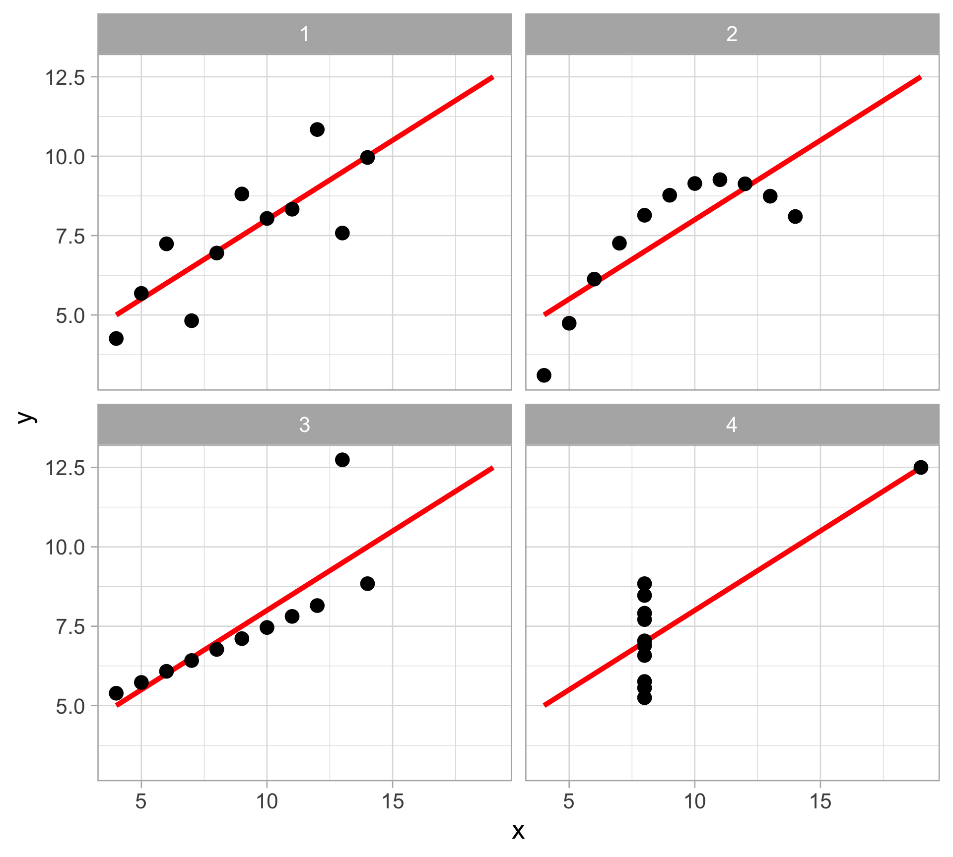
ALWAYS visualize your data before modeling and analysis
The Datasaurus dozen
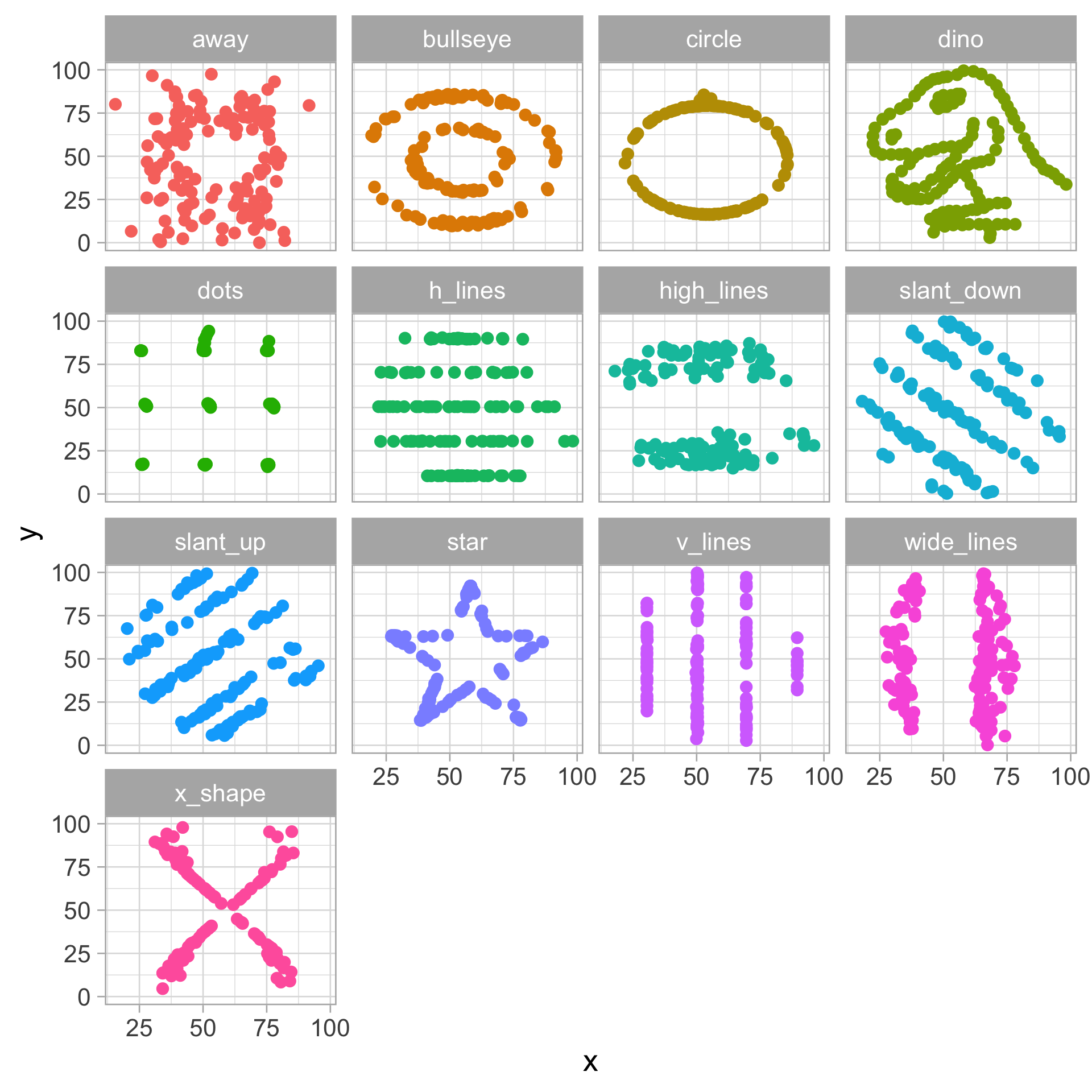
| dataset | x_mean | x_var | y_mean | y_var | x_y_cor |
|---|---|---|---|---|---|
| away | 54.3 | 281.2 | 47.8 | 725.7 | -0.06 |
| bullseye | 54.3 | 281.2 | 47.8 | 725.5 | -0.07 |
| circle | 54.3 | 280.9 | 47.8 | 725.2 | -0.07 |
| dino | 54.3 | 281.1 | 47.8 | 725.5 | -0.06 |
| dots | 54.3 | 281.2 | 47.8 | 725.2 | -0.06 |
| h_lines | 54.3 | 281.1 | 47.8 | 725.8 | -0.06 |
| high_lines | 54.3 | 281.1 | 47.8 | 725.8 | -0.07 |
| slant_down | 54.3 | 281.1 | 47.8 | 725.6 | -0.07 |
| slant_up | 54.3 | 281.2 | 47.8 | 725.7 | -0.07 |
| star | 54.3 | 281.2 | 47.8 | 725.2 | -0.06 |
| v_lines | 54.3 | 281.2 | 47.8 | 725.6 | -0.07 |
| wide_lines | 54.3 | 281.2 | 47.8 | 725.7 | -0.07 |
| x_shape | 54.3 | 281.2 | 47.8 | 725.2 | -0.07 |
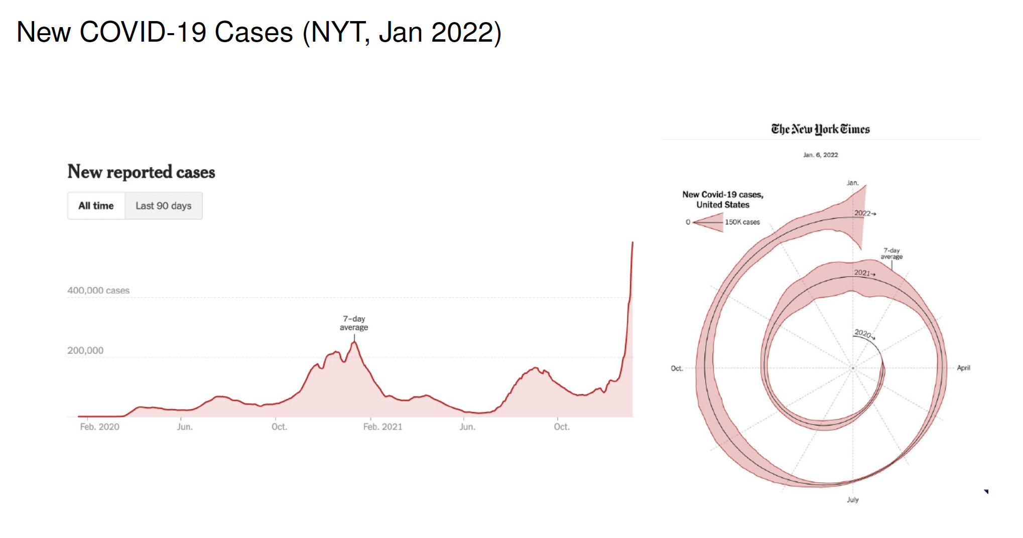
Viz crime?
Florence Nightingale’s rose diagram
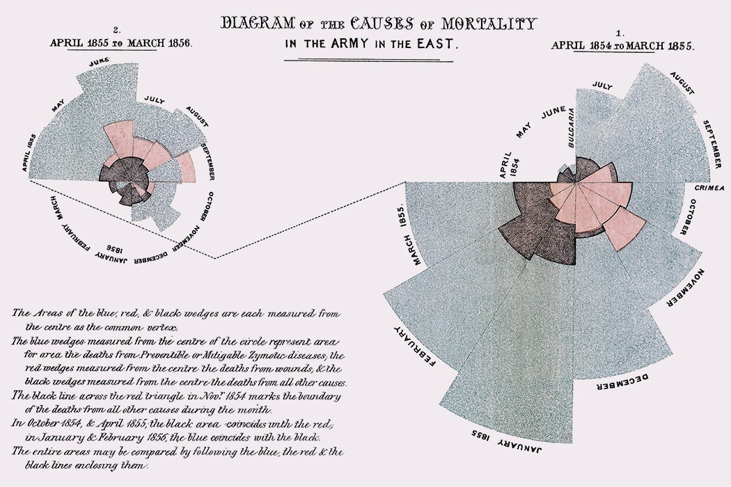
Viz crime?
Previously…
Yearly MLB batting statistics from Lahman with tidyverse:
- total hits, home runs, strikeouts, walks, at bats
- total batting average for each year
= total H / total AB - only keeps AL and NL leagues
library(tidyverse)
library(Lahman)
yearly_batting <- Batting |>
  filter(lgID %in% c("AL", "NL")) |>
  group_by(yearID) |>
  summarize(total_h = sum(H, na.rm = TRUE),
            total_hr = sum(HR, na.rm = TRUE),
            total_so = sum(SO, na.rm = TRUE),
            total_bb = sum(BB, na.rm = TRUE),
            total_ab = sum(AB, na.rm = TRUE)) |>
  mutate(batting_avg = total_h / total_ab)
How do we make data visualization?
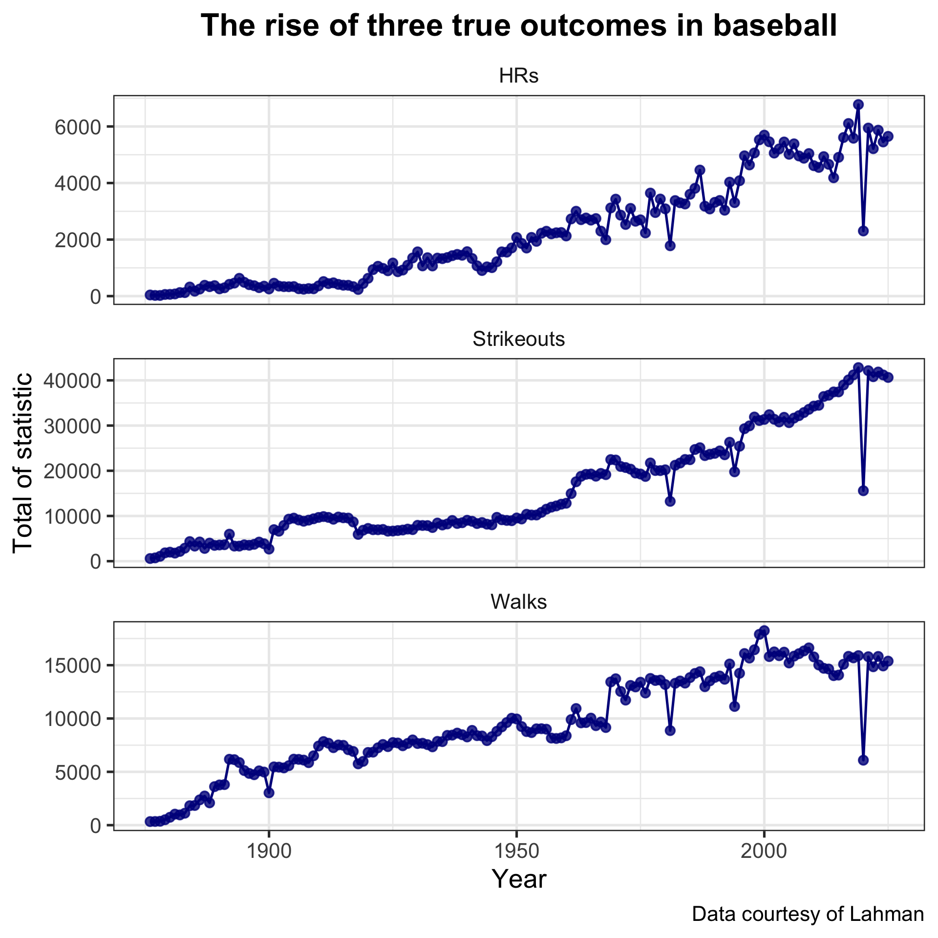
What are the steps to make this figure below?
First, start with the data
ggplot(data = yearly_batting)or equivalently, using |>
yearly_batting |>
  ggplot()
So far, nothing is displayed

Specify variables and geometric object
yearly_batting |>
  ggplot() +
  geom_point(aes(x = yearID, y = total_hr))
Adding (
+) a geometric layer of points to the plotMap
yearIDto the x-axis andtotal_hrto the y-axis viaaes()Implicitly using
coord_cartesian()
yearly_batting |>
  ggplot() +
  geom_point(aes(x = yearID, y = total_hr)) +
  coord_cartesian()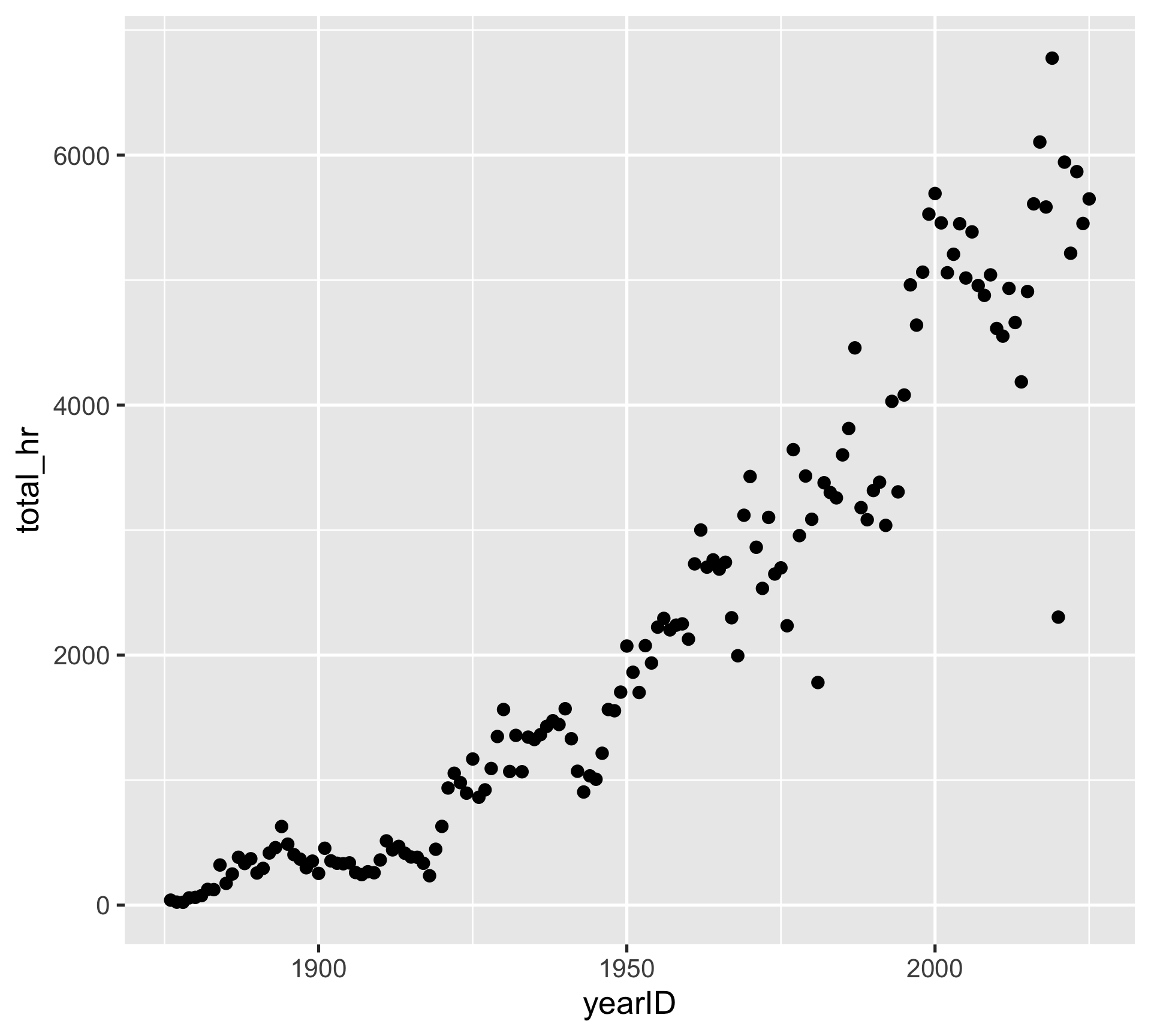
Now, can we add another geometric layer?
yearly_batting |>
  ggplot() +
  geom_point(aes(x = yearID, y = total_hr)) +
  geom_line(aes(x = yearID, y = total_hr))
Adding (
+) a line geometric layerInclude mappings shared across geometric layers inside
ggplot()
yearly_batting |>
  ggplot(aes(x = yearID, y = total_hr)) +
  geom_point() +
  geom_line()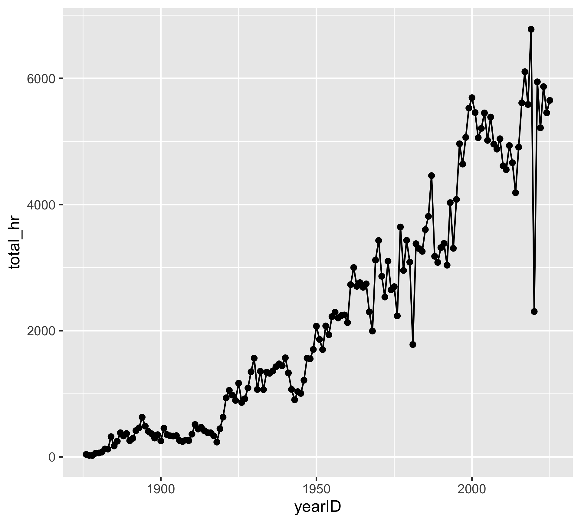
Scaling axes: changing axis label breaks
yearly_batting |>
  ggplot(aes(x = yearID, y = total_hr)) +
  geom_point() +
  geom_line() +
  scale_y_continuous(breaks = seq(0, 6000, 1000))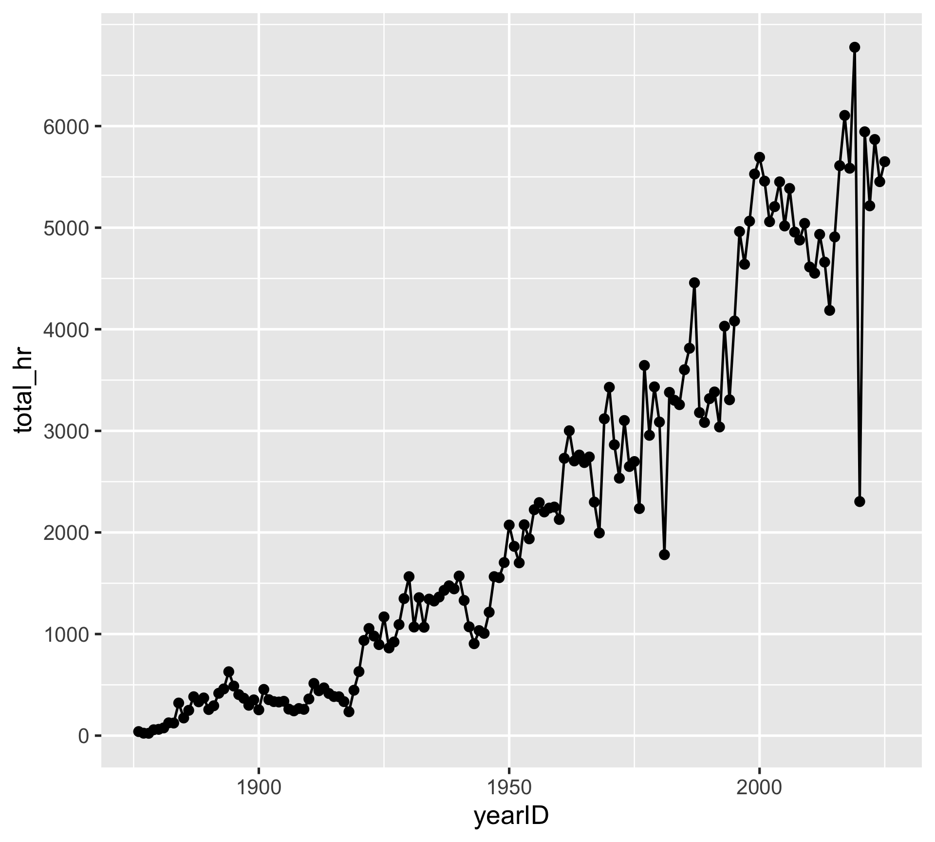
Scaling axes: customizing axis limits
yearly_batting |>
  ggplot(aes(x = yearID, y = total_hr)) +
  geom_point() +
  geom_line() +
  scale_x_continuous(limits = c(2000, 2015))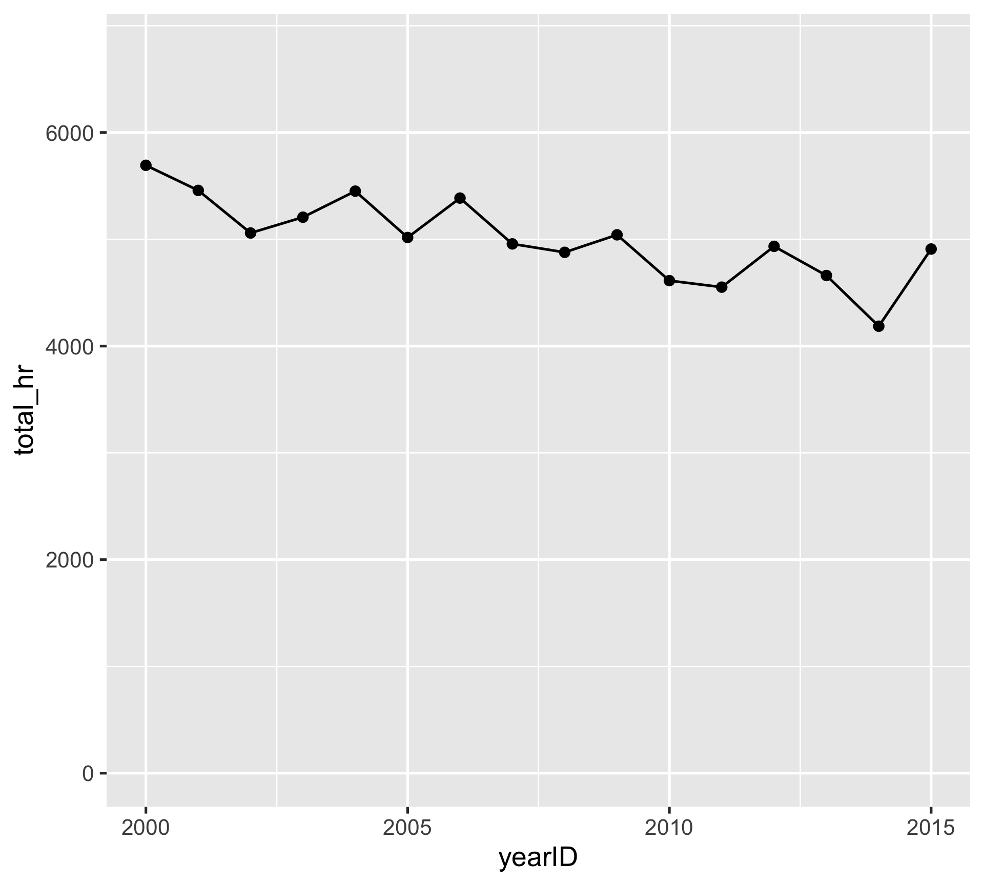
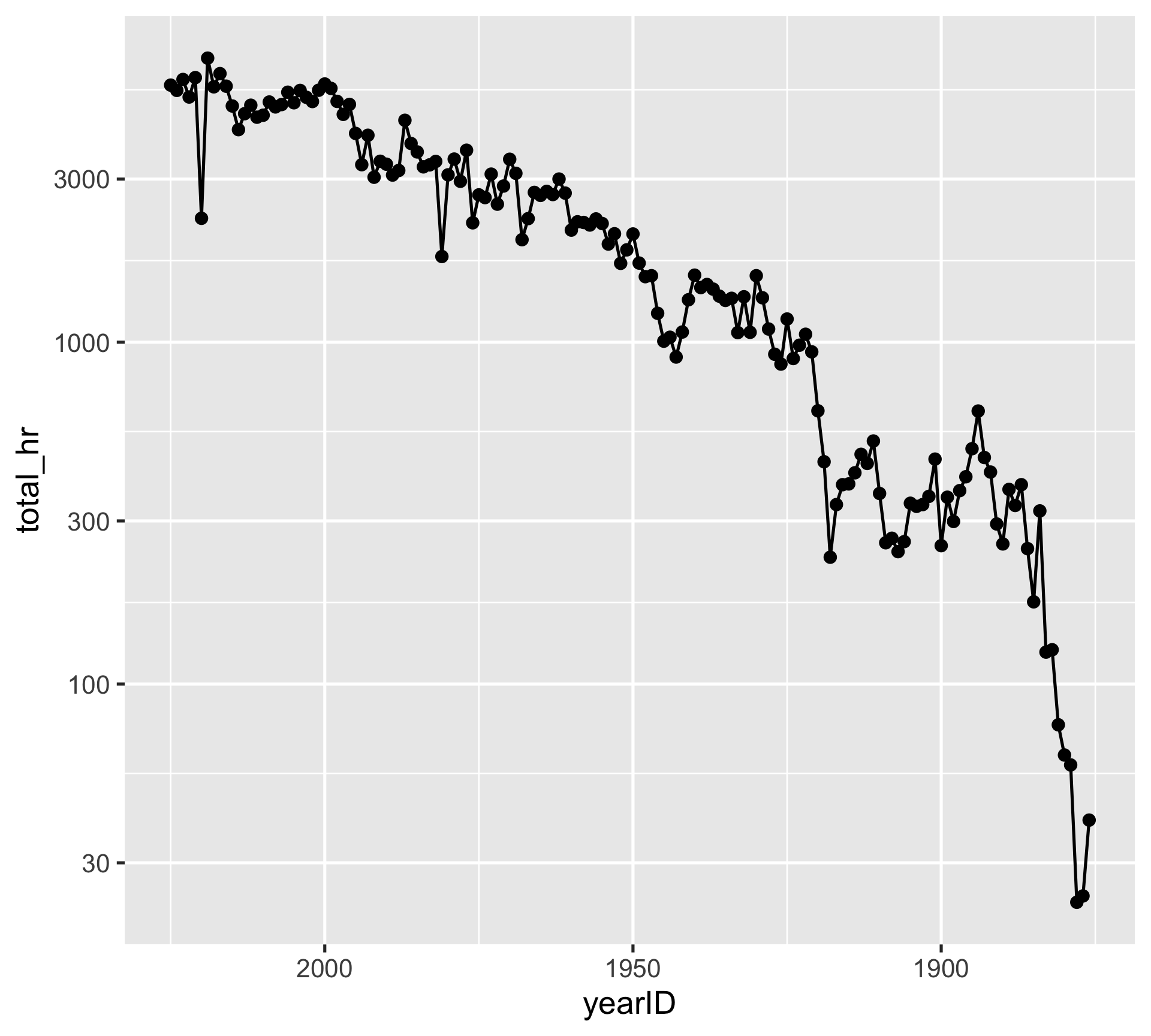
Scaling axes: having different axis scales
yearly_batting |>
  ggplot(aes(x = yearID, y = total_hr)) +
  geom_point() +
  geom_line() +
  scale_x_reverse() +
  scale_y_log10()
We can easily adjust variable scales without directly modifying the columns in the data
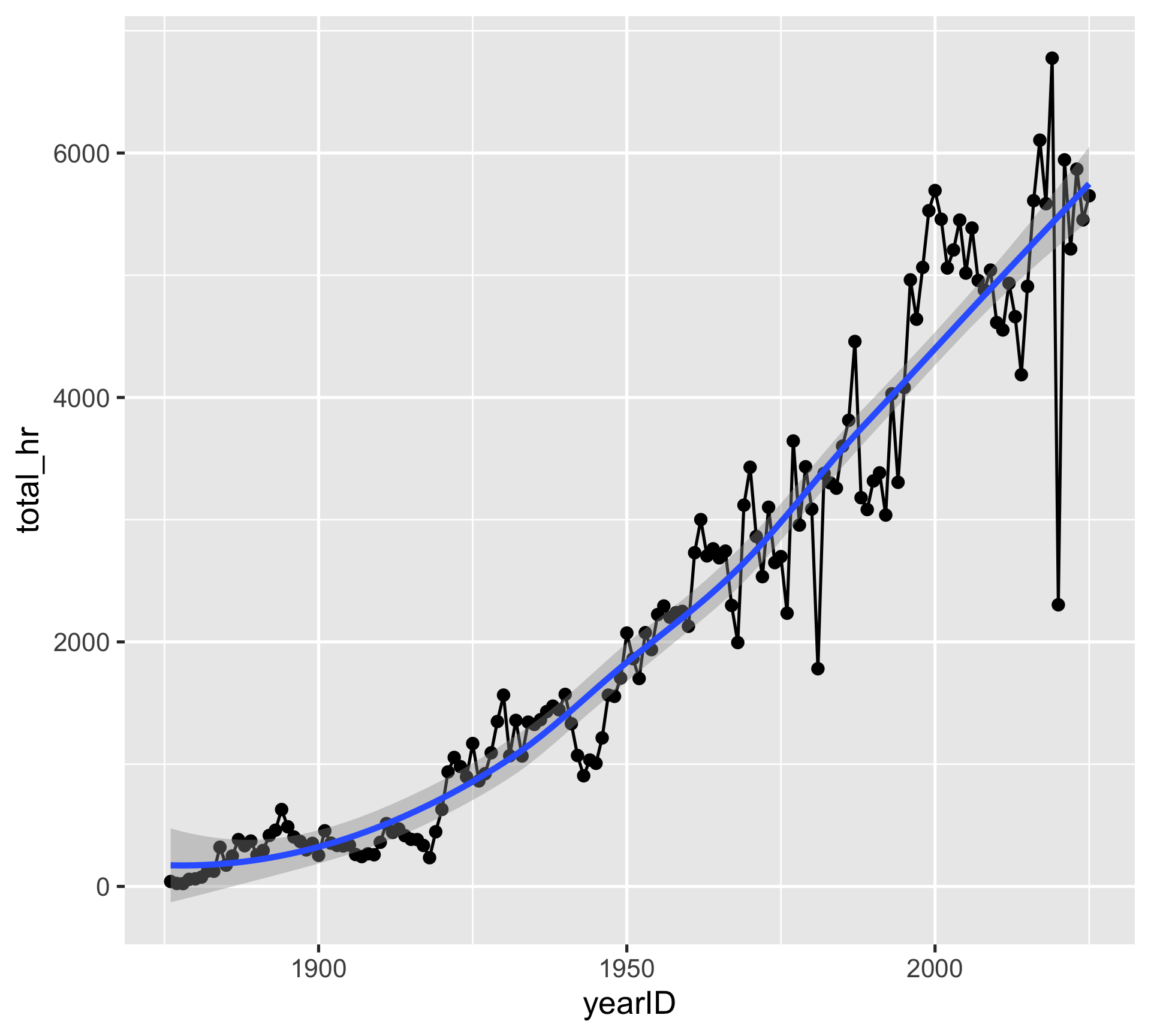
Adding a statistical summary
yearly_batting |>
  ggplot(aes(x = yearID, y = total_hr)) +
  geom_point() +
  geom_line() +
  geom_smooth()
Smoothing regression summary (will cover later) using yearID and total_hr
Mapping additional variables
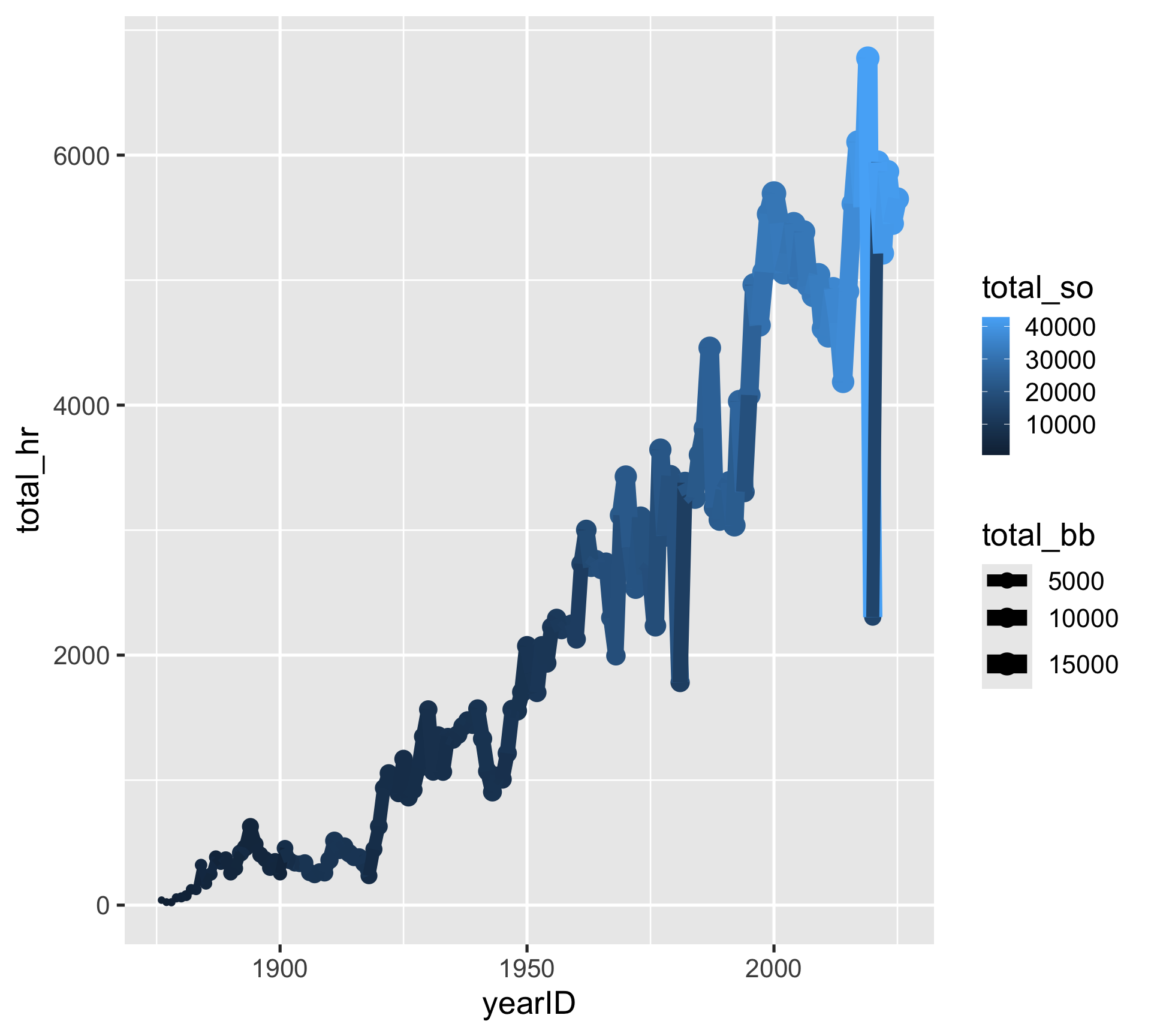
yearly_batting |>
  ggplot(aes(x = yearID, y = total_hr,
             color = total_so,
             size = total_bb)) +
  geom_point() +
geom_line()total_hr,total_so, andtotal_bbare all displayedcolorandsizeare being shared globally across layersThis is a bit odd to look at…
Customizing mappings by layer
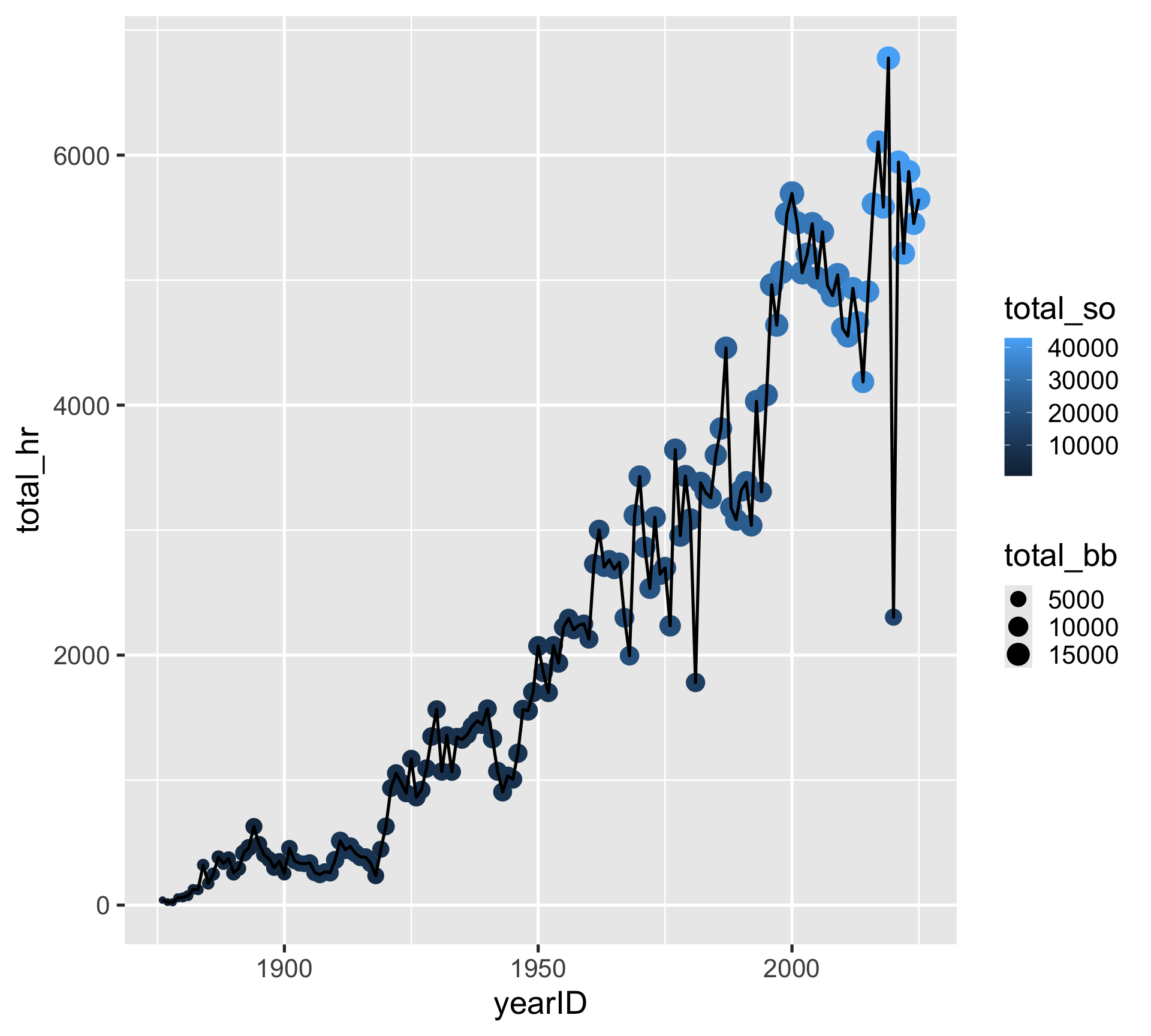
yearly_batting |>
  ggplot(aes(x = yearID, y = total_hr)) +
  geom_point(aes(color = total_so, size = total_bb)) +
  geom_line()
Now mapping total_so and total_bb to color and size of the point layer only
Changing aesthetics without mapping variables
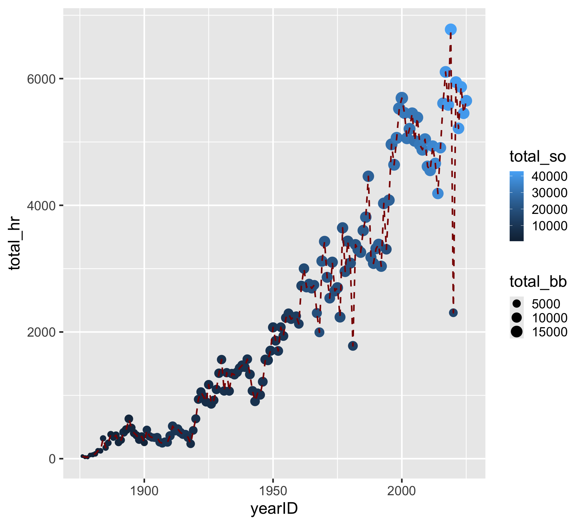
yearly_batting |>
  ggplot(aes(x = yearID, y = total_hr)) +
  geom_point(aes(color = total_so, size = total_bb)) +
  geom_line(color = "darkred", linetype = "dashed")
Manually set the color and linetype of the line layer
Further refining the color and size
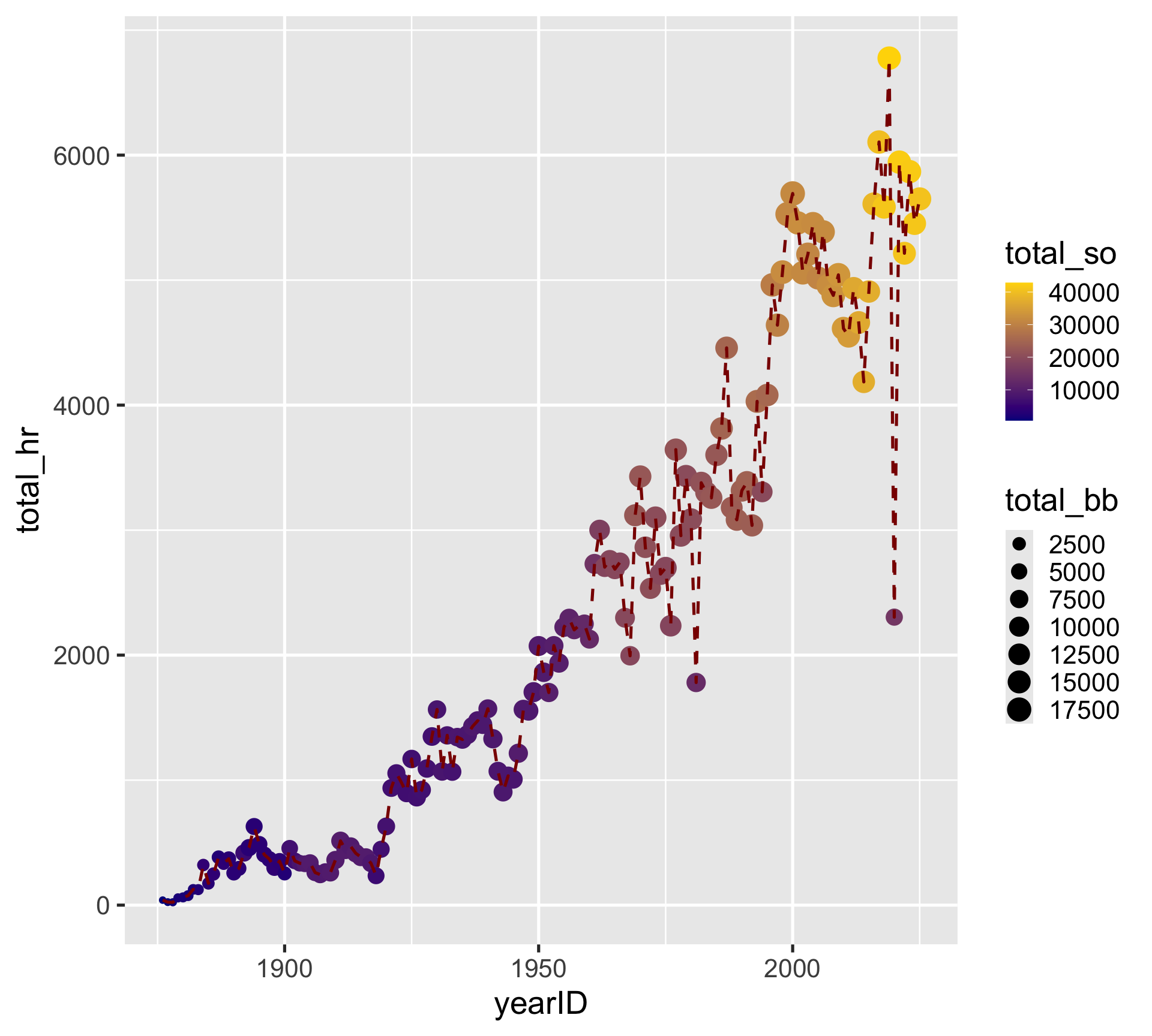
yearly_batting |>
  ggplot(aes(x = yearID, y = total_hr)) +
  geom_point(aes(color = total_so, size = total_bb)) +
  geom_line(color = "darkred", linetype = "dashed") +
  scale_color_gradient(low = "darkblue", high = "gold") +
  scale_size_continuous(breaks = seq(0, 20000, 2500))
There are lots of different scale_color_XYZ() and scale_size_XYZ() functions to check out!
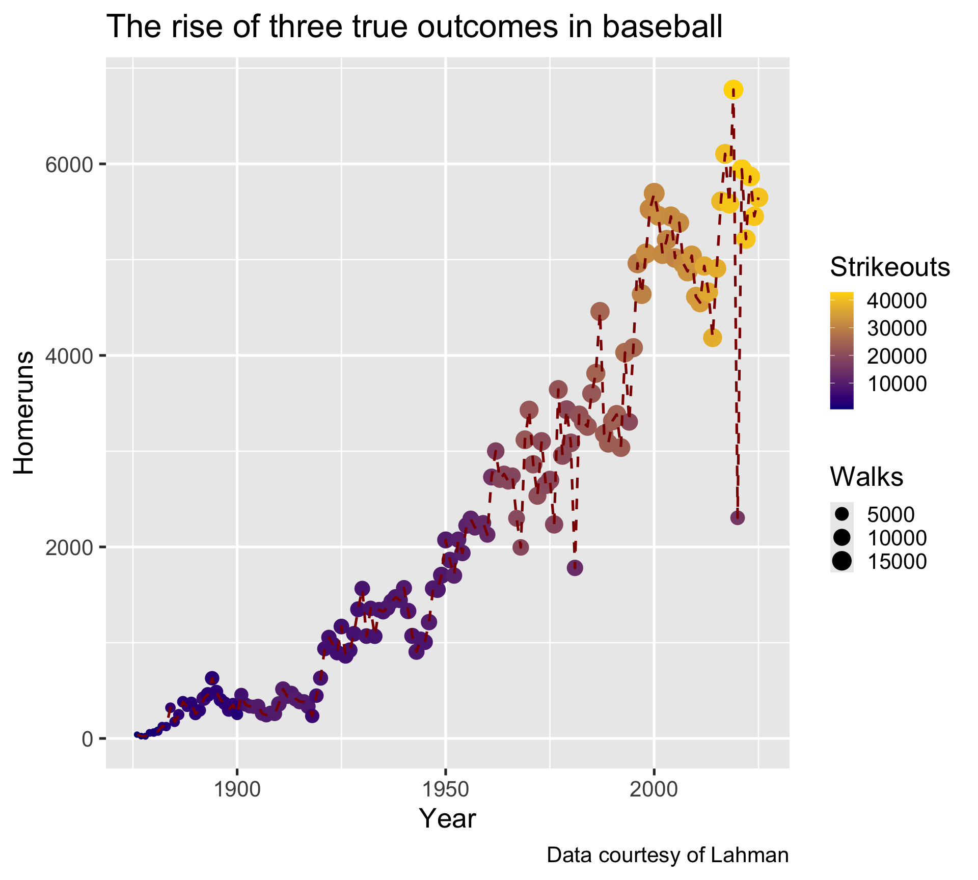
Always label your plots! (seriously…)
yearly_batting |>
  ggplot(aes(x = yearID, y = total_hr)) +
  geom_point(aes(color = total_so, size = total_bb)) +
  geom_line(color = "darkred", linetype = "dashed") +
  scale_color_gradient(low = "darkblue", high = "gold") +
  labs(
    x = "Year",
    y = "Homeruns",
    color = "Strikeouts",
    size = "Walks",
    title = "The rise of three true outcomes in baseball",
    caption = "Data courtesy of Lahman"
  )
Each mapped aesthetic can be labeled
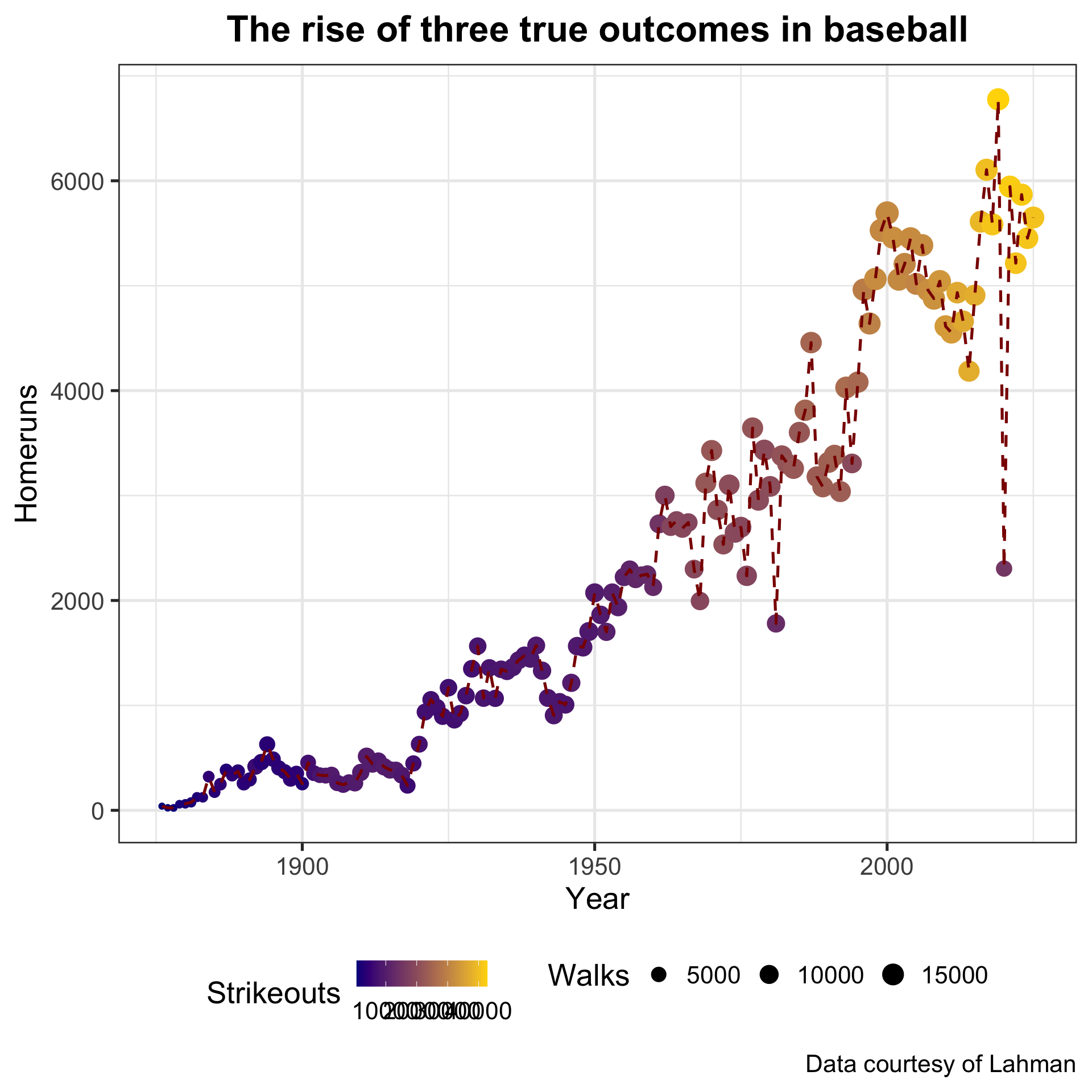
Custom theme
yearly_batting |>
  ggplot(aes(x = yearID, y = total_hr)) +
  geom_point(aes(color = total_so, size = total_bb)) +
  geom_line(color = "darkred", linetype = "dashed") +
  scale_color_gradient(low = "darkblue", high = "gold") +
  labs(
    x = "Year",
    y = "Homeruns",
    color = "Strikeouts",
    size = "Walks",
    title = "The rise of three true outcomes in baseball",
    caption = "Data courtesy of Lahman"
  ) +
  theme_bw(base_size = 20) +
  theme(legend.position = "bottom",
        plot.title = element_text(hjust = 0.5,
                                  face = "bold"))
For more theme options, check out the ggthemes and hrbrthemes packages
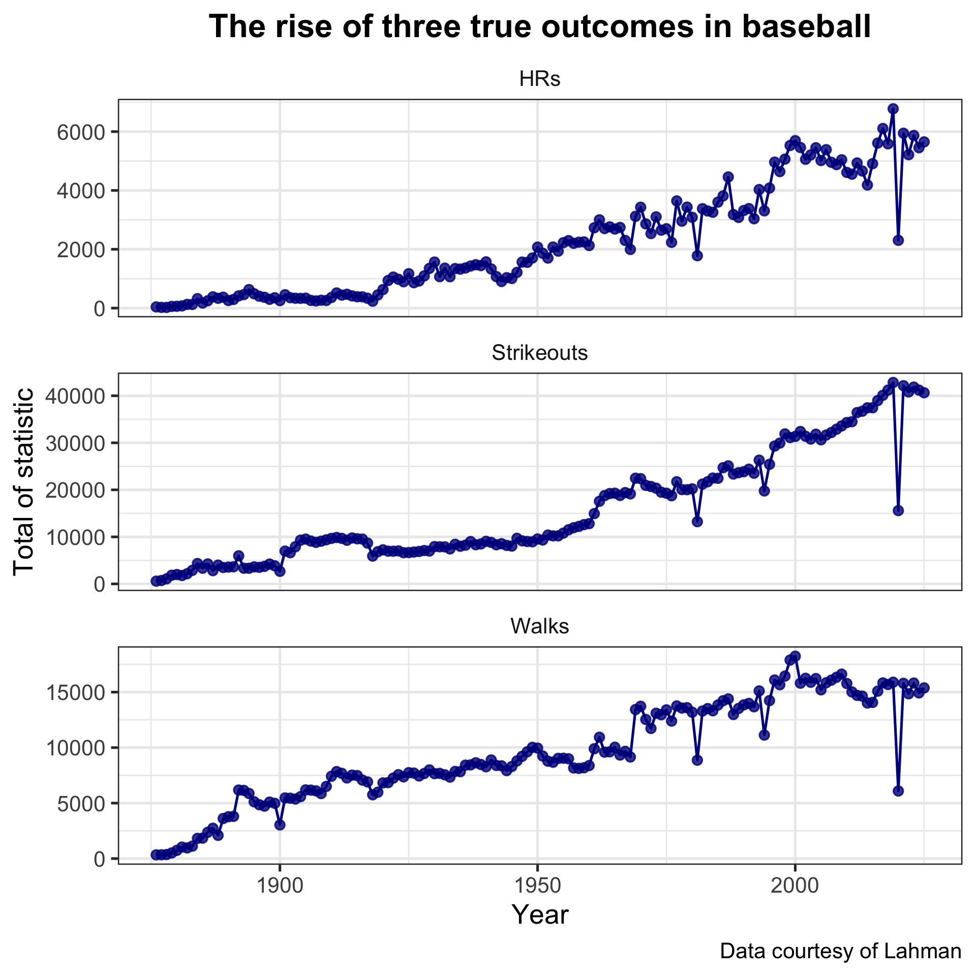
Faceting
yearly_batting |>
  select(yearID, HRs = total_hr,
         Strikeouts = total_so, Walks = total_bb) |>
  pivot_longer(HRs:Walks,
               names_to = "stat",
               values_to = "val") |>
  ggplot(aes(yearID, val)) +
  geom_line(color = "darkblue") +
  geom_point(alpha = 0.8, color = "darkblue") +
  facet_wrap(~ stat, scales = "free_y", ncol = 1) +
  labs(
    x = "Year",
    y = "Total of statistic",
    title = "The rise of three true outcomes in baseball",
    caption = "Data courtesy of Lahman"
  ) +
  theme_bw(base_size = 20) +
  theme(strip.background = element_blank(),
        plot.title = element_text(hjust = 0.5,
                                  face = "bold"))
Create a multi-panel plot faceted by a conditioning variable (in our case, stat)