Data visualization: categorical data


CMSACamp 2026

Department of Statistics & Data Science
Carnegie Mellon University

Background

Data

  • Our dataset is Wimbledon women’s tennis shot-level data

  • The original data is publicly available on the SCORE Sports Data Repository

    • We will look at a random sample of 10,000 (non-serve) shots

    • The data was pre-processed slightly for this lecture:

# set seed for reproducibility
set.seed(4747)

# import data from current working directory
tennis_shots <- read_csv("tennis-w-shots-wim.csv.gz") |>
  # tidy names
  janitor::clean_names() |>
  # remove serves
  filter(shot_type != "serve") |>
  # NA = shot did not produce an outcome (i.e., returned)
  mutate(outcome_type = if_else(is.na(outcome_type),"returned", outcome_type)) |>
  # replace "_" with " " in all character variables 
  mutate(across(where(is.character), ~ str_replace_all(., "_", " "))) |>
  # convert date into ymd format
  mutate(date = ymd(date)) |>
  # random sample of sample 10,000 observations
  dplyr::slice_sample(n = 10000)

Data

Let’s begin by importing the data:

library(tidyverse)
theme_set(theme_light()) # setting the ggplot theme

tennis_shots <- read_csv("https://raw.githubusercontent.com/36-SURE/2026/main/data/tennis_w_shots_wim.csv") |>
  # filter out NAs for shot_type and outcome_type
  filter(!is.na(shot_type), !is.na(outcome_type)) |>
  # convert characters into factors
  mutate(across(where(is.character), as.factor)) 


What does each row represent here?

names(tennis_shots)
 [1] "date"            "tournament"      "round"           "player1"        
 [5] "player2"         "point"           "shot"            "serve"          
 [9] "serving_player"  "winning_player"  "shot_hand"       "shot_type"      
[13] "shot_direction"  "serve_direction" "shot_depth"      "outcome_type"   
[17] "error_type"     

Categorical data

Two different versions of categorical data:

Nominal: categorical variables having unordered scales

  • Examples: race, gender, species, etc.

Ordinal: ordered categories; levels with a meaningful order

  • Examples: education level, grades, ranks, etc.

Factors in R

  • In R, factors are used to work with categorical variables

  • R treats factors as ordinal - defaults to alphabetical

    • May need to manually define the factor levels (e.g., the reference level)
  • See the forcats package (automatically loaded with tidyverse)

class(tennis_shots$shot_type)
[1] "factor"
levels(tennis_shots$shot_type)
[1] "drop shot"       "groundstroke"    "half volley"     "lob"            
[5] "overhead"        "slice"           "swinging volley" "volley"         

1D categorical data

Summarizing 1D categorical data

How often is each shot type used during women’s singles at the Wimbledon Championships?

Frequency tables (counts)

table(tennis_shots$shot_type)

      drop shot    groundstroke     half volley             lob        overhead 
            131            7919              33             184              64 
          slice swinging volley          volley 
           1363              49             257 
#tennis_shots |> 
#  group_by(shot_type) |>
#  summarize(n = n(), .groups = "drop")

tennis_shots |> 
  count(shot_type)
# A tibble: 8 × 2
  shot_type           n
  <fct>           <int>
1 drop shot         131
2 groundstroke     7919
3 half volley        33
4 lob               184
5 overhead           64
6 slice            1363
7 swinging volley    49
8 volley            257

Summarizing 1D categorical data

Proportion table

prop.table(table(tennis_shots$shot_type))

      drop shot    groundstroke     half volley             lob        overhead 
         0.0131          0.7919          0.0033          0.0184          0.0064 
          slice swinging volley          volley 
         0.1363          0.0049          0.0257 
tennis_shots |> 
  count(shot_type) |> 
  mutate(prop = n / sum(n))
# A tibble: 8 × 3
  shot_type           n   prop
  <fct>           <int>  <dbl>
1 drop shot         131 0.0131
2 groundstroke     7919 0.792 
3 half volley        33 0.0033
4 lob               184 0.0184
5 overhead           64 0.0064
6 slice            1363 0.136 
7 swinging volley    49 0.0049
8 volley            257 0.0257

Visualizing 1D categorical data

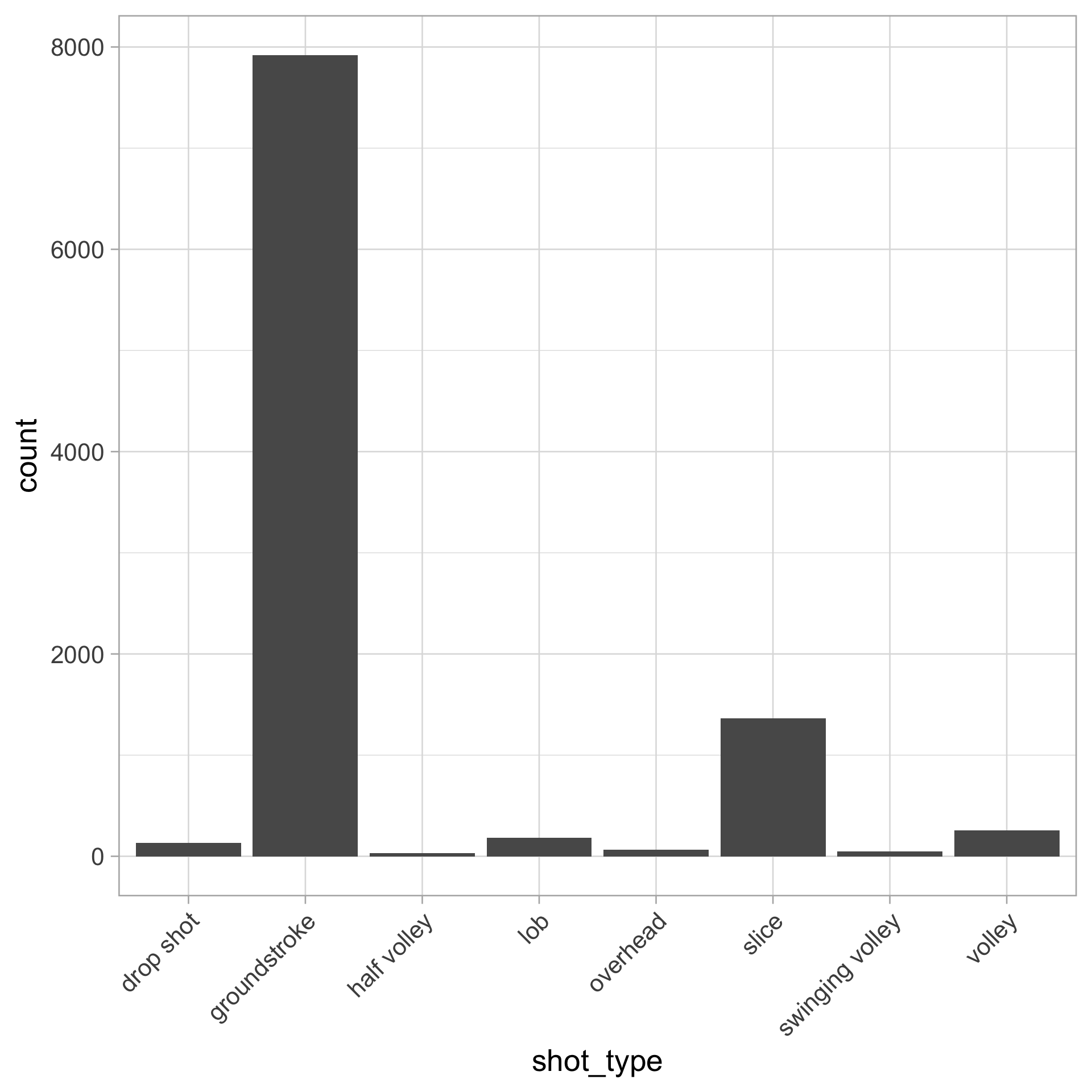
Create a bar chart with geom_bar()

  • Map shot_type to the x-axis

  • Counts of each category are displayed on the y-axis

tennis_shots |> 
  ggplot(aes(x = shot_type)) +
  geom_bar() +
  # angling axis text for readability
  theme(axis.text.x = element_text(angle = 45,
                                   vjust = 1, hjust = 1))
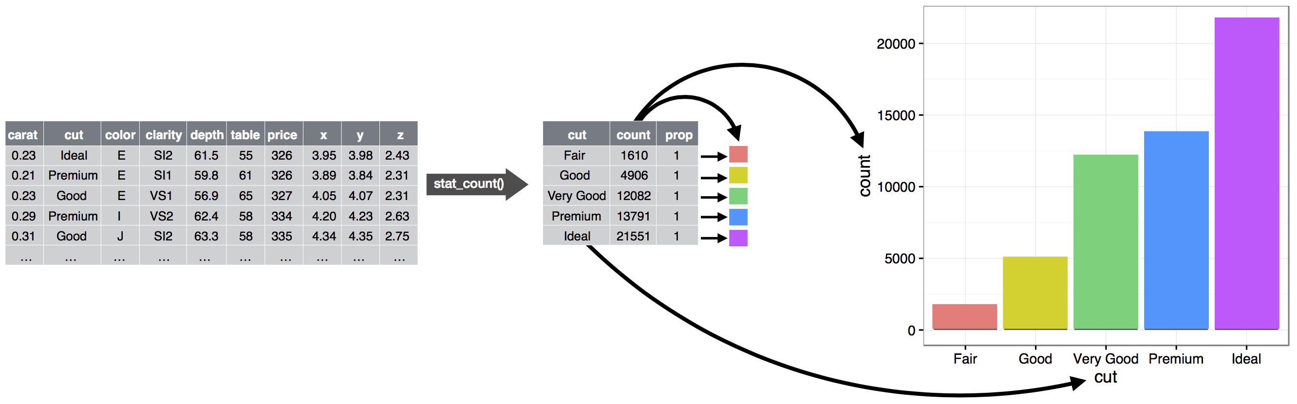
Behind the scenes of geom_bar()

  • Start with the data
  • Aggregate and count the number of observations in each bar
  • Map to plot aesthetics

R for data science (2e)

Visualizing 1D categorical data

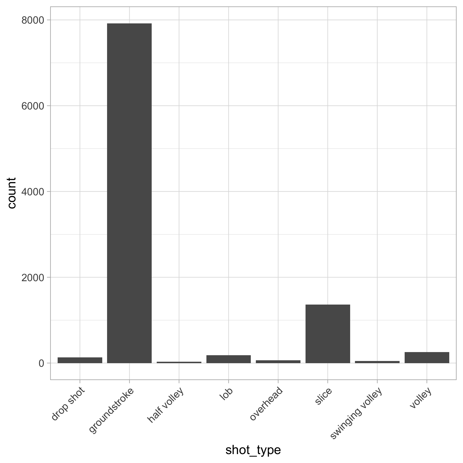
Instead of using geom_bar(), you can do these steps “by hand”

  • Aggregate and obtain the counts first with count() (or group_by and summarize())

  • Then use geom_col()

tennis_shots |>
  count(shot_type, name = "count") |> 
  ggplot(aes(x = shot_type, y = count)) +
  geom_col() +
  theme(axis.text.x = element_text(angle = 45,
                                   vjust = 1, hjust = 1))
Visualizing 1D categorical data

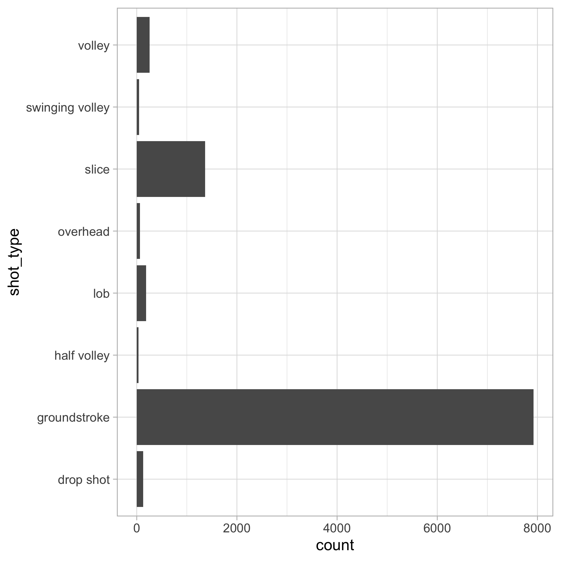
Flip your bar chart axes!

Simply replace x with y:

tennis_shots |> 
  ggplot(aes(y = shot_type)) +
  geom_bar() 

Or use coord_flip():

tennis_shots |> 
  ggplot(aes(x = shot_type)) +
  geom_bar() +
  coord_flip() 
What does a bar chart show?

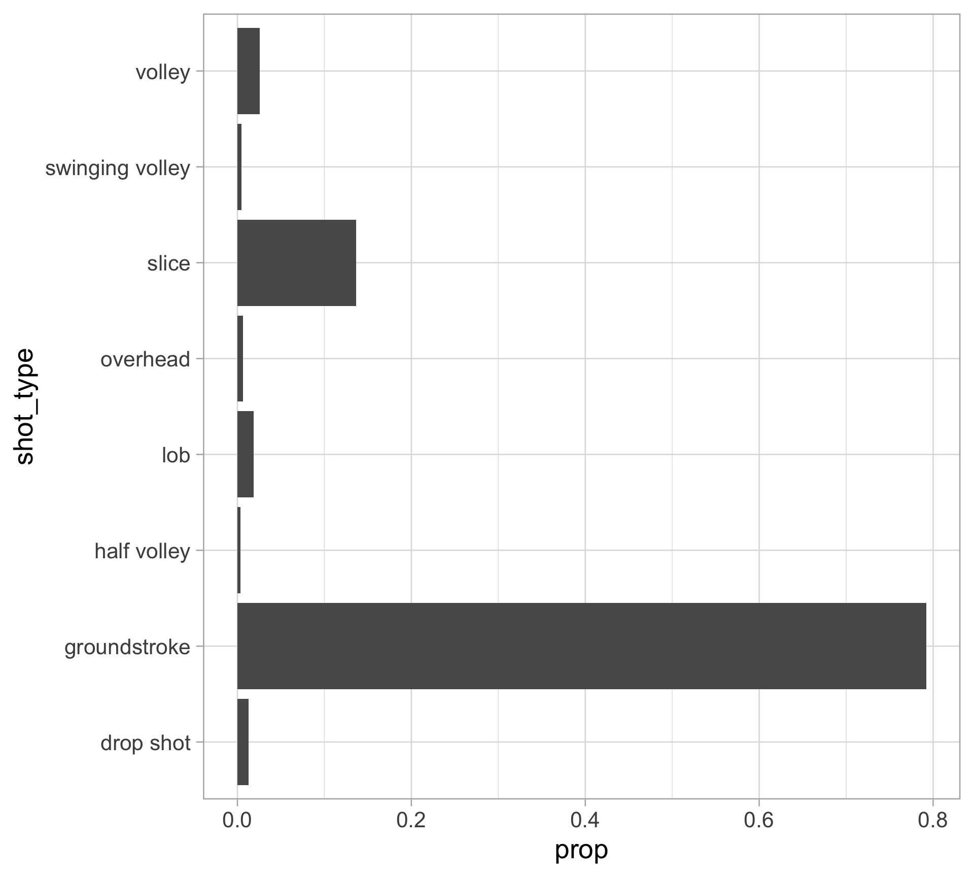
Marginal distribution: probability that a categorical variable \(X\) (e.g., shot_type) takes each particular category value \(x\) (groundstroke, lob, …, slice)

  • Frequency bar charts (earlier version) give info about sample size, but this could be labeled in the chart (use geom_text() or geom_label())

  • Now, we create a proportion/percent bar chart to display the individual probabilities

  • This shows the probability mass function (PMF) for discrete variables

    • For example: \(P(\) shot_type \(=\) slice\()\)
tennis_shots |> 
  count(shot_type) |> 
  mutate(prop = n / sum(n)) |> 
  ggplot(aes(x = prop, y = shot_type)) +
  geom_col() # + geom_label(aes(label = n), hjust = 1)
Population vs sample

Population: The collection of all subjects of interest

Sample: A representative subset of the population of interest


For us: Our random sample of women’s Wimbledon (non-serve) shots is a subset of all women’s Wimbledon (non-serve) shots


Empirical distribution: estimates the true marginal distribution with observed (sample) data

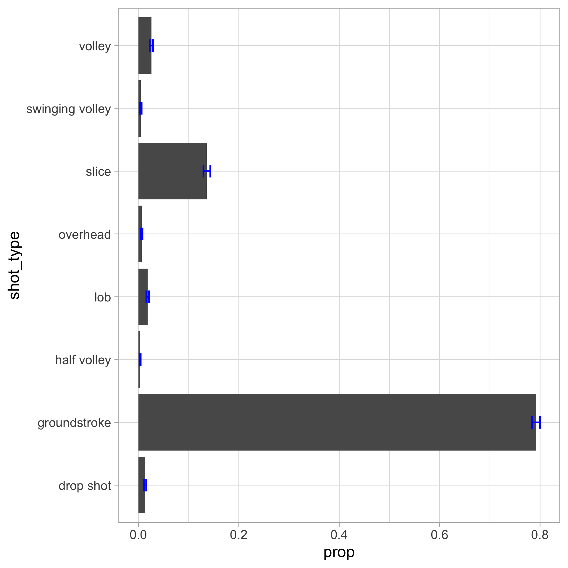
  • Estimate \(P(\) shot_type = \(C_j\)) with \(\hat p_j\) for each category \(C_j\) (e.g., \(\hat p_\texttt{dropshot}\), …, \(\hat p_\texttt{volley}\))

  • Standard error for each \(\hat p_j\): \(\quad \displaystyle \text{SE}(\hat{p}_j) = \sqrt{\frac{\hat{p}_j (1 - \hat{p}_j)}{n}}\)

Adding confidence intervals to bar chart

We can add confidence intervals by calculating the standard error estimate for each category

tennis_shots |> 
  count(shot_type) |> 
  mutate(prop = n / sum(n),
         se = sqrt(prop * (1 - prop) / sum(n)),
         lower = prop - 2 * se,
         upper = prop + 2 * se) |> 
  ggplot(aes(x = prop, y = shot_type)) +
  geom_col() +
  geom_errorbar(aes(xmin = lower, xmax = upper), 
                color = "blue", 
                width = 0.2, 
                linewidth = 1)
Ordering factors in a bar chart

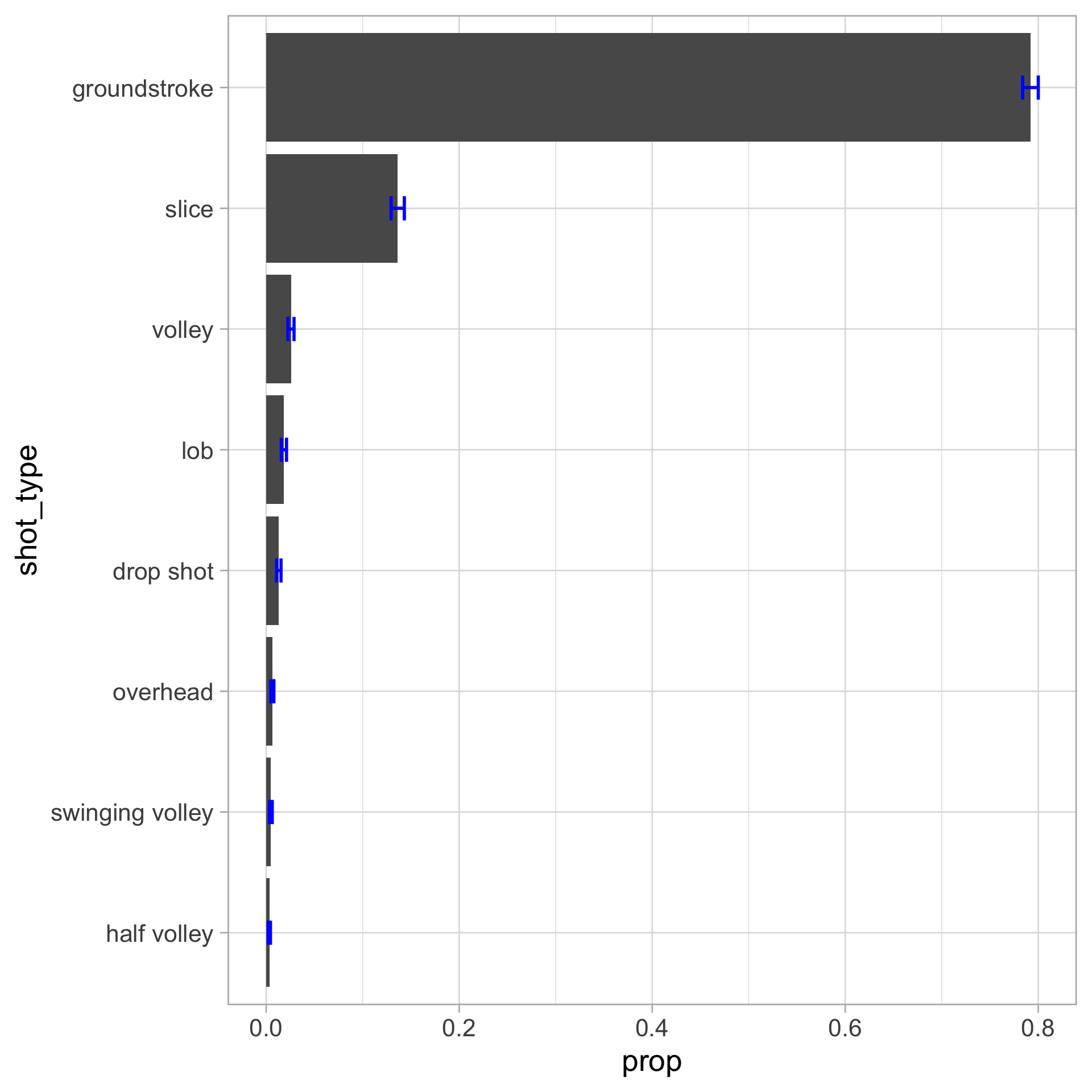
Let’s order the bars by proportion

tennis_shots |> 
  count(shot_type) |> 
  mutate(prop = n / sum(n),
         se = sqrt(prop * (1 - prop) / sum(n)),
         lower = prop - 2 * se,
         upper = prop + 2 * se,
         shot_type = fct_reorder(shot_type, prop)) |> 
  ggplot(aes(x = prop, y = shot_type)) +
  geom_col() +
  geom_errorbar(aes(xmin = lower, xmax = upper), 
                color = "blue", width = 0.2, linewidth = 1)
Pie charts… don’t make them

Why?

A particularly painful pie chart from Fox News on 2012 GOP candidates:
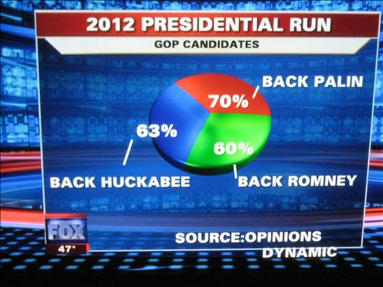
Courtesy of dataviz.ca

3D pie charts?… even worse

Inference for 1D categorical data

Chi-square test for 1D categorical data

  • Null hypothesis: \(H_0\): \(p_1 = p_2 = \cdots = p_K\)

  • Alternative hypothesis: \(H_1\): At least one category has a different proportion

Test statistic:

\[\displaystyle \chi^2 = \sum_{j=1}^K \frac{(O_j - E_j)^2}{E_j},\]

where

  • \(O_j\): observed counts in category \(j\)

  • \(E_j\) : expected counts under the null (i.e., \(n/K\) or each category is equally likely to occur)

We can perform this test in R:

chisq.test(table(tennis_shots$shot_type))

Hypothesis testing in general

Computing \(p\)-values works like this:

  • Choose a test statistic

  • Compute the test statistic using the observed data

  • Is test statistic “unusual” compared to what we would expect under the null hypothesis (\(H_0\))?

  • Compare \(p\)-value to the pre-specified target Type I error rate (“significance level”) \(\alpha\)


Decision \(H_0\) true \(H_1\) true
Fail to reject \(H_0\) Correct decision Type II error (\(\beta\))
Reject \(H_0\) Type I error (\(\alpha\)) Correct decision

2D categorical data

Summarizing 2D categorical data

Continuing with our women’s Wimbledon tennis sample, let’s look at two attributes:

  • shot_type (What was the shot type?)

  • outcome_type (What was the shot’s outcome?)

How many levels does each variable have?

table(tennis_shots$shot_type)

      drop shot    groundstroke     half volley             lob        overhead 
            131            7919              33             184              64 
          slice swinging volley          volley 
           1363              49             257 
table(tennis_shots$outcome_type)

  forced error       returned unforced error         winner 
           934           7410            908            748 

Let’s put the two error categories in outcome_type together…

tennis_shots <- mutate(tennis_shots, outcome_type = fct_relevel(outcome_type, "unforced error"))

Summarizing 2D categorical data

Two-way table (or contingency table, cross tabulation, crosstab)

table("Shot type" = tennis_shots$shot_type, 
      "Outcome type" = tennis_shots$outcome_type)
                 Outcome type
Shot type         unforced error forced error returned winner
  drop shot                   20            1       84     26
  groundstroke               786          619     5989    525
  half volley                  0           12       17      4
  lob                          4           44      125     11
  overhead                     4            2       22     36
  slice                       63          227     1056     17
  swinging volley              7            0       18     24
  volley                      24           29       99    105
xtabs(~ shot_type + outcome_type, data = tennis_shots)
                 outcome_type
shot_type         unforced error forced error returned winner
  drop shot                   20            1       84     26
  groundstroke               786          619     5989    525
  half volley                  0           12       17      4
  lob                          4           44      125     11
  overhead                     4            2       22     36
  slice                       63          227     1056     17
  swinging volley              7            0       18     24
  volley                      24           29       99    105

Visualizing 2D categorical data

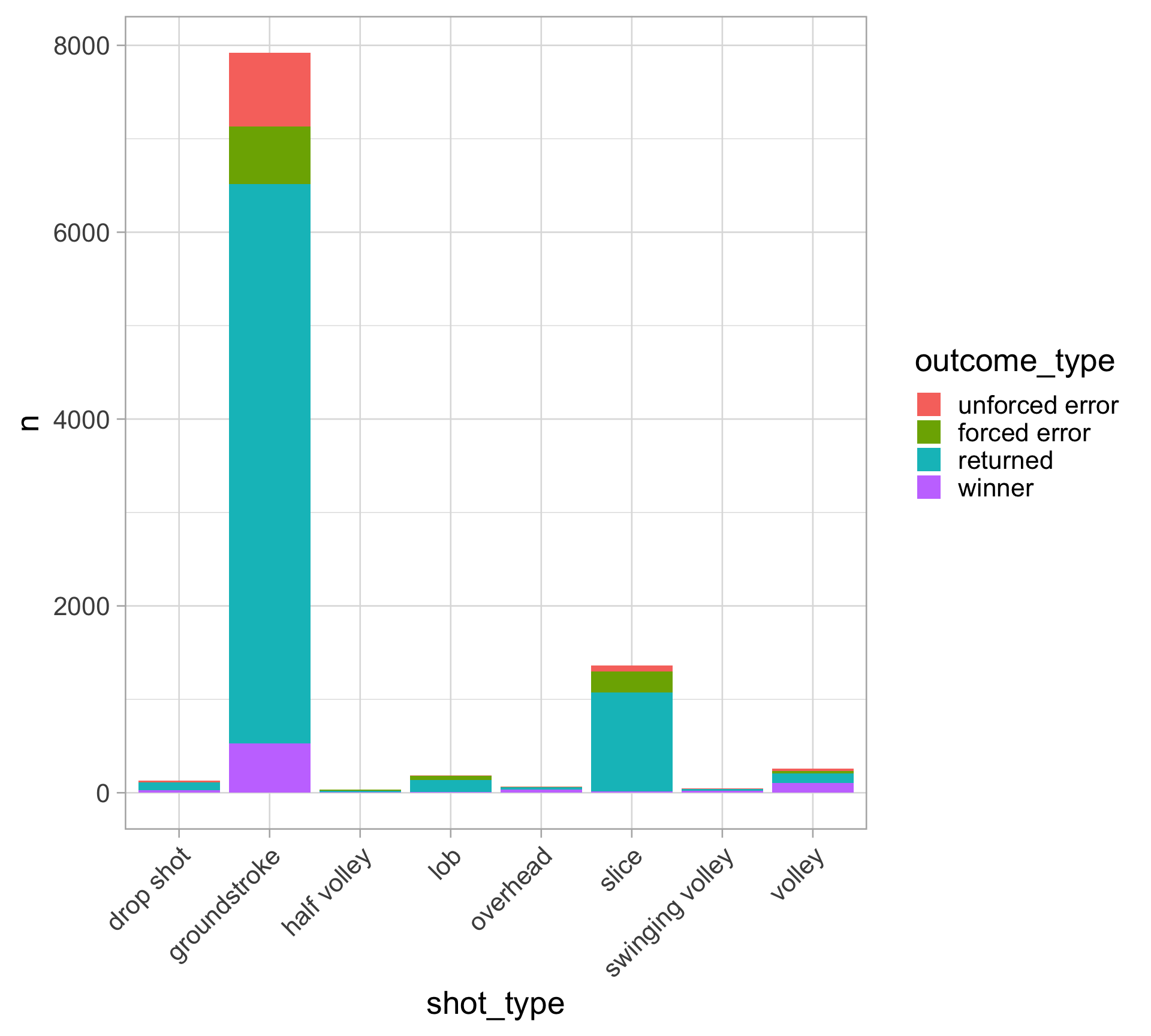
Stacked bar chart: a bar chart of spine charts

Emphasizes the marginal distribution of each category of the X variable

  • e.g., \(P(\) outcome_type \(=\) winner \()\)

Similar to 1D bar charts:

  1. Start with counting every combination of 2 variables (using count() or group_by() and summarize()),

  2. Plot with geom_col()

tennis_shots |>
  count(shot_type, outcome_type) |>
  ggplot(aes(x = shot_type, y = n, fill = outcome_type)) +
  geom_col() +
  theme(axis.text.x = element_text(angle = 45,
                                   vjust = 1, hjust = 1))
Visualizing 2D categorical data

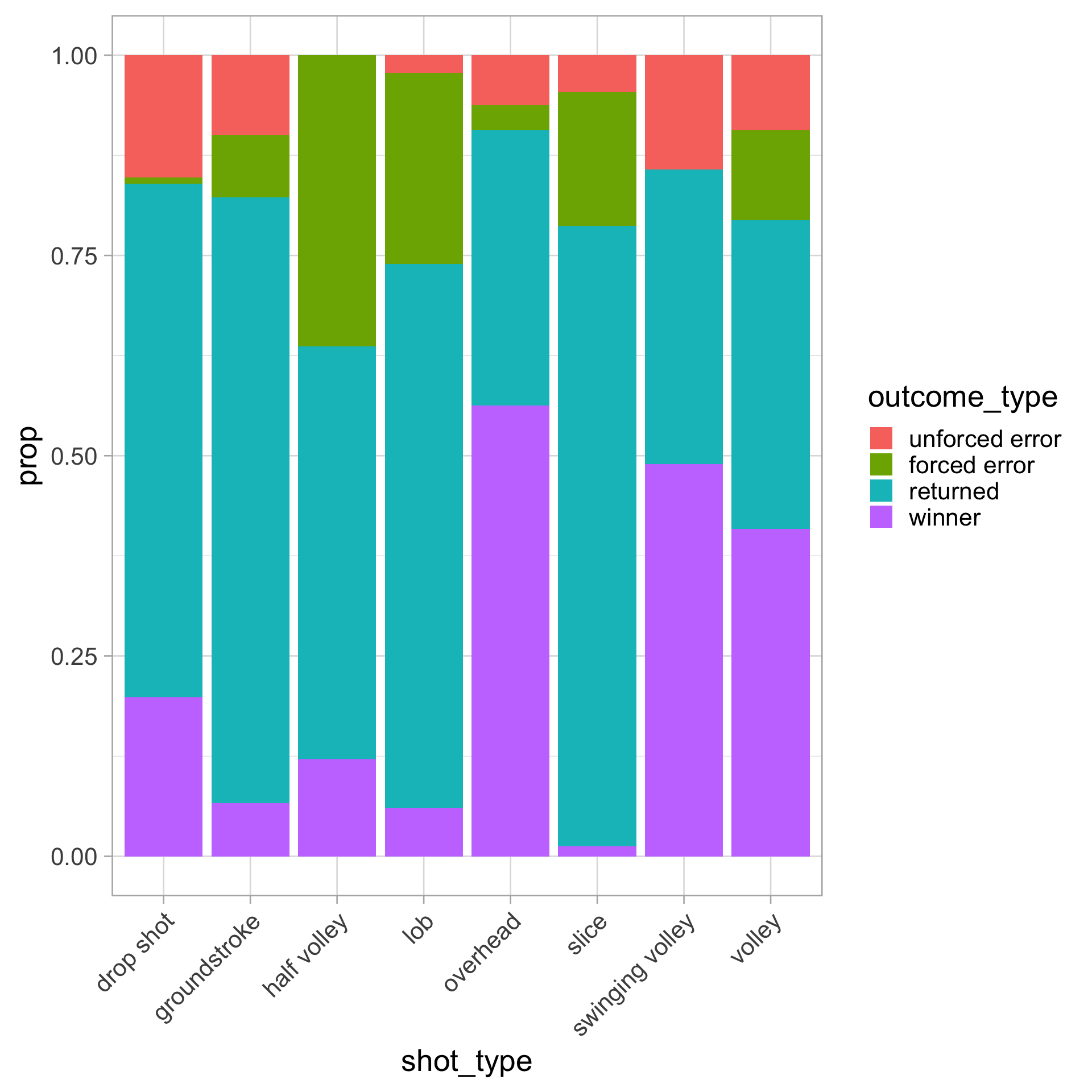
Stacked bar chart (proportion version)

tennis_shots |>
  count(shot_type, outcome_type) |>
  ggplot(aes(x = shot_type, y = n,
             fill = outcome_type)) +
  geom_col(position = "fill") +
  labs(y = "prop") +
  theme(axis.text.x = element_text(angle = 45,
                                   vjust = 1, hjust = 1))

Just make sure to change the y-axis title (at least)!
Visualizing 2D categorical data

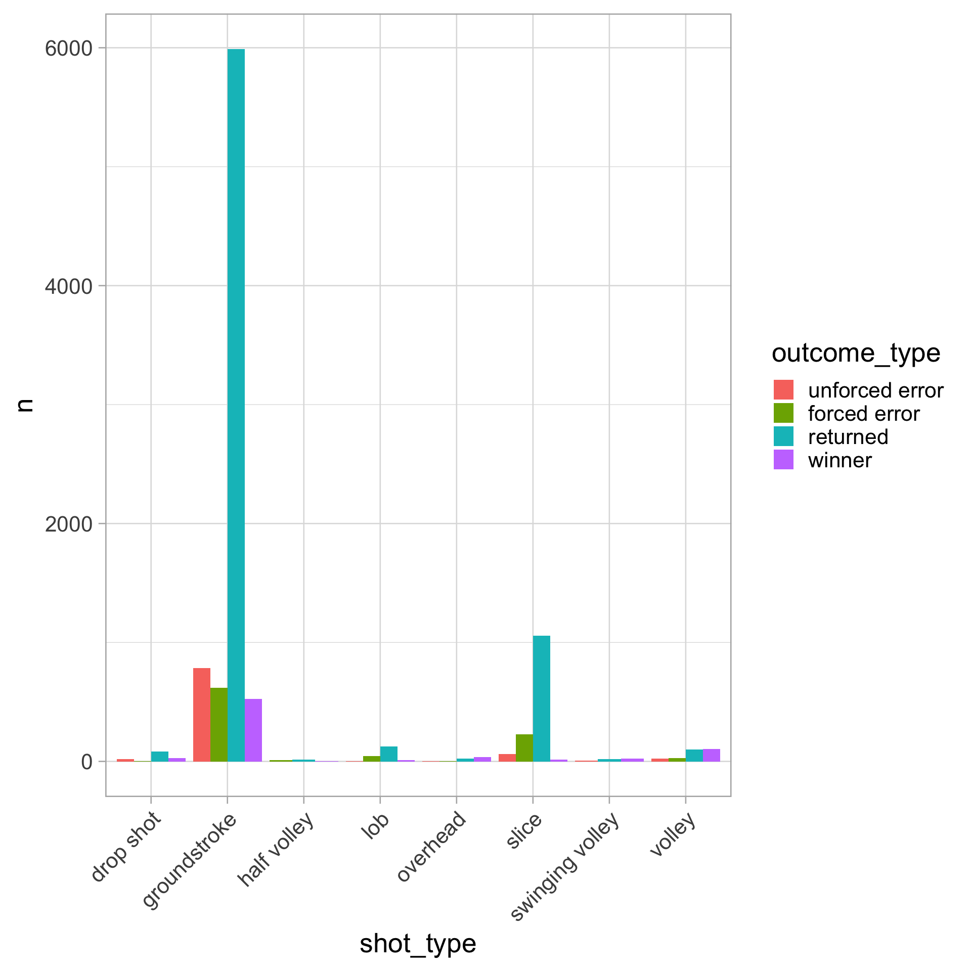
Side-by-side (grouped, dodged) bar chart: a bar chart of bar charts

Shows the conditional distribution of fill variable given X variable

For example: \(P(\) outcome_type \(=\) winner \(\mid\) shot_type \(=\) groundstroke \()\)

tennis_shots |>
  count(shot_type, outcome_type) |>
  ggplot(aes(x = shot_type, y = n,
             fill = outcome_type)) +
  geom_col(position = "dodge") +
  theme(axis.text.x = element_text(angle = 45,
                                   vjust = 1, hjust = 1))
Joint, marginal, and conditional probabilities

Let \(X\) = shot_type and \(Y\) = outcome_type

  • Joint distribution: frequency of the intersection

    • e.g., \(P(X =\) overhead \(, Y =\) winner \()\)
  • Marginal distribution: row sums or column sums

    • e.g., \(P(X =\) overhead \()\), \(P(Y =\) winner \()\)
  • Conditional distribution: probability event \(X\) given event \(Y\)

    • e.g., \(P(X =\) overhead \(\mid Y =\) winner \()\)

      \(\displaystyle \qquad \quad = \frac{P(X = \texttt{overhead}, Y = \texttt{winner})}{P(Y = \texttt{winner})}\)

Joint, marginal, and conditional probabilities

Two-way proportion table (the tidyverse way) with pivot_wider

tennis_shots |>
  group_by(shot_type, outcome_type) |>
  summarize(joint = n() / nrow(tennis_shots)) |>
  pivot_wider(names_from = outcome_type, values_from = joint, values_fill = 0)
# A tibble: 8 × 5
# Groups:   shot_type [8]
  shot_type       `unforced error` `forced error` returned winner
  <fct>                      <dbl>          <dbl>    <dbl>  <dbl>
1 drop shot                 0.002          0.0001   0.0084 0.0026
2 groundstroke              0.0786         0.0619   0.599  0.0525
3 half volley               0              0.0012   0.0017 0.0004
4 lob                       0.0004         0.0044   0.0125 0.0011
5 overhead                  0.0004         0.0002   0.0022 0.0036
6 slice                     0.0063         0.0227   0.106  0.0017
7 swinging volley           0.0007         0        0.0018 0.0024
8 volley                    0.0024         0.0029   0.0099 0.0105


# The base `R` way to get a two-way proportion table
tennis_shots |> 
  select(shot_type, outcome_type) |> 
  table() |> 
  prop.table()

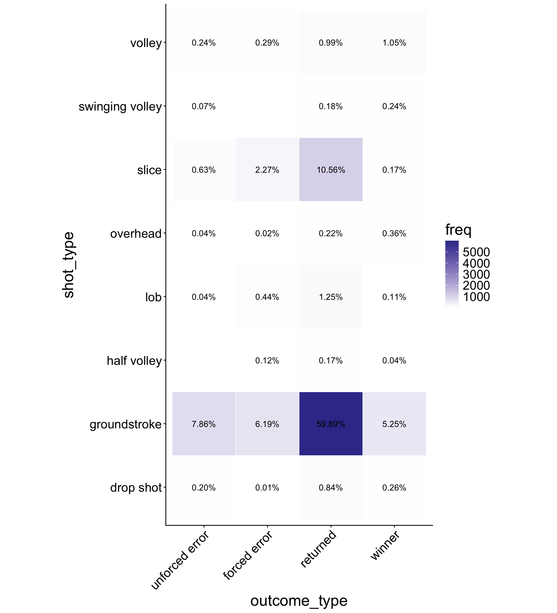
Categorical heatmaps

  • Use geom_tile() to display joint distribution of two categorical variables

  • Annotate tiles with labels of percentages using geom_text() and the scales package (a very neat package)

#install.packages("scales")

tennis_shots |>
  group_by(shot_type, outcome_type) |>
  summarize(
    freq = n(), 
    joint = n() / nrow(tennis_shots)
  ) |> 
  ggplot(aes(x = outcome_type, y = shot_type)) +
  geom_tile(aes(fill = freq), color = "white") +
  geom_text(aes(label = scales::percent(joint, accuracy = 0.01))) +
  scale_fill_gradient2() +
  coord_equal() +
  theme_classic() +
  theme(axis.text.x = element_text(angle = 45,
                                   vjust = 1, hjust = 1))
Visualizing independence

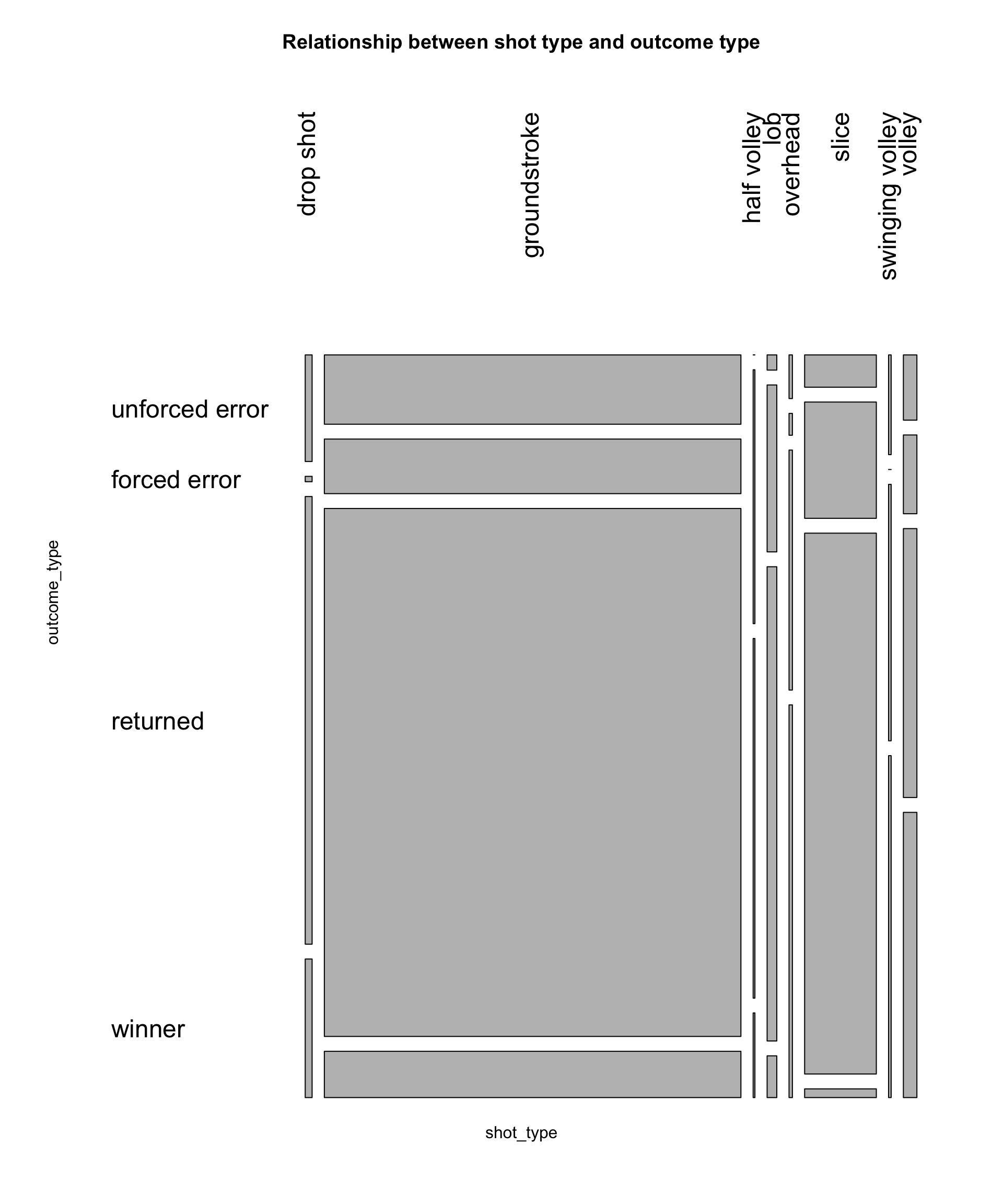
Mosaic plot

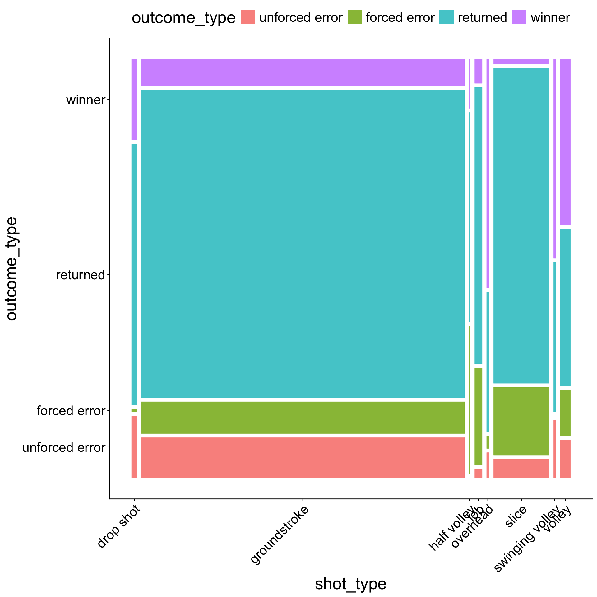
  • A spine chart of spine charts

  • Width: marginal distribution of shot_type

  • Height: conditional distribution of outcome_type | shot_type

  • Area: joint distribution

Using a mosaic plot to visually check for independence:

  • Check whether all proportions are the same (i.e., the boxes line up in a grid)
tennis_shots |> 
  select(shot_type, outcome_type) |> 
  table() |> 
  mosaicplot(main = "Relationship between shot type and outcome type",
             las=2, cex.axis = 1.2, cex.lab = 1.5, cex.main = 2)
Visualizing independence

Mosaic plot with ggmosaic package

# devtools::install_github("haleyjeppson/ggmosaic")
library(ggmosaic)
tennis_shots |> 
  ggplot() +
  geom_mosaic(aes(x = product(outcome_type, shot_type),
                  fill = outcome_type)) +
  theme_classic() +
  theme(legend.position = "top",
        axis.text.x = element_text(angle = 45,
                                   vjust = 1, hjust = 1))
Inference for 2D categorical data

Chi-square test for 2D categorical data

  • Null hypothesis: \(H_0\): two categorical variables are independent of each other

    • e.g., no association between shot_type and outcome_type
  • Alternative hypothesis: \(H_1\): two categorical variables are dependent

Test statistic:

\[\displaystyle \chi^2 = \sum_i^{k_1} \sum_j^{k_2} \frac{(O_{ij} - E_{ij})^2}{E_{ij}}\]

We can alslo perform this test in R:

# chisq.test(table(tennis_shots$outcome_type, tennis_shots$shot_type))

tennis_shots |> 
  select(outcome_type, shot_type) |> 
  table() |> 
  chisq.test()

Residuals

Recall the test statistic:

\[\displaystyle \chi^2 = \sum_i^{k_1} \sum_j^{k_2} \frac{(O_{ij} - E_{ij})^2}{E_{ij}}\]

Define the Pearson residuals:

\[\displaystyle r_{ij} = \frac{O_{ij} - E_{ij}}{\sqrt{E_{ij}}}\]

Some rules of thumb:

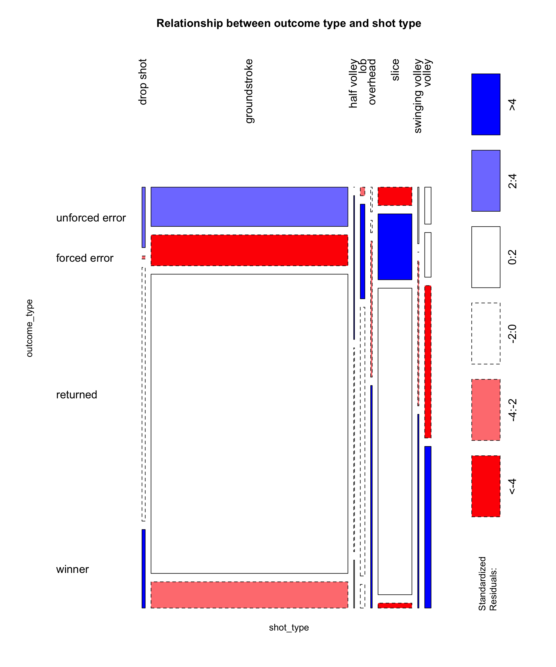
  • \(r_{ij} \approx 0\): observed counts are close to expected counts

  • \(|r_{ij}| > 2\): significant at \(\alpha = 0.05\)

  • very positive \(r_{ij}\): higher than expected

  • very negative \(r_{ij}\): lower than expected

Residuals

  • We can make mosaic plots with the cells color-coded by Pearson residuals

  • Tells us which combinations of 2 categorical variables (cells) are much higher/lower than expected

tennis_shots |> 
  select(shot_type, outcome_type) |> 
  table() |> 
  mosaicplot(main = "Relationship between outcome type and shot type",
             shade = TRUE, las = 2,
             cex.axis = 1.2, cex.lab = 2, cex.main = 2)
Beyond 2D: facets!

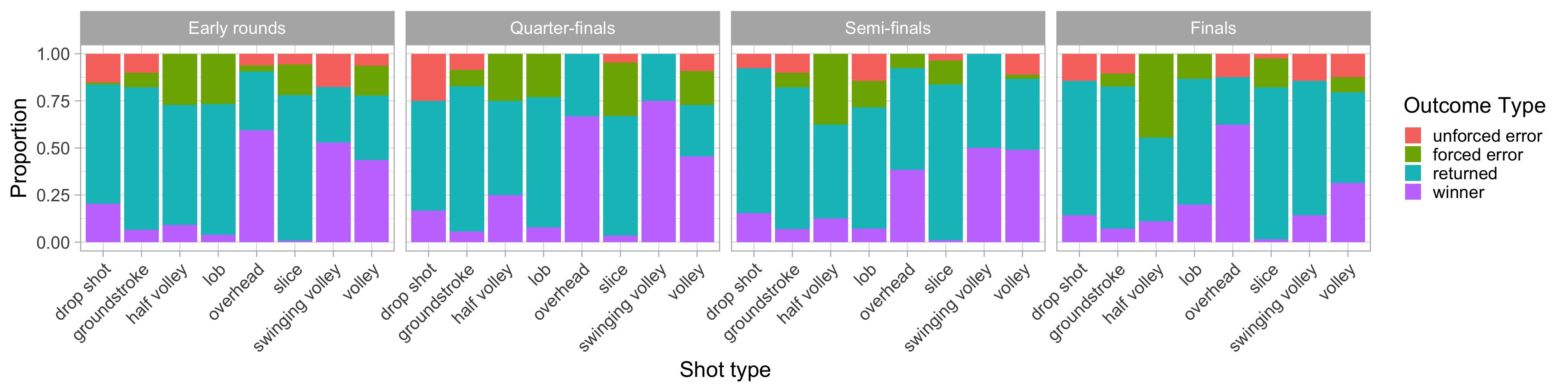
Using some dplyr data wrangling and ggplot2 material…

tennis_shots |>
  filter(!(round %in% c("Q1", "Q2", "Q3"))) |>
  mutate(round_grouped = case_when(
    round == "F" ~ "Finals",
    round == "SF" ~ "Semi-finals",
    round == "QF" ~ "Quarter-finals",
    TRUE ~ "Early rounds")) |>
  mutate(round_grouped = fct_relevel(round_grouped, "Early rounds", "Quarter-finals", "Semi-finals", "Finals")) |>
  ggplot(aes(x = shot_type, fill = outcome_type)) + 
  geom_bar(position = "fill") + # could remove position = "fill" to get raw counts
  labs(x = "Shot type", y = "Proportion", fill = "Outcome Type") +
  facet_wrap(~ round_grouped, ncol = 4) +
  theme(axis.text.x = element_text(angle = 45, vjust = 1, hjust = 1))
Appendix

The janitor package

The most popular janitor function is clean_names()… for cleaning column names

# before
iris |> 
  head()
  Sepal.Length Sepal.Width Petal.Length Petal.Width Species
1          5.1         3.5          1.4         0.2  setosa
2          4.9         3.0          1.4         0.2  setosa
3          4.7         3.2          1.3         0.2  setosa
4          4.6         3.1          1.5         0.2  setosa
5          5.0         3.6          1.4         0.2  setosa
6          5.4         3.9          1.7         0.4  setosa
# after
library(janitor)
iris |> 
  clean_names() |> 
  head()
  sepal_length sepal_width petal_length petal_width species
1          5.1         3.5          1.4         0.2  setosa
2          4.9         3.0          1.4         0.2  setosa
3          4.7         3.2          1.3         0.2  setosa
4          4.6         3.1          1.5         0.2  setosa
5          5.0         3.6          1.4         0.2  setosa
6          5.4         3.9          1.7         0.4  setosa

Tabulation with the janitor package

The lesser-known stars of janitor: functions for tabulation of categorical data

The tabyl() function:

library(gt) # for nicely outputted tables

tennis_shots |> 
  tabyl(shot_type) |>
  gt()
shot_type n percent
drop shot 131 0.0131
groundstroke 7919 0.7919
half volley 33 0.0033
lob 184 0.0184
overhead 64 0.0064
slice 1363 0.1363
swinging volley 49 0.0049
volley 257 0.0257

Tabulation with the janitor package

The adorn_*() functions

tennis_shots |> 
  tabyl(shot_type, outcome_type) |> 
  adorn_percentages("row") |> 
  adorn_pct_formatting(digits = 2) |> 
  adorn_ns() |>
  gt()
shot_type unforced error forced error returned winner
drop shot 15.27% (20) 0.76% (1) 64.12% (84) 19.85% (26)
groundstroke 9.93% (786) 7.82% (619) 75.63% (5,989) 6.63% (525)
half volley 0.00% (0) 36.36% (12) 51.52% (17) 12.12% (4)
lob 2.17% (4) 23.91% (44) 67.93% (125) 5.98% (11)
overhead 6.25% (4) 3.12% (2) 34.38% (22) 56.25% (36)
slice 4.62% (63) 16.65% (227) 77.48% (1,056) 1.25% (17)
swinging volley 14.29% (7) 0.00% (0) 36.73% (18) 48.98% (24)
volley 9.34% (24) 11.28% (29) 38.52% (99) 40.86% (105)