library(tidyverse)
ggplot2::theme_set(ggplot2::theme_light(base_size = 20)) # setting the ggplot theme

runs <- read_csv("https://raw.githubusercontent.com/36-SURE/2026/main/data/ultra_running.csv")
race_stats_2019 <- read_csv("https://raw.githubusercontent.com/36-SURE/2026/main/data/ultra_races_2019.csv")Data visualization: quantitative data
Western States Endurance Run
For the majority of the lecture, we will be using race results from the Western States Endurance Run.
wser <- runs |>
  filter(event == "Western States Endurance Run")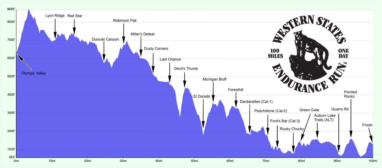
Boxplots visualize summary statistics
Pros:
Displays outliers, percentiles, spread, skew
Useful for side-by-side comparison
Cons:
Does not display the full distribution shape
Does not display modes
wser |>
  ggplot(aes(x = time_in_hours)) +
  geom_boxplot() +
  theme(axis.text.y = element_blank())+
  labs(x= 'Time (hours)')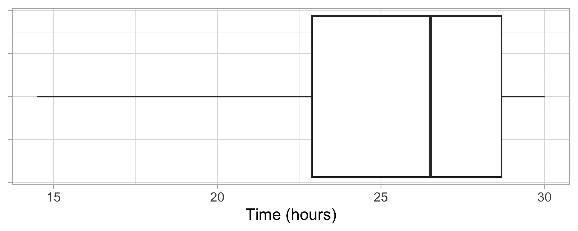
Histograms display 1D continuous distributions
\(\displaystyle \text{# total obs.} = \sum_{j=1}^k \text{# obs. in bin }j\)
Pros:
Displays full shape of distribution
Easy to interpret
Cons:
- Have to choose number of bins and bin locations (will revisit later)
wser |>
  ggplot(aes(x = time_in_hours)) +
  geom_histogram()+
  labs(x= "Time (hours)")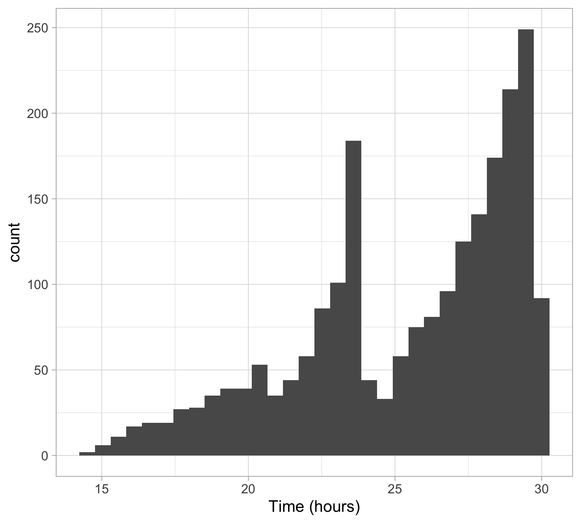
Density plots are a smoothed, continuous version of a histogram
Pros:
Bin-free
Excellent for comparing multiple categories at once
Easy to view full shape of distribution
Cons:
No individual data points or frequency count
Smooth curve can sometimes extend into ranges where no real data exists
wser |>
  ggplot(aes(x = time_in_hours)) +
  geom_density()+
  labs(x= "Time (hours)")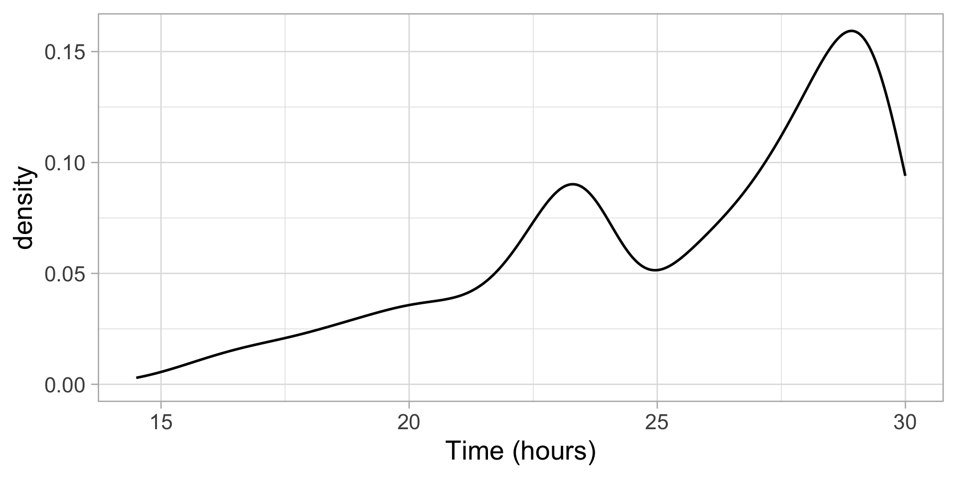
We will talk more about density estimation on Monday!
Display the data points directly with beeswarm plots
Pros:
Displays each data point
Easy to view full shape of distribution
Cons:
Can be overbearing with large datasets
Which algorithm for arranging points?
library(ggbeeswarm)
wser |>
  ggplot(aes(x = time_in_hours, y = "")) +
  geom_beeswarm(cex = 1, size = 0L)+
  labs(x= "Time (hours)", y="")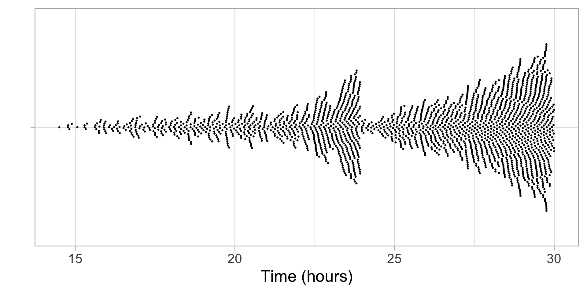
Smooth summary with violin plots
Pros:
Displays full shape of distribution
Can easily layer…
wser |>
  ggplot(aes(x = time_in_hours, y = "")) +
  geom_violin()+
  labs(x= "Time (hours)", y ="")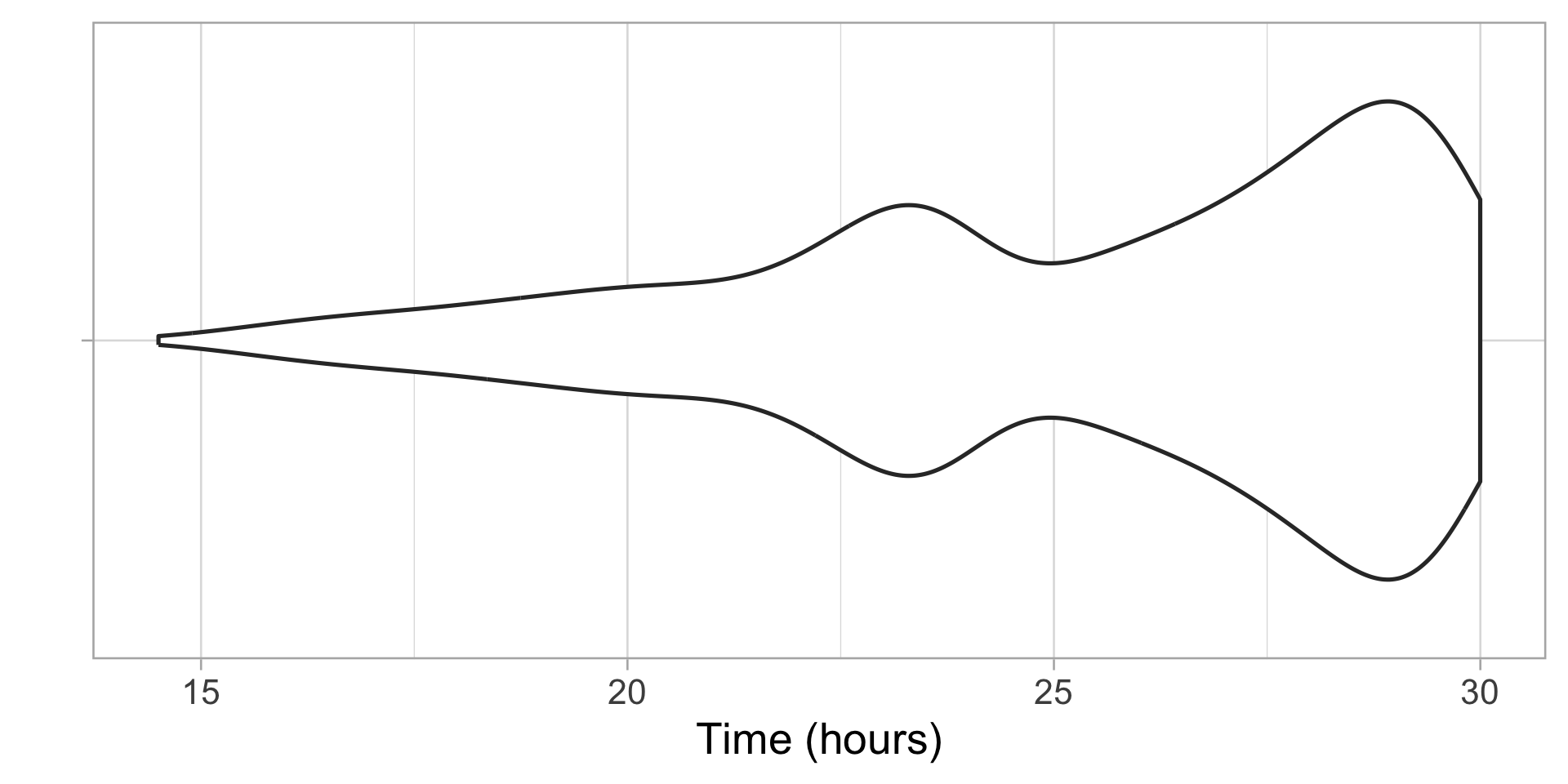
Smooth summary with violin plots + box plots
Pros:
Displays full shape of distribution
Can easily layer… with box plots on top
Cons:
Summary of data via density estimate (no sample size)
Mirror image is duplicate information
May be harder to interpret for general audience
wser |>
  ggplot(aes(x = time_in_hours, y = "")) +
  geom_violin() +
  geom_boxplot(width = 0.25)+
  labs(x= "Time (hours)", y = "")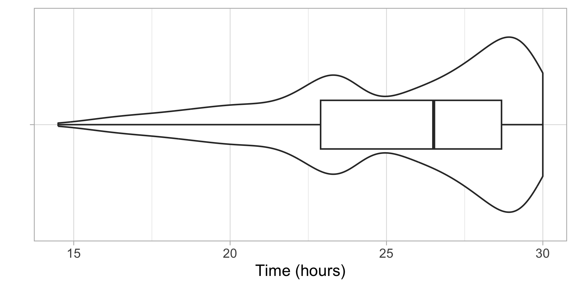
Display full distribution with ECDF plot
Pros:
Displays all of your data at once
As \(n \rightarrow \infty\), the ECDF \(\hat F_n(x)\) converges to the true CDF \(F(x)\)
Cons:
- What are the cons?
wser |>
  ggplot(aes(x = time_in_hours)) +
  stat_ecdf()+
  labs(x= "Time (hours)")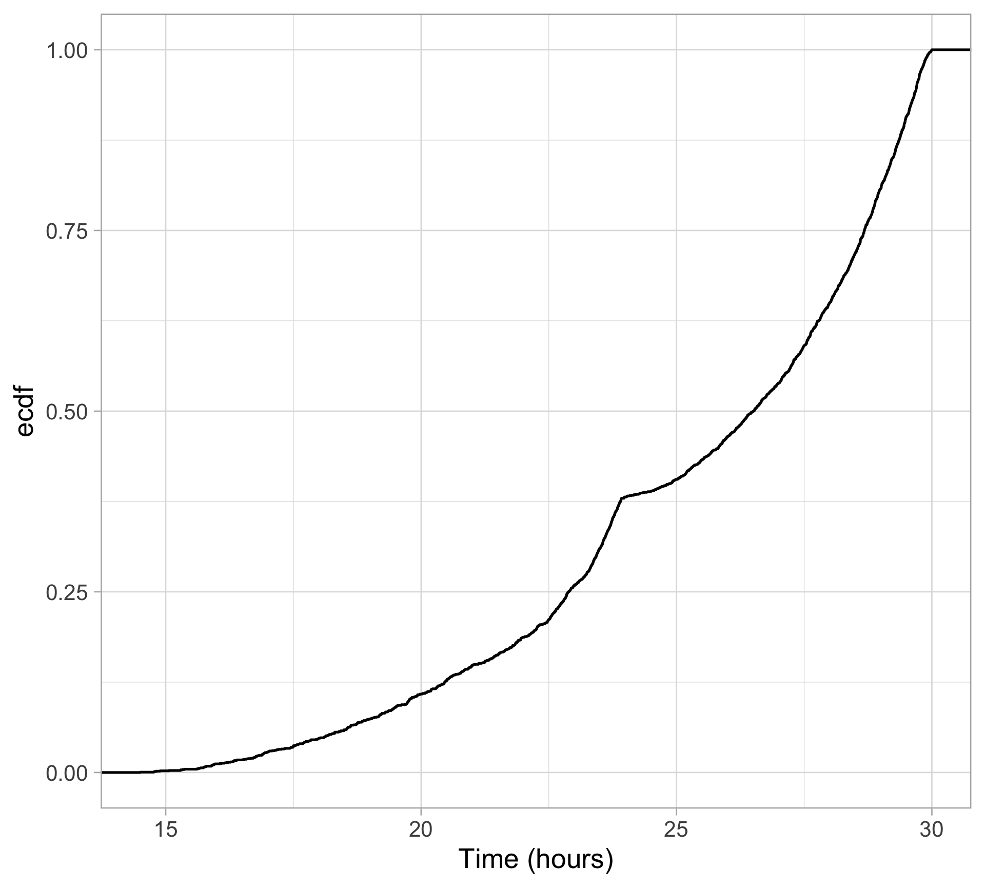
Zooming in on our ECDF
On the previous plot, we have enough data points that the ECDF looks like a smooth curve
Keep in mind, however, while the CDF is a curve, the ECDF is a step function
- Each jump size of \(1/n\) is a single observed point
wser |>
  ggplot(aes(x = time_in_hours)) +
  stat_ecdf()+
  coord_cartesian(xlim = c(16, 17), ylim = c(0.01, 0.03))+
  labs(x= "Time (hours)")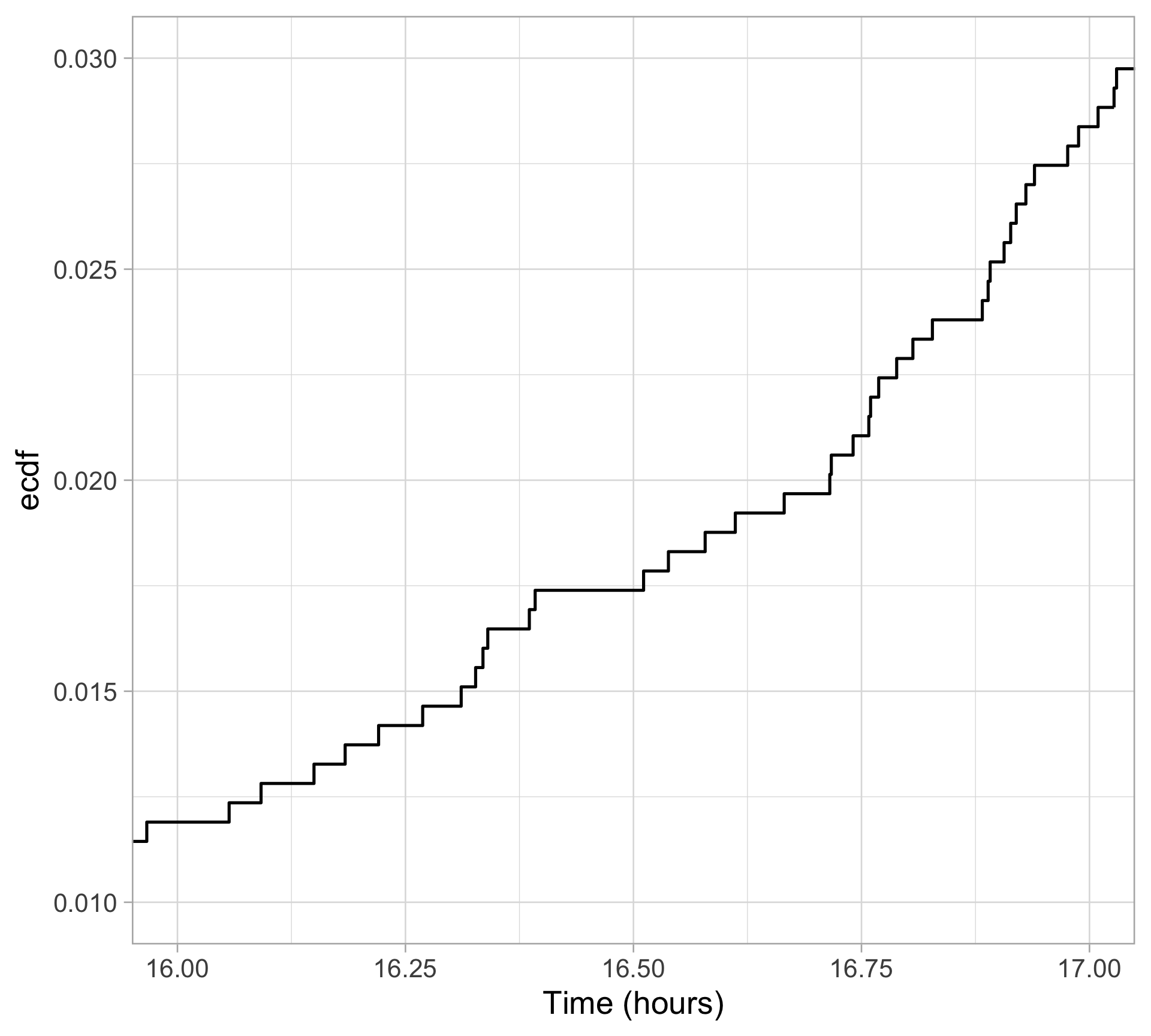
Rug plots display raw data
Pros:
Displays raw data points
Useful supplement for summaries and 2D plots
Cons:
- Can be overbearing for large datasets
wser |>
  ggplot(aes(x = time_in_hours)) +
  geom_rug(alpha = 0.3)+
  labs(x= "Time (hours)")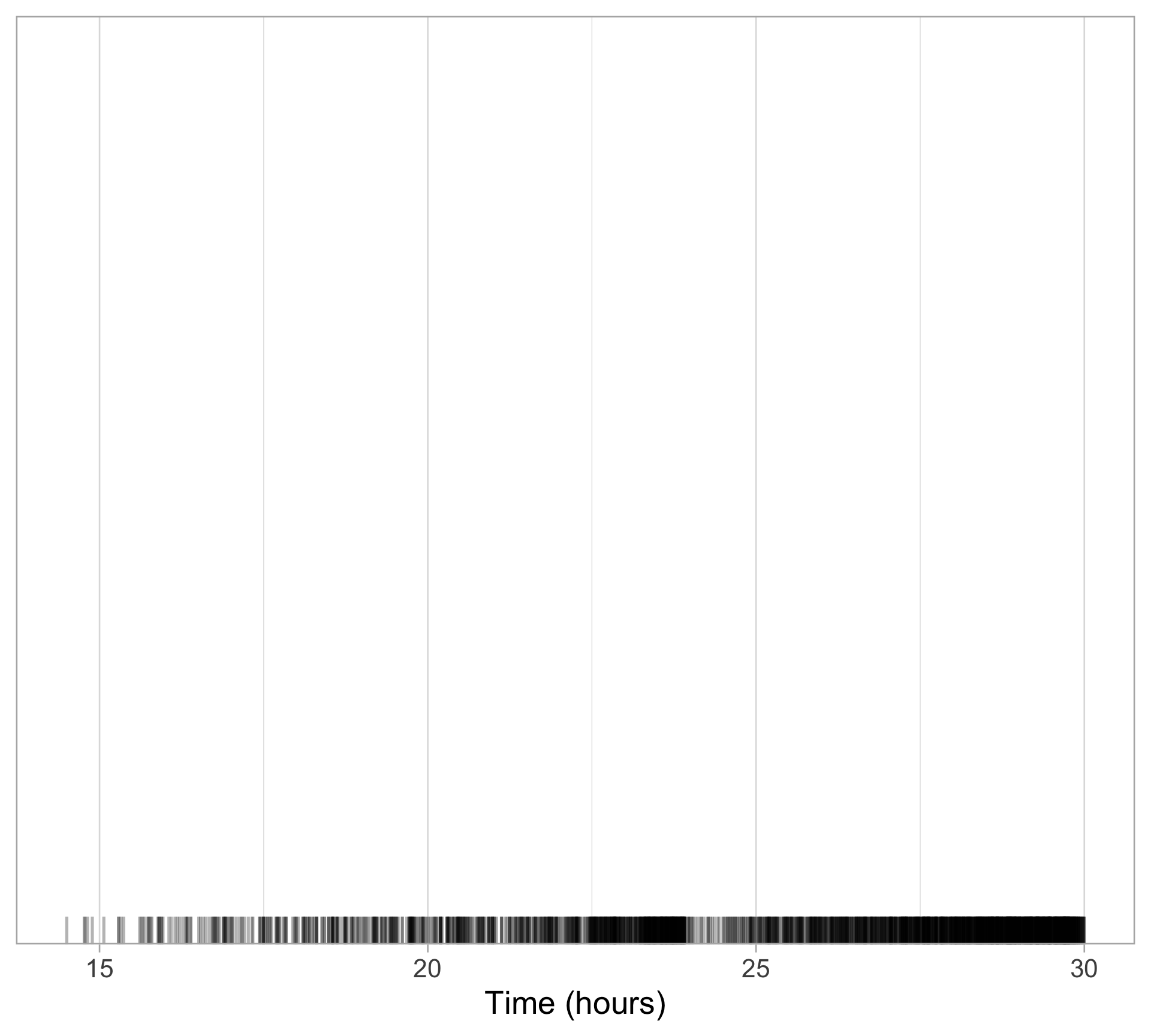
Rug plots supplement other displays
wser |>
  ggplot(aes(x = time_in_hours, y = "")) +
  geom_violin() +
  geom_rug(alpha = 0.3)+
  labs(x= "Time (hours)")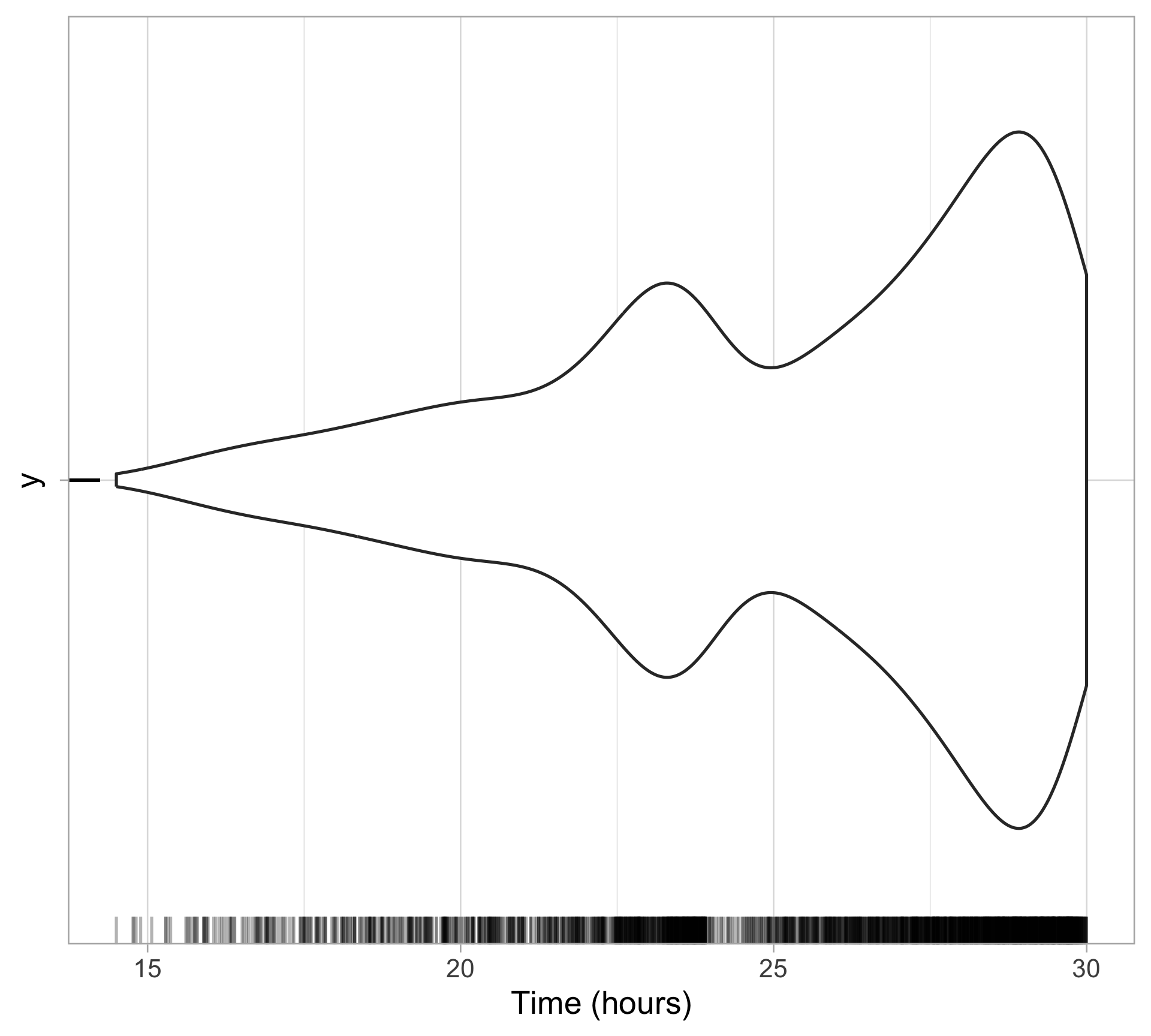
wser |>
  ggplot(aes(x = time_in_hours)) +
  stat_ecdf() +
  geom_rug(alpha = 0.3)+
  labs(x= "Time (hours)")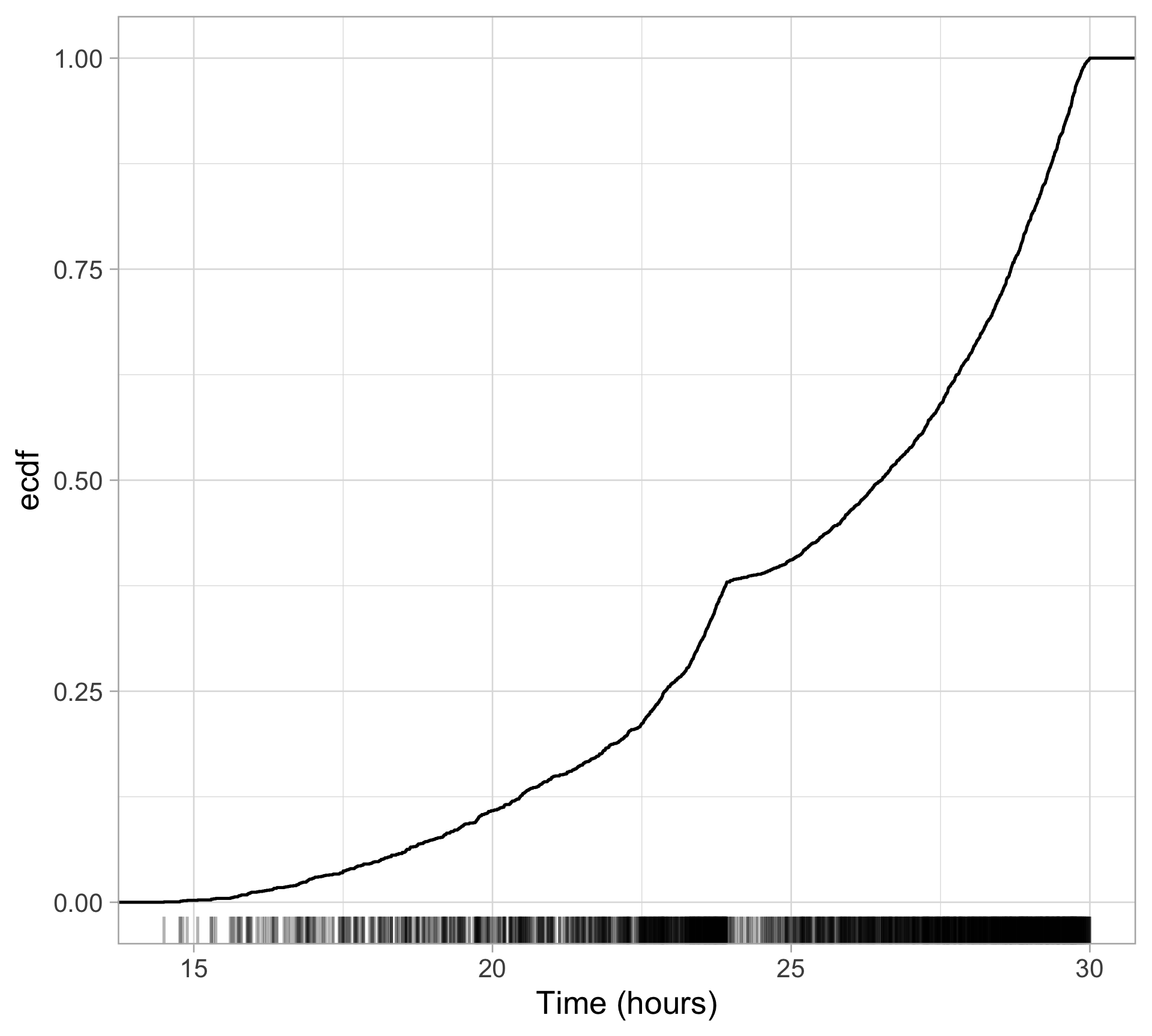
Making scatterplots
Use
geom_point(): each point is a raceDisplaying the joint (bivariate) distribution
Adjust transparency with
alphato visualize overlapProvides better understanding of joint frequency
Especially important with larger datasets
See also:
ggblend
race_stats_2019 |>
  ggplot(aes(x = elevation_gain, y = mean_finish_time)) +
  geom_point(color = "navy", size = 4, alpha = 0.5)+
  scale_x_continuous(labels = scales::label_comma())+
  labs(x = "Elevation Gain (m)", y = "Avg finish time (hrs)")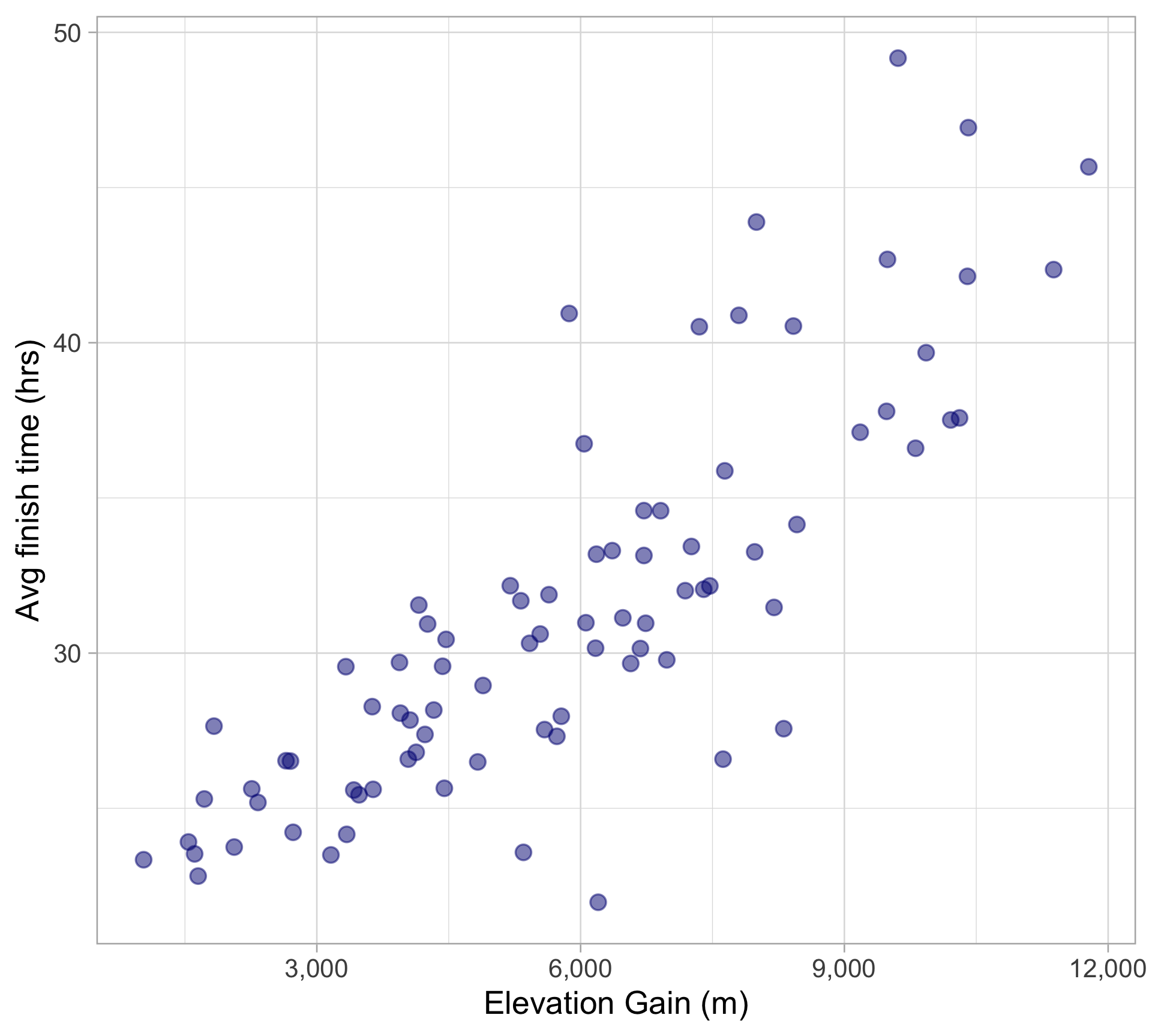
Summarizing 2D quantitative data
Correlation coefficient
cor(race_stats_2019$elevation_gain,
    race_stats_2019$mean_finish_time,
    use = "complete.obs")
[1] 0.8232547Note: the default correlation you get from cor() is Pearson correlation coefficient
Other correlations:
Displaying trend line: linear regression
(a preview)
Display regression line for
mean finish time ~ elevation gain95% confidence intervals by default
Estimating the conditional expectation of
mean finish time|elevation gain- \(\mathbb{E}[\)
mean finish time\(\mid\)elevation gain\(]\)
- \(\mathbb{E}[\)
race_stats_2019 |>
  ggplot(aes(x = elevation_gain, y = mean_finish_time)) +
  geom_point(color = "navy", size = 4, alpha = 0.5)+
  geom_smooth(method = "lm", linewidth = 2)+
  labs(x = "Elevation Gain (m)", y = "Avg finish time (hrs)")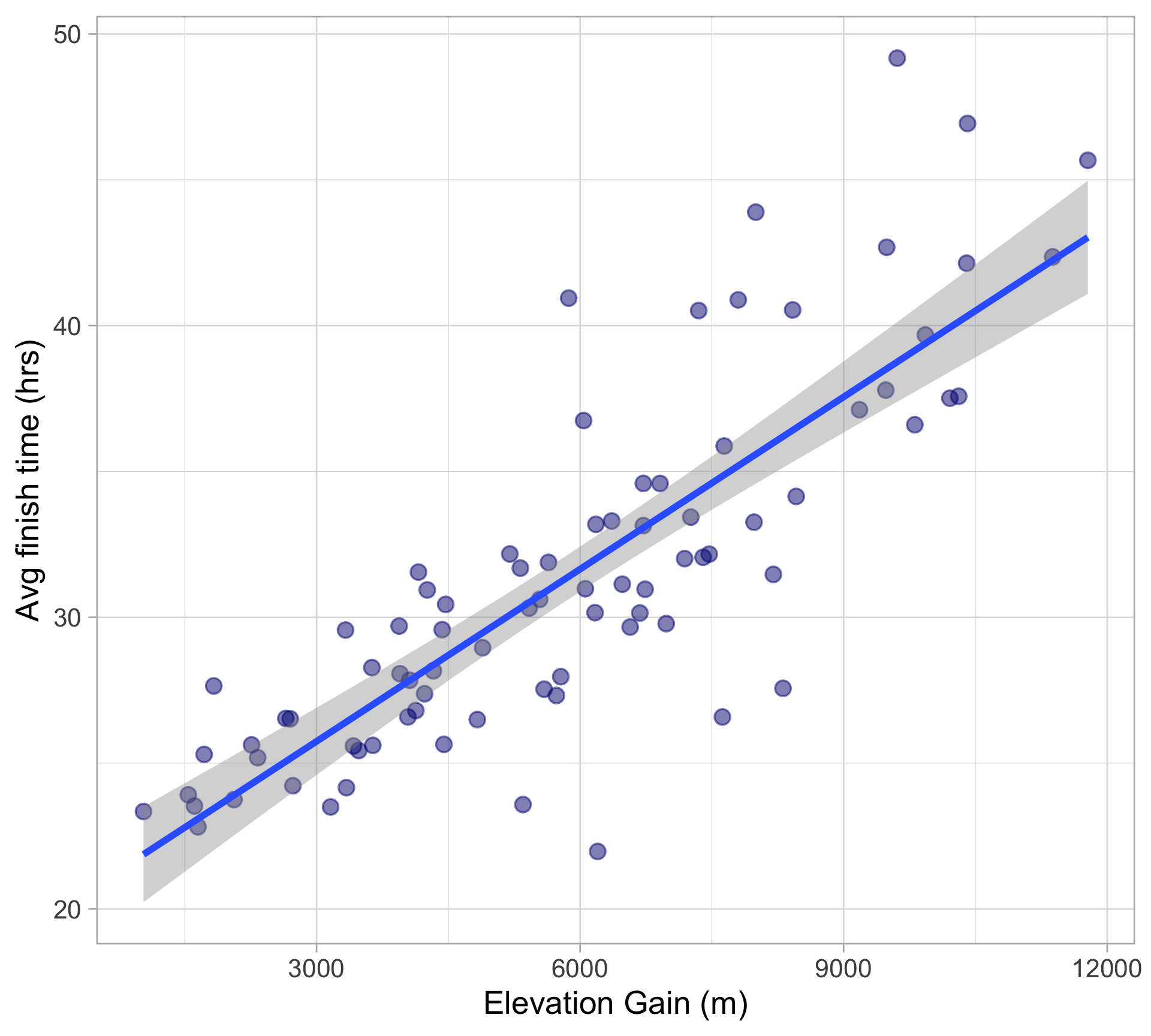
Summarizing 2D quantitative data
Add rug plots to supplement scatterplot
race_stats_2019 |>
  ggplot(aes(x = elevation_gain, y = mean_finish_time)) +
  geom_point(color = "navy", size = 4, alpha = 0.5) +
  geom_rug(alpha = 0.4)+
  labs(x = "Elevation Gain (m)", y = "Avg finish time (hrs)")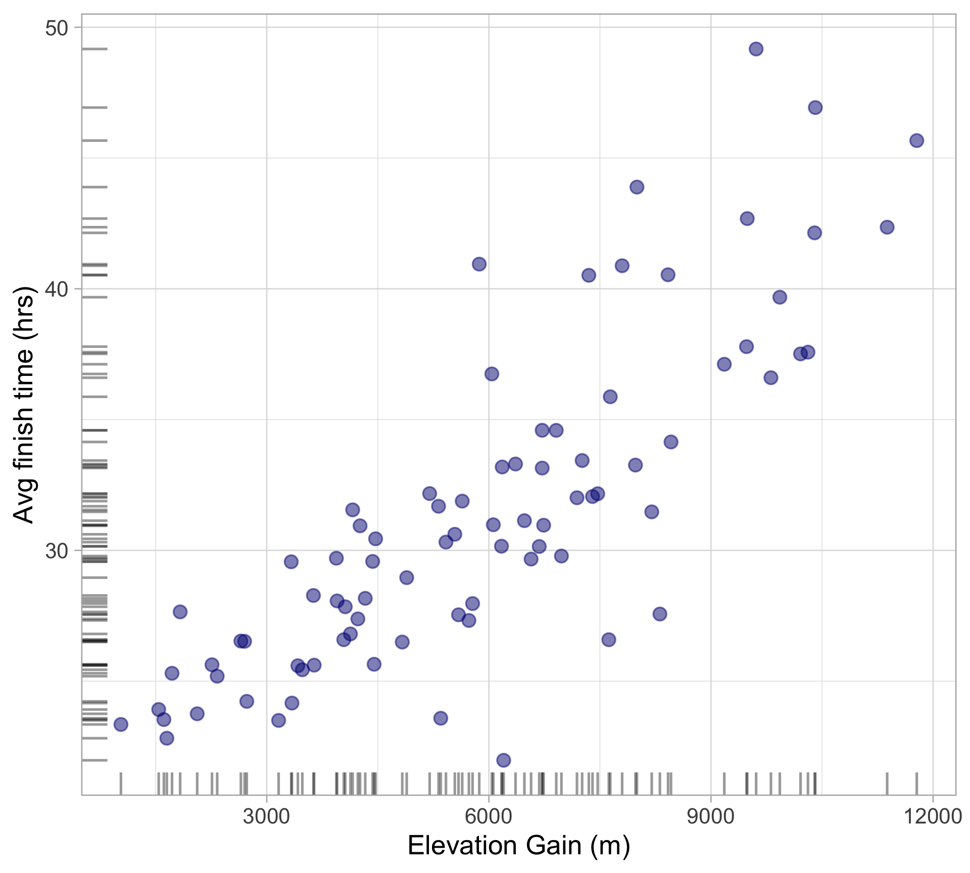
Pairs plot
library(GGally)
race_stats_2019 |>
  ungroup() |>
  select(elevation_gain, elevation_loss, mean_finish_time, n_finishers) |>
  ggpairs(aes(alpha=0.3)) # note: alpha in aes() here, even though it is not a variable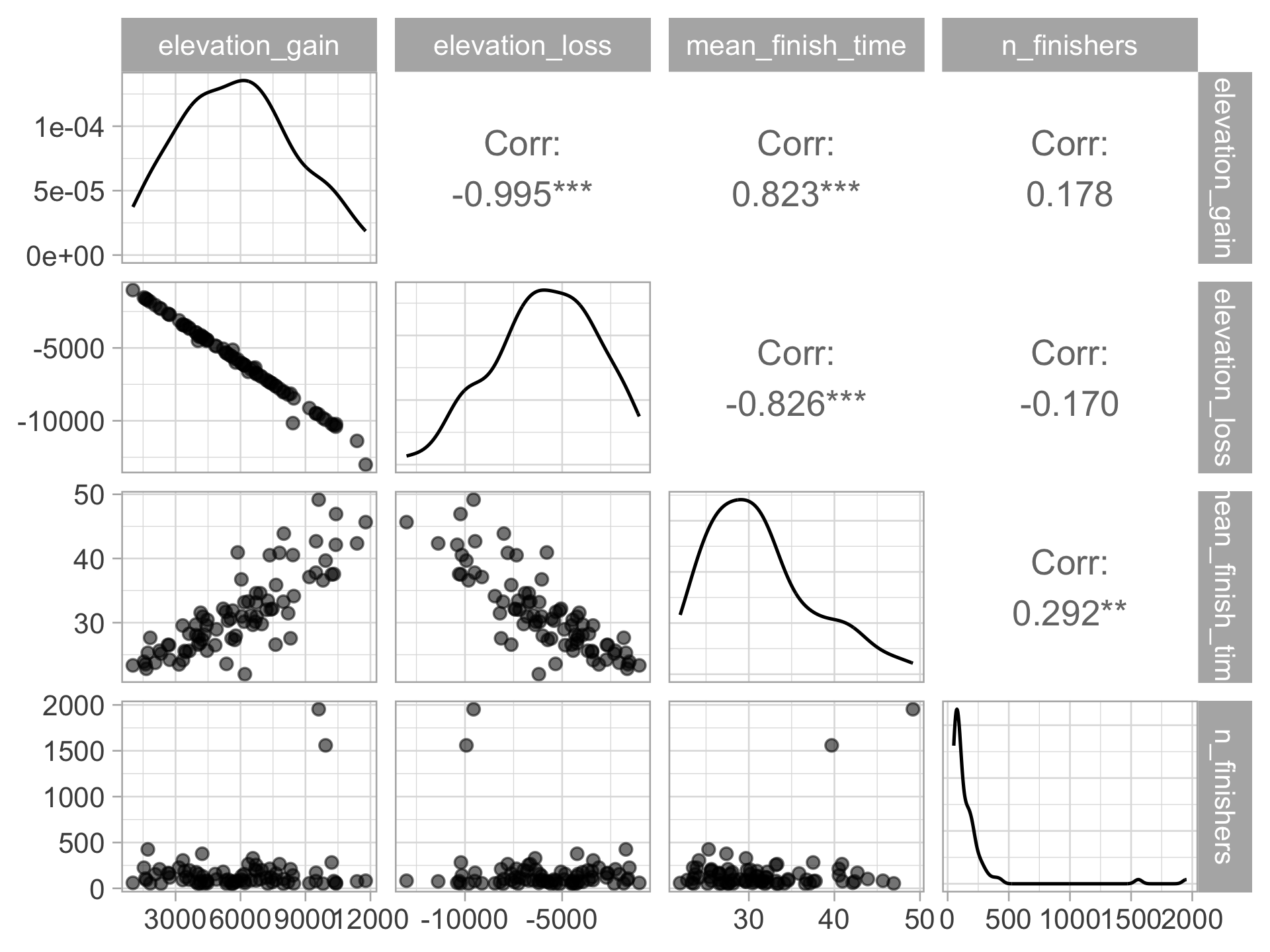
Continuous by categorical: side by side plots
wser <- wser |>
  mutate(age_grp = case_when(age <= 39 ~ "22-39",
                             age > 39 & age <= 49 ~ "40-49",
                             age > 49 & age <= 59 ~ "50-59",
                             age > 59 ~ "60+"))

wser |>
  ggplot(aes(x = time_in_hours, y = age_grp))+
  geom_boxplot()+
  labs(x = "Time (hours)", y = "Age group")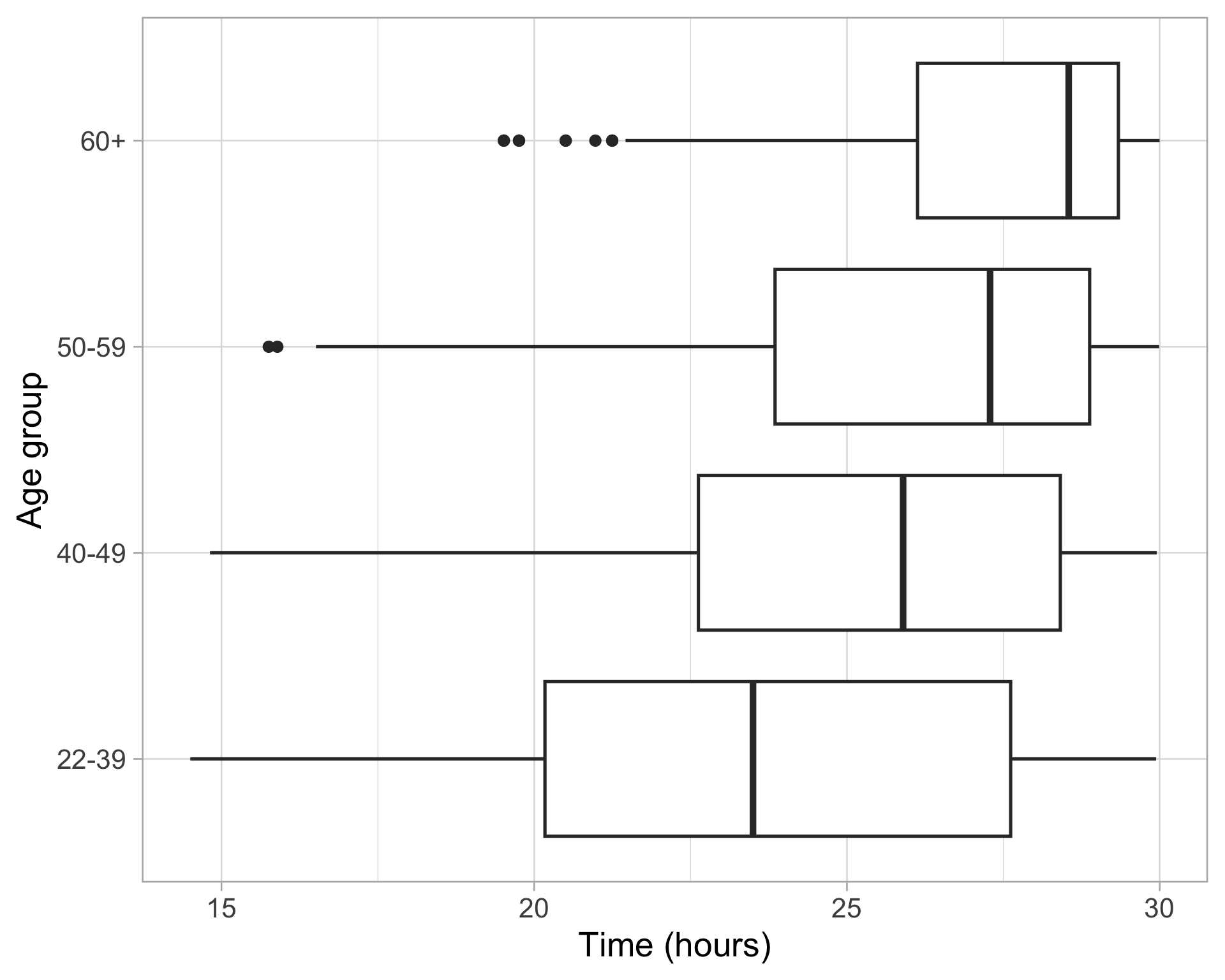
Continuous by categorical: ECDF
wser |>
  ggplot(aes(x = time_in_hours, color = age_grp)) +
  stat_ecdf(linewidth = 1) +
  theme(legend.position = "bottom")+
  scale_color_viridis_d()+
  labs(x = "Time (hours)", color = "Age group")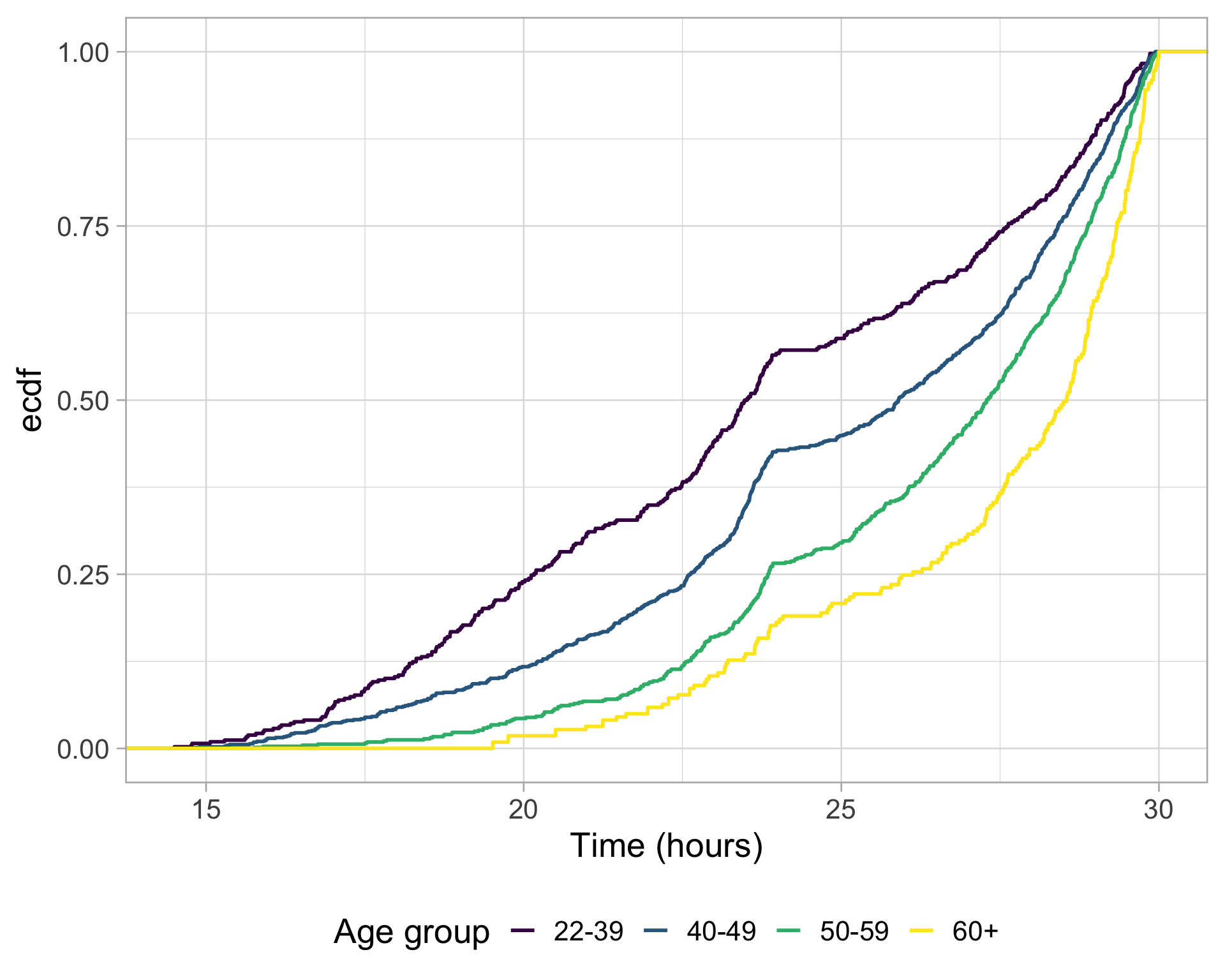
Continuous by categorical: density plot
 wser |>
  ggplot(aes(x = time_in_hours, color = age_grp)) +
  geom_density() +
  scale_color_viridis_d()+
  labs(color = "Age group", x = "Time (hours)")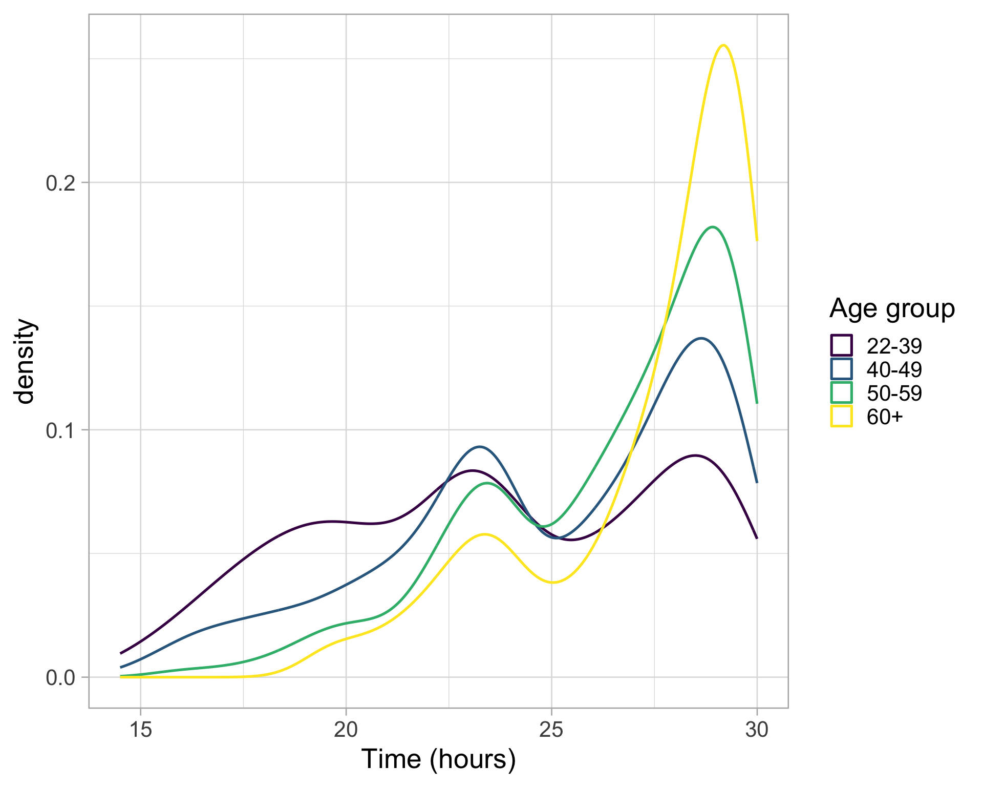
Continuous by categorical: ridgeline plot
For more, see this tutorial
library(ggridges)
wser |>
  ggplot(aes(x = time_in_hours, y = age_grp, fill = age_grp)) +
  geom_density_ridges(scale = 1.5)+
  scale_fill_viridis_d()+
  labs(x = "Time (hours)", y = "Age group")+
  theme(legend.position = "none")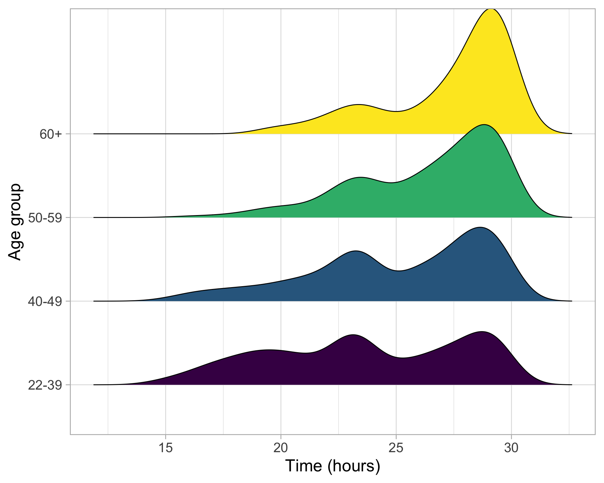
What about for histograms?
 wser |>
  ggplot(aes(x = time_in_hours, fill = age_grp)) +
  geom_histogram(bins = 15) +
  scale_fill_viridis_d(alpha = 0.6)+
  labs(fill = "Age group", x = "Time (hours)")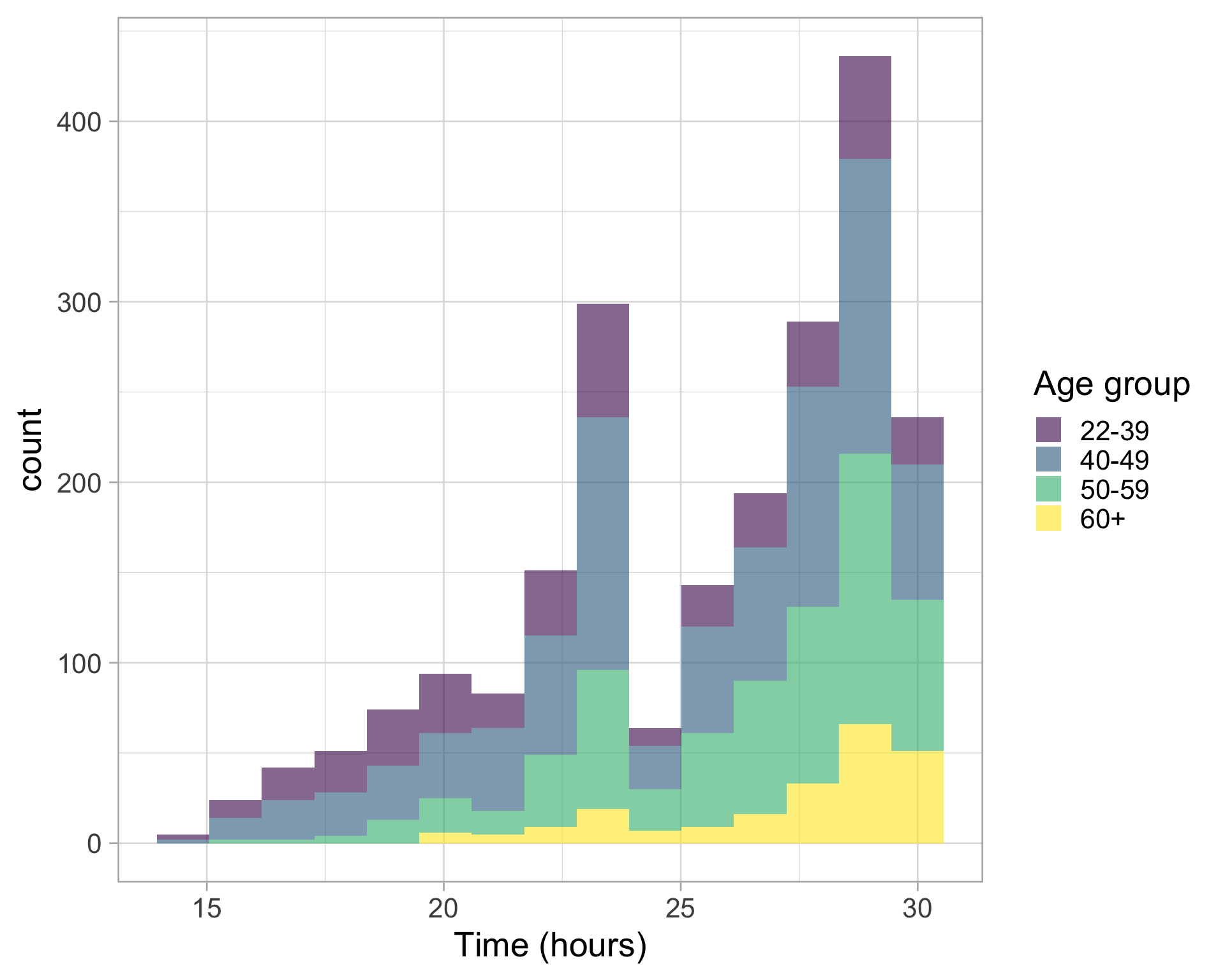
What about facets?
Difference between facet_wrap and facet_grid
wser |>
  ggplot(aes(x = time_in_hours)) +
  geom_histogram(bins = 15) +
  facet_wrap(~ age_grp, nrow = 1)+
  labs(x= "Time (hours)")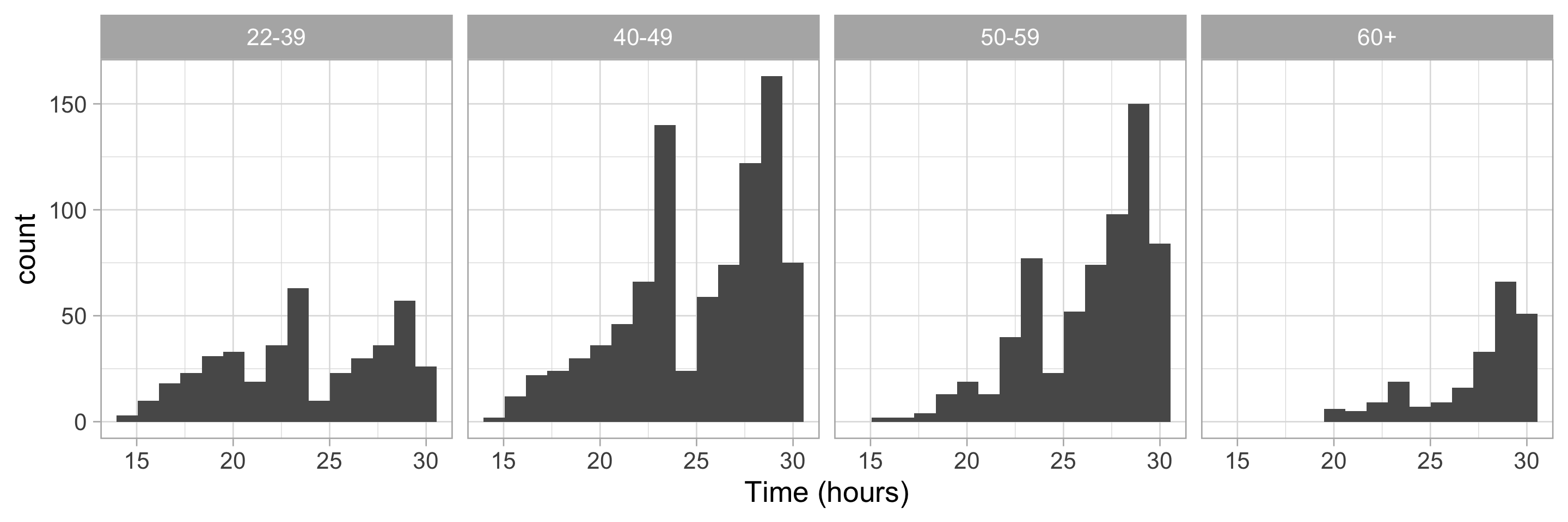
What about facets?
wser |>
  ggplot(aes(x = time_in_hours)) +
  geom_histogram(bins = 15) +
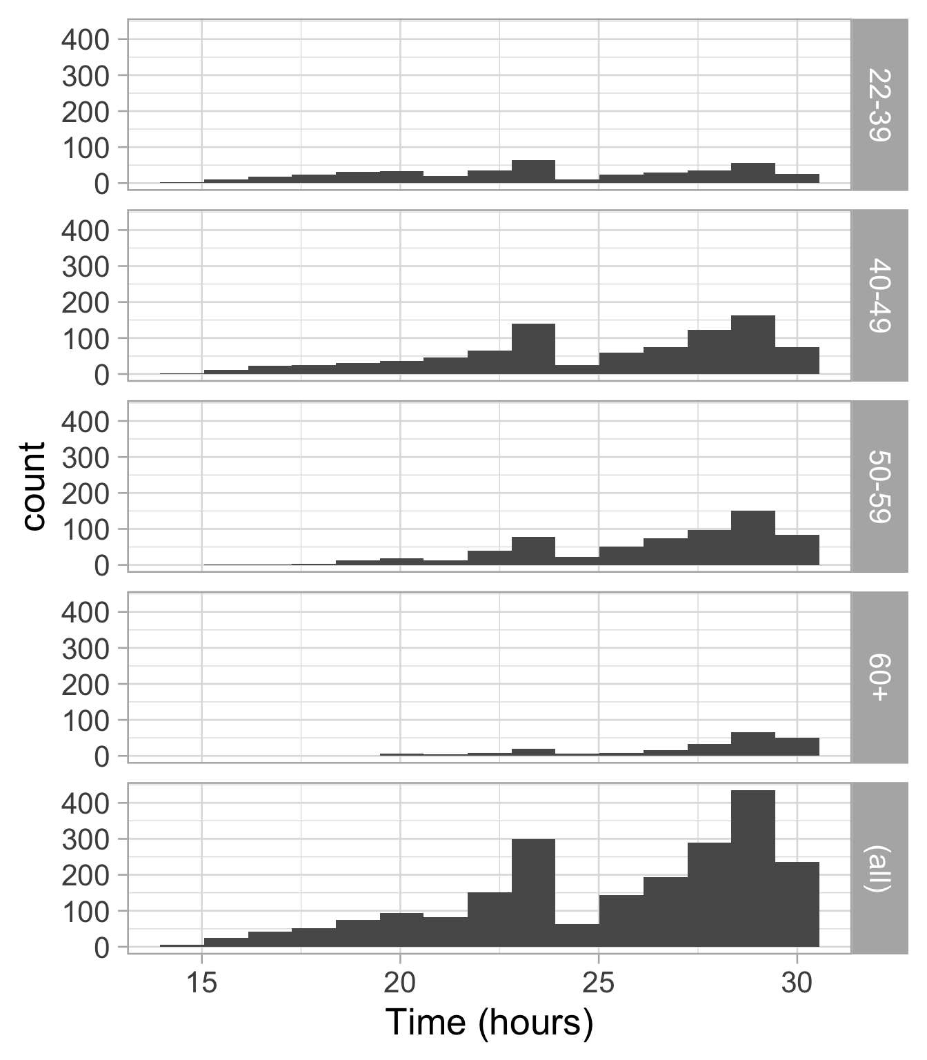
  facet_grid(age_grp ~ ., margins = TRUE)+
  labs(x = "Time (hours)")