Data visualization: density estimation


SURE 2026

Department of Statistics & Data Science
Carnegie Mellon University

Background

Data: A’ja Wilson’s shots

Shot attempts by the A’ja Wilson in the 2025 WNBA season using wehoop

library(tidyverse)
theme_set(theme_light())
wilson_shots <- read_csv("https://raw.githubusercontent.com/36-SURE/2026/main/data/wilson_shots.csv")
glimpse(wilson_shots)
Rows: 1,030
Columns: 7
$ ...1          <dbl> 1, 2, 3, 4, 5, 6, 7, 8, 9, 10, 11, 12, 13, 14, 15, 16, 1…
$ scoring_play  <lgl> TRUE, FALSE, TRUE, FALSE, TRUE, FALSE, FALSE, TRUE, FALS…
$ score_value   <dbl> 2, 0, 2, 0, 2, 0, 0, 2, 0, 0, 0, 0, 0, 0, 0, 2, 0, 0, 2,…
$ shot_x        <dbl> 0, 19, -4, 0, -4, -6, -3, -4, -12, -1, -4, -4, -5, -4, -…
$ shot_y        <dbl> 10, 17, 2, 17, 2, 5, 3, 2, 25, 9, 7, 2, 24, 2, 2, 3, 1, …
$ shot_distance <dbl> 10.000000, 25.495098, 4.472136, 17.000000, 4.472136, 7.8…
$ shot_type     <chr> "Pullup Jump Shot", "Jump Shot", "Driving Layup Shot", "…
  • Each row is a shot attempt by A’ja Wilson in the 2025 WNBA season

  • Categorical/qualitative variables: scoring_play, shot_type

  • Continuous/quantitative variables: shot_x, shot_y, shot_distance, score_value

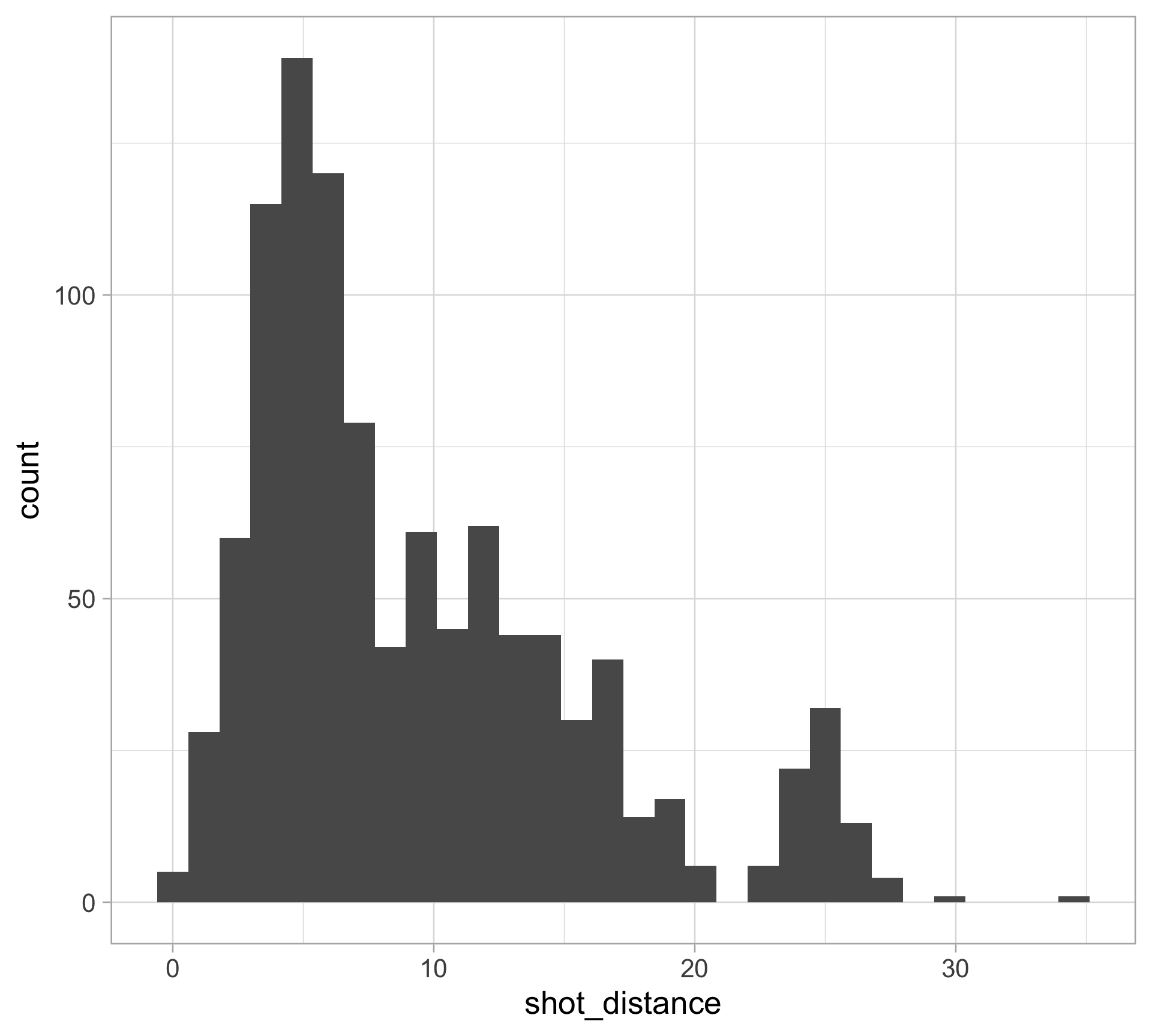
Revisiting histograms

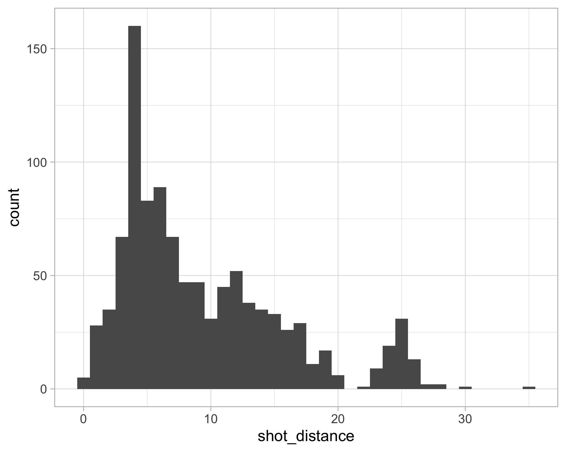
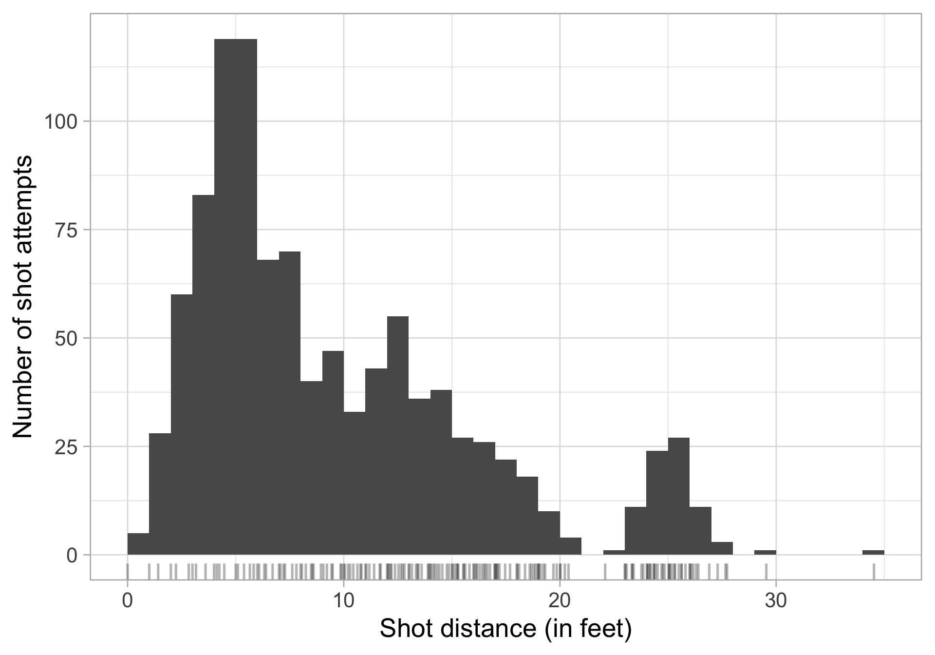
wilson_shots |>
  ggplot(aes(x = shot_distance)) +
  geom_histogram()
  • Split observed data into bins

  • Count number of observations in each bin

Need to choose the number of bins, adjust with:

  • bins: number of bins (default is 30)

  • binwidth: width of bins (overrides bins), various rules of thumb

  • breaks: vector of bin boundaries (overrides both bins and binwidth)

Adjusting the binwidth

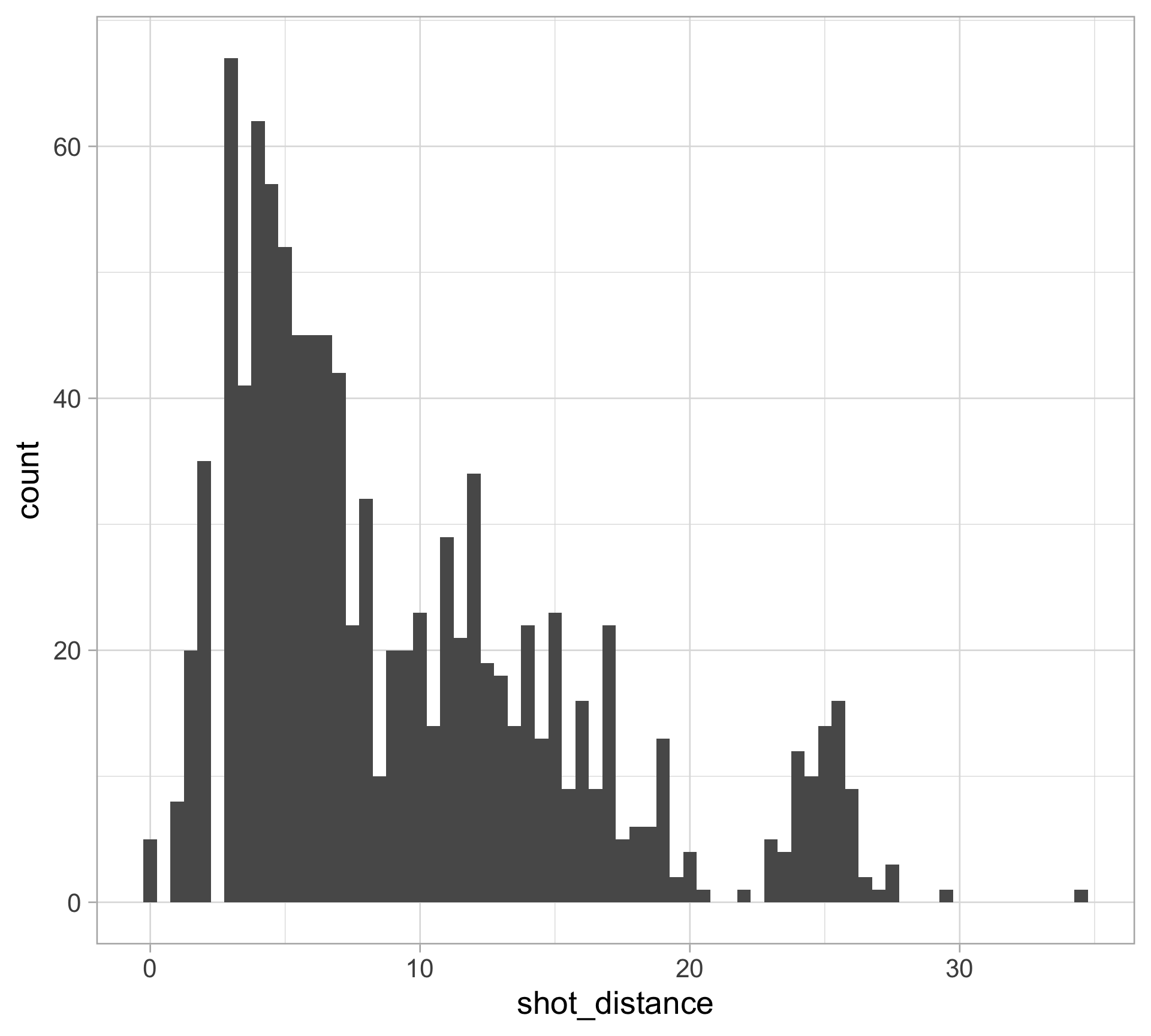
Small binwidth \(\rightarrow\) undersmooth/spiky

wilson_shots |>
  ggplot(aes(x = shot_distance)) +
  geom_histogram(binwidth = 0.5)

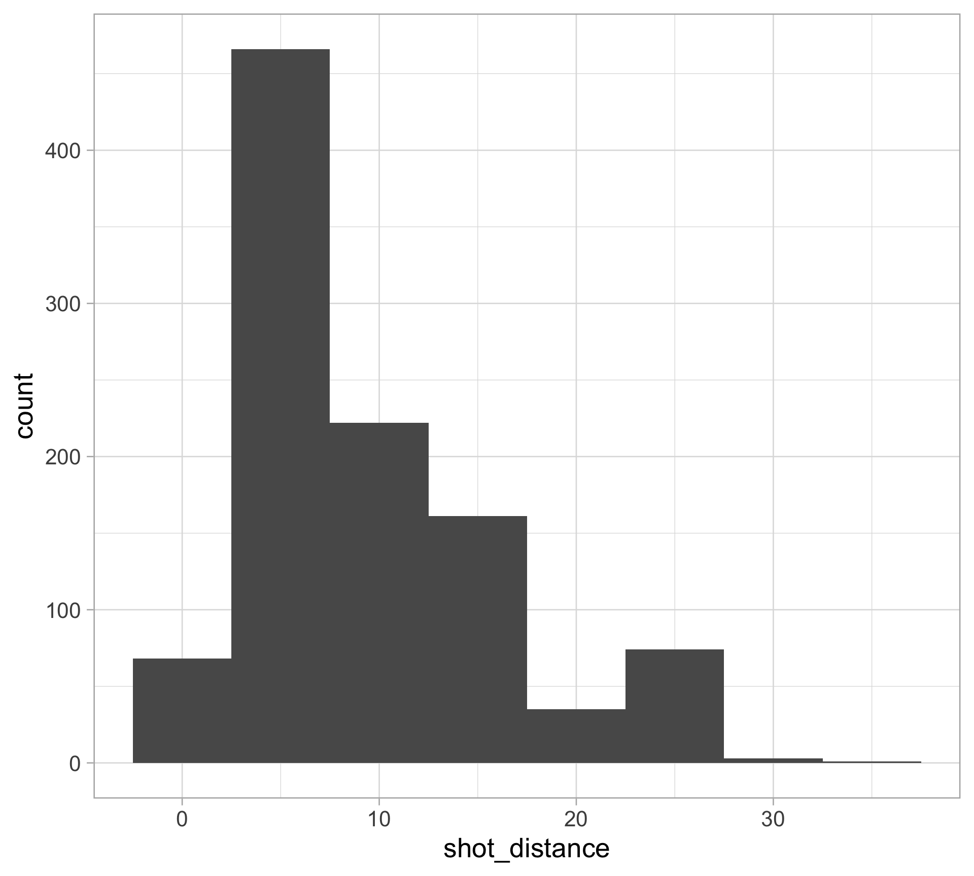
Large binwidth \(\rightarrow\) oversmooth/flat

wilson_shots |>
  ggplot(aes(x = shot_distance)) +
  geom_histogram(binwidth = 5)

Adjusting the binwidth

  • A binwidth that is too narrow shows too much detail

    • too many bins: low bias, high variance
  • A binwidth that is too wide hides detail

    • too few bins: high bias, low variance

Try several values, the ggplot2 default is NOT guaranteed to be an optimal choice

A subtle point about the histogram code…

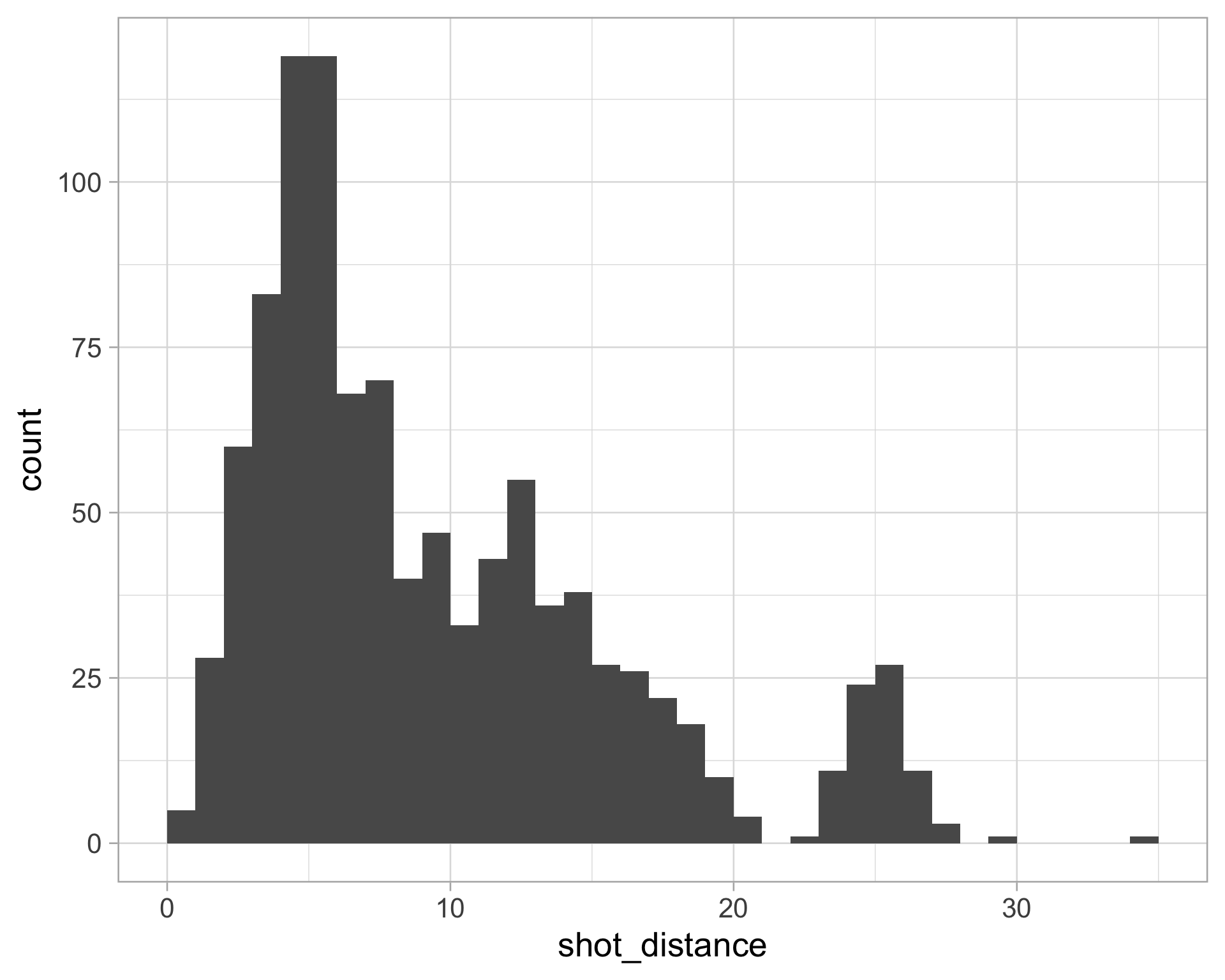
By default the bins are centered on the integers

  • left-closed, right-open intervals
  • starting at -0.5 to 0.5, 0.5 to 1.5, …
wilson_shots |>
  ggplot(aes(x = shot_distance)) +
  geom_histogram(binwidth = 1)

Specify center of one bin (e.g. 0.5)

  • Use closed = "left"
wilson_shots |>
  ggplot(aes(x = shot_distance)) +
  geom_histogram(binwidth = 1, center = 0.5,
                 closed = "left")

How do histograms relate to the PDF & CDF?

  • Remember: we use the probability density function (PDF) to provide a relative likelihood

  • PDF is the derivative of the cumulative distribution function (CDF)

  • Histograms approximate the PDF with bins, and points are equally likely within a bin

Density estimation

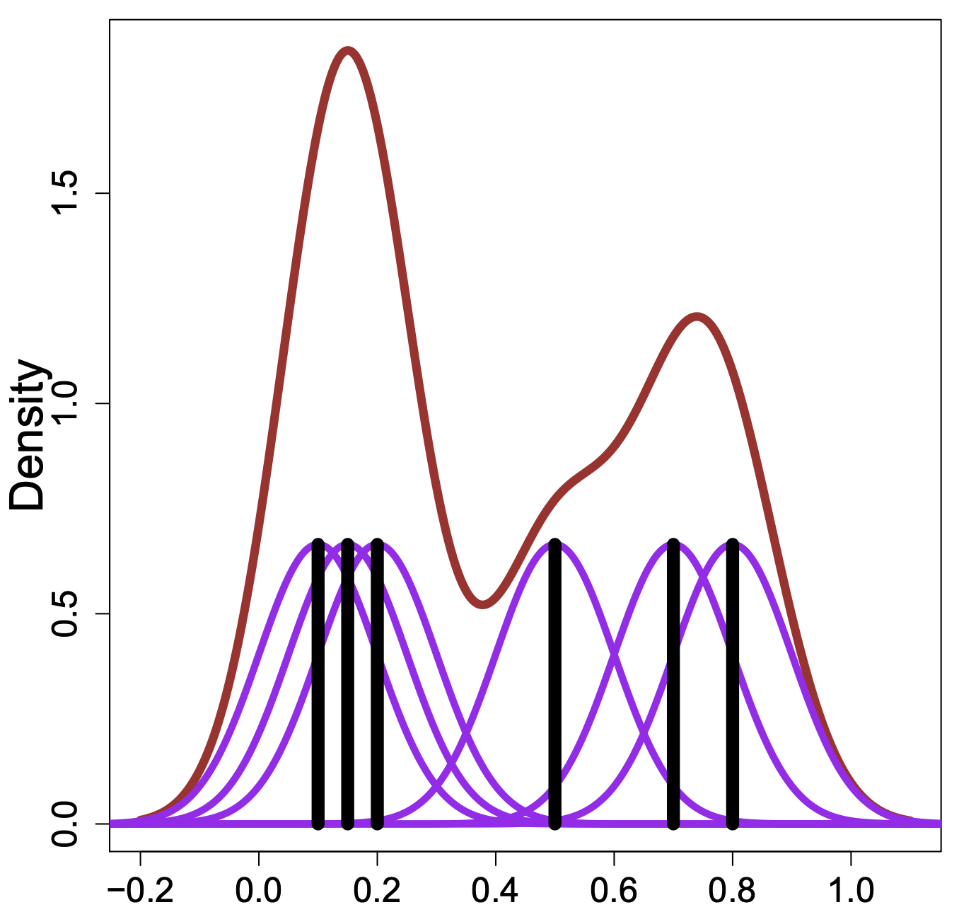
Kernel density estimation: intuition

  • smooth each data point into a small density bumps
  • sum all these small bumps together to obtain the final density estimate

Check out this great interactive tutorial

Kernel density estimation (KDE)

Overarching Goal: estimate the PDF \(f(x)\) for all possible values (assuming it is smooth)

The kernel density estimator (KDE) is \(\displaystyle \hat{f}(x) = \frac{1}{n} \sum_{i=1}^n \frac{1}{h} K_h(x - x_i) = \frac{1}{n} \sum_{i=1}^n \frac{1}{h} K \left(\frac{x-x_i}{h}\right)\)

  • \(n\): sample size

  • \(h\): bandwidth, analogous to histogram binwidth, ensures \(\hat{f}(x)\) integrates to 1

  • \(x\): location where we want to estimate the density \(f(x)\): does not have to be in dataset!

    • Example: \(x=3\): how much evidence do the observed data points provide for probability density around 3?
  • \(x_i\): \(i\)th observation in the dataset

Kernel density estimation (KDE)

Overarching Goal: estimate the PDF \(f(x)\) for all possible values (assuming it is smooth)

The kernel density estimator (KDE) is \(\displaystyle \hat{f}(x) = \frac{1}{n} \sum_{i=1}^n \frac{1}{h} K \left(\frac{x-x_i}{h}\right)\)

  • \(|x - x_i|\): how far evaluation point \(x\) is from observation \(x_i\)

  • \(\frac{x - x_i}{h}\): expresses distance in units of bandwidth

    • If \(h=2\), then being 1 unit away is considered “closer” than in each \(h = 0.5\)
  • \(K\left(\frac{x - x_i}{h}\right)\): kernel function, creates a weight from the scaled distance

    • weight is large when \(x_i\) is close to \(x\)

    • As \(h\) becomes large, the weight of one data point \(x_i\) becomes indistinguishable from the influence of any other data point

  • The \(\frac{1}{h}\) outside of the kernel function rescales kernel so that it remains a valid density integrating to 1, regardless of bandwidth.

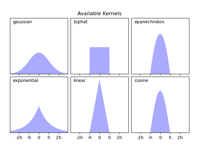
Choice of kernel

The Gaussian (normal) kernel is typically used, but there are many other choices

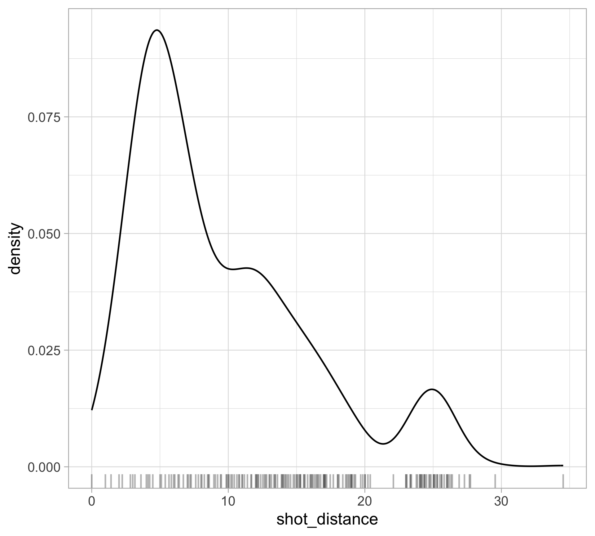
Visualizing KDE

wilson_shots |>
  ggplot(aes(x = shot_distance)) + 
  geom_density() +
  geom_rug(alpha = 0.3)
  • Pros:
    • Displays full shape of distribution
    • Can easily layer
    • Add categorical variable with color
  • Cons:
    • Need to pick bandwidth and kernel…

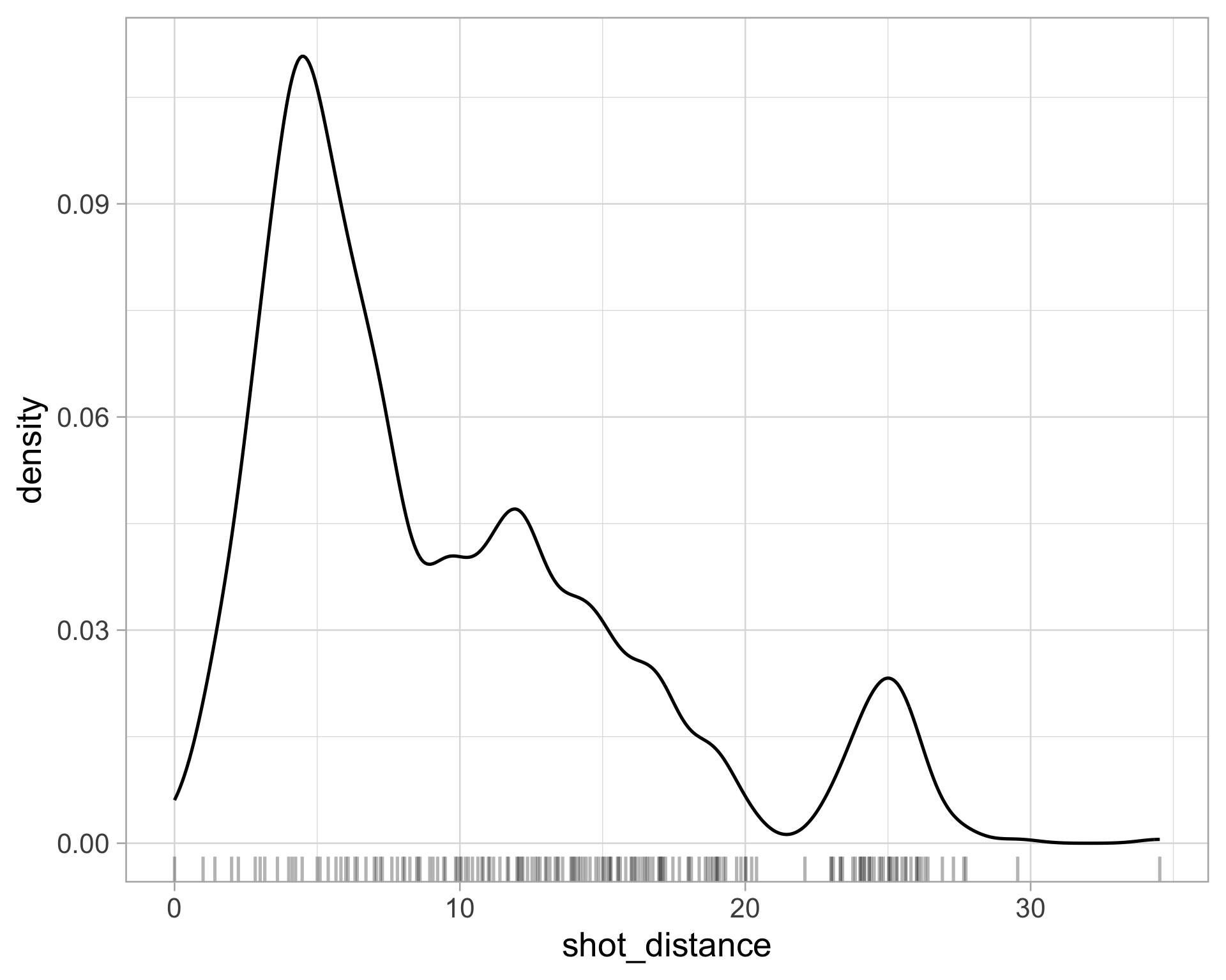
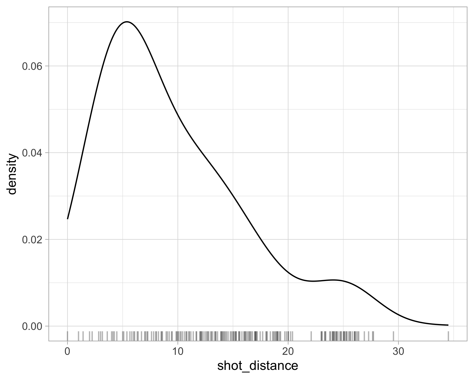
What about the bandwidth?

See ?geom_density for the default bandwidth

Modify the bandwidth using the adjust argument (value to multiply default bandwidth by)

wilson_shots |>
  ggplot(aes(x = shot_distance)) + 
  geom_density(adjust = 0.5) +
  geom_rug(alpha = 0.3)

wilson_shots |>
  ggplot(aes(x = shot_distance)) + 
  geom_density(adjust = 2) +
  geom_rug(alpha = 0.3)

Notes on density estimation

For the same data, multiple factors affect the shape of the density curve!

  • If the bandwidth is too small, the density estimate can become overly peaky and the main trends in the data may be obscured
  • If the bandwidth is too large, then smaller features in the distribution of the data may disappear
  • The choice of the kernel can affect the shape of the density curve.

    • A Gaussian kernel typically gives density estimates that look bell-shaped (ish)

    • A rectangular kernel can generate the appearance of steps in the density curve

    • Kernel choice matters less with more data points

Density plots are often reliable and informative for large datasets but can be misleading for smaller ones.

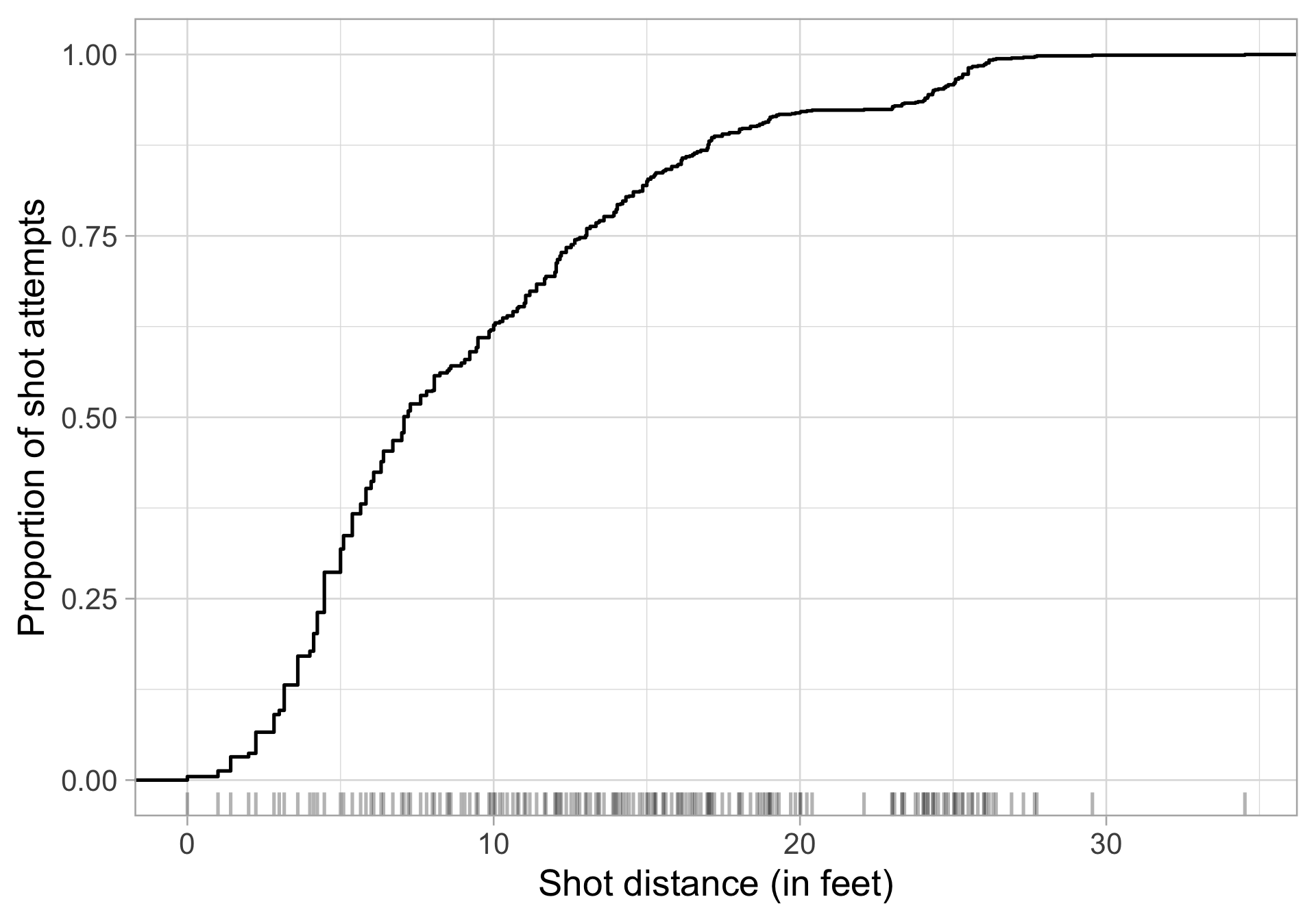
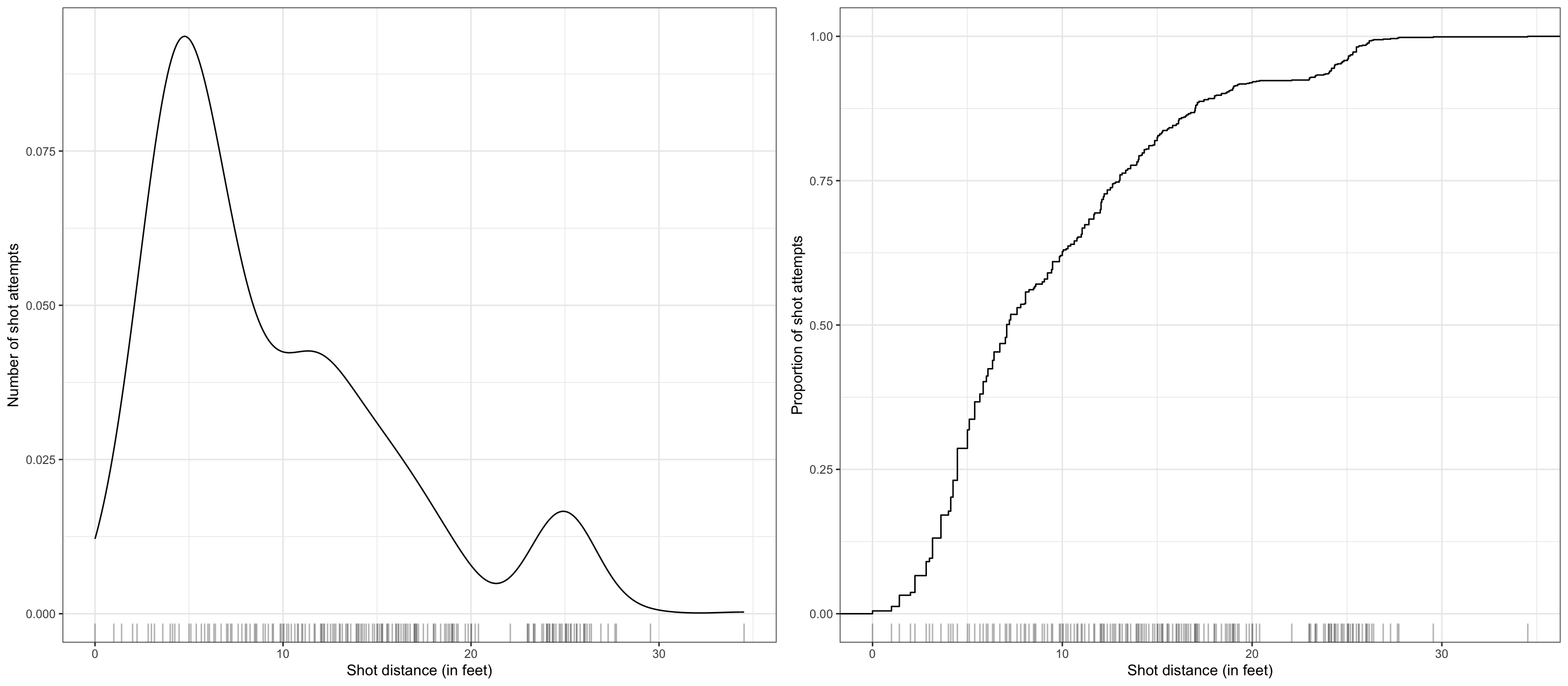
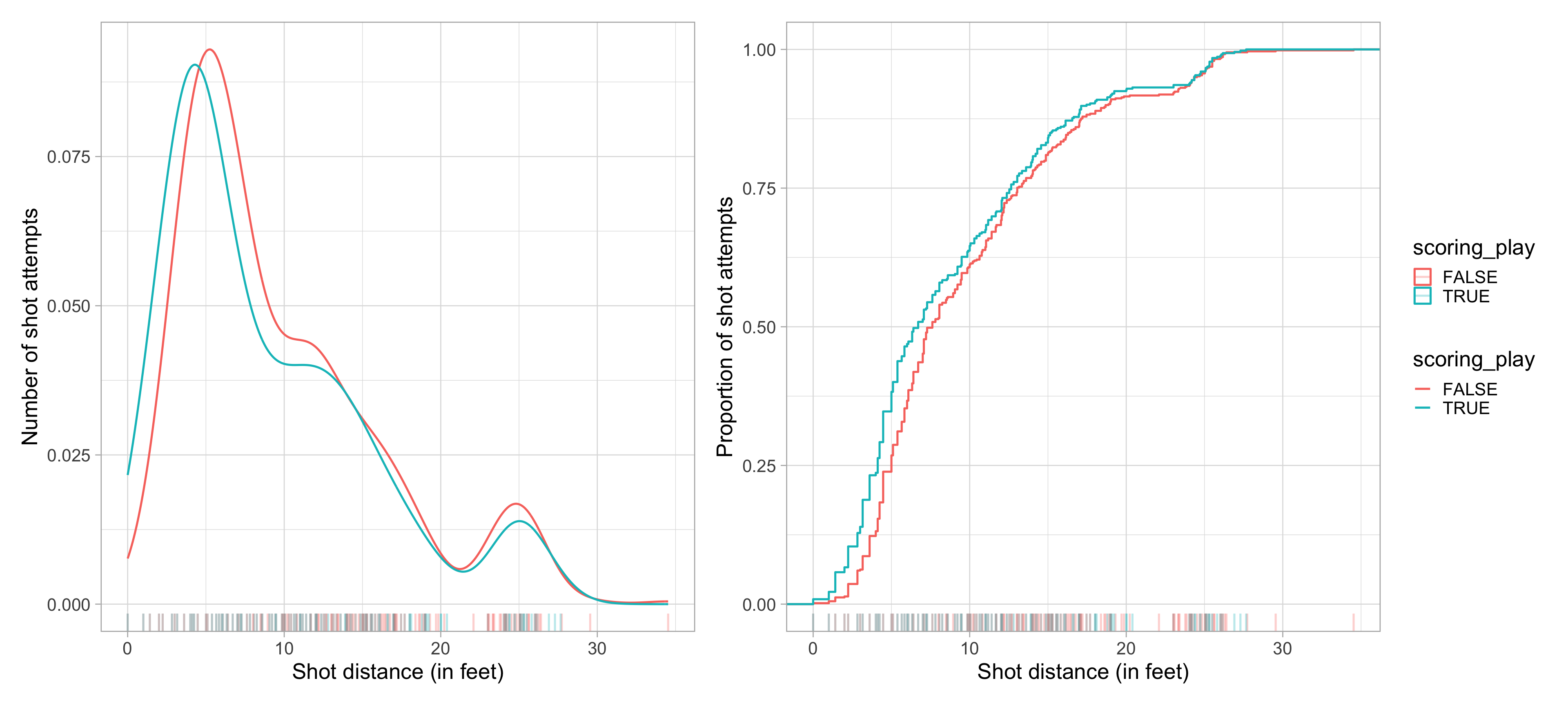
Use density curves and ECDFs together

Code interlude: arranging multiple figures

Use the cowplot package to easily arrange your plots (see also patchwork)

library(cowplot)

wilson_shot_dens <- wilson_shots |>
  ggplot(aes(x = shot_distance)) + 
  geom_density() +
  geom_rug(alpha = 0.3) +
  theme_bw() +
  labs(x = "Shot distance (in feet)",
       y = "Number of shot attempts")

wilson_shot_ecdf <- wilson_shots |>
  ggplot(aes(x = shot_distance)) + 
  stat_ecdf() +
  geom_rug(alpha = 0.3) +
  theme_bw() +
  labs(x = "Shot distance (in feet)",
       y = "Proportion of shot attempts")

# library(patchwork)
# wilson_shot_dens + wilson_shot_ecdf
plot_grid(wilson_shot_dens, wilson_shot_ecdf)

Use density curves and ECDFs together

Another code interlude: collect the legends with patchwork

wilson_shot_dens_made <- wilson_shots |>
  ggplot(aes(x = shot_distance, 
             color = scoring_play)) + 
  geom_density() +
  geom_rug(alpha = 0.3) +
  labs(x = "Shot distance (in feet)",
       y = "Number of shot attempts")

wilson_shot_ecdf_made <- wilson_shots |>
  ggplot(aes(x = shot_distance,
             color = scoring_play)) + 
  stat_ecdf() +
  geom_rug(alpha = 0.3) +
  labs(x = "Shot distance (in feet)",
       y = "Proportion of shot attempts")

library(patchwork)
wilson_shot_dens_made + wilson_shot_ecdf_made + plot_layout(guides = "collect")

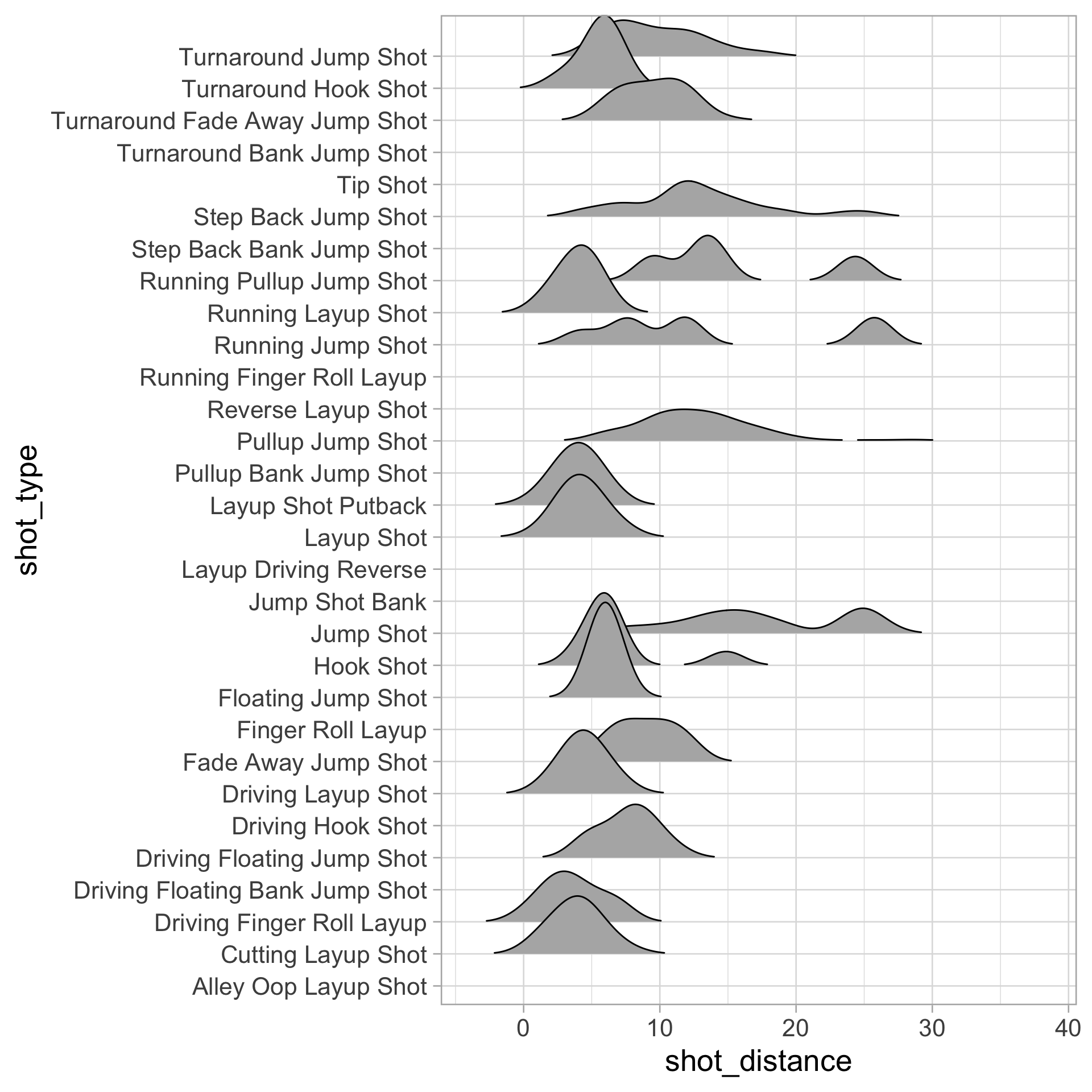
Ridgeline plots

  • Check out the ggridges package for a variety of customization options
library(ggridges)
wilson_shots |>
  ggplot(aes(x = shot_distance, y = shot_type)) + 
  geom_density_ridges(rel_min_height = 0.01) 
  • Useful to display conditional distributions across many levels

  • Also check out ggdist

Going from 1D to 2D density estimation

In 1D: estimate density \(f(x)\), assuming that \(f(x)\) is smooth:

\[ \hat{f}(x) = \frac{1}{n} \sum_{i=1}^n \frac{1}{h} K\left(\frac{x - x_i}{h} \right) \]

In 2D: estimate joint density \(f(x_1, x_2)\)

\[\hat{f}(x_1, x_2) = \frac{1}{n} \sum_{i=1}^n \frac{1}{h_1h_2} K\left(\frac{x_1 - x_{i1}}{h_1}\right) K\left(\frac{x_2 - x_{i2}}{h_2}\right)\]

In 1D there’s one bandwidth, now we have two bandwidths

  • \(h_1\): controls smoothness as \(X_1\) changes, holding \(X_2\) fixed
  • \(h_2\): controls smoothness as \(X_2\) changes, holding \(X_1\) fixed

Think of it like going from each observation contributing a bump on a line to a bump on a plane.

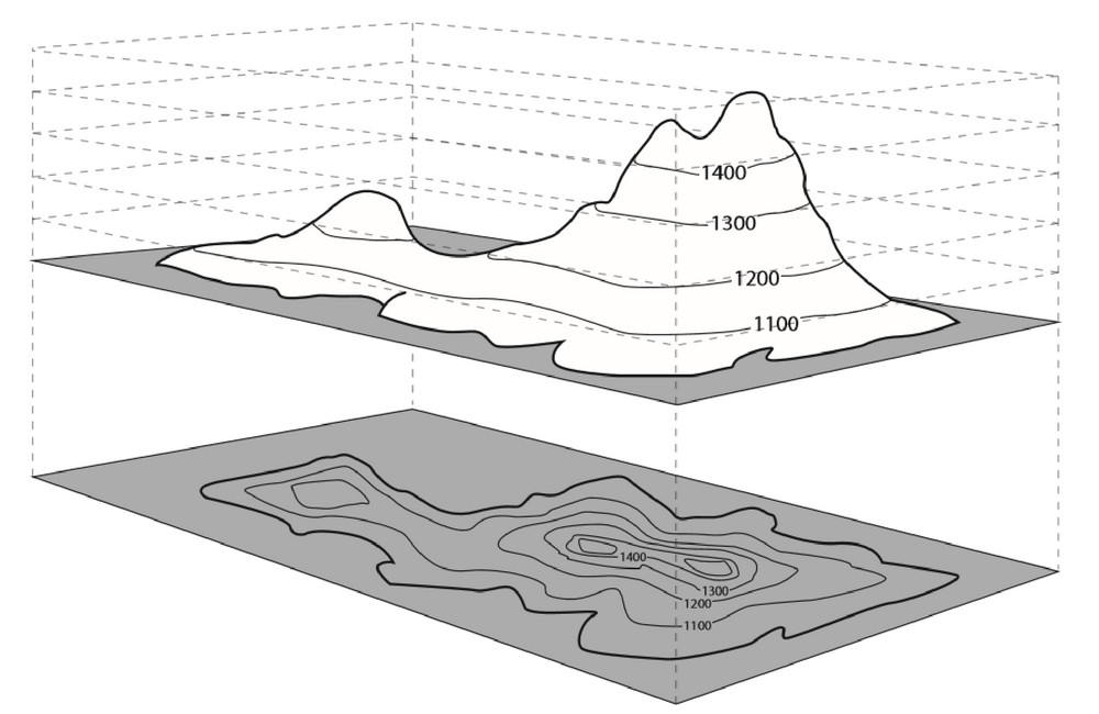
Display densities for 2D data: contour plots

Best known in topography: outlines (contours) denote levels of elevation

2D density estimation

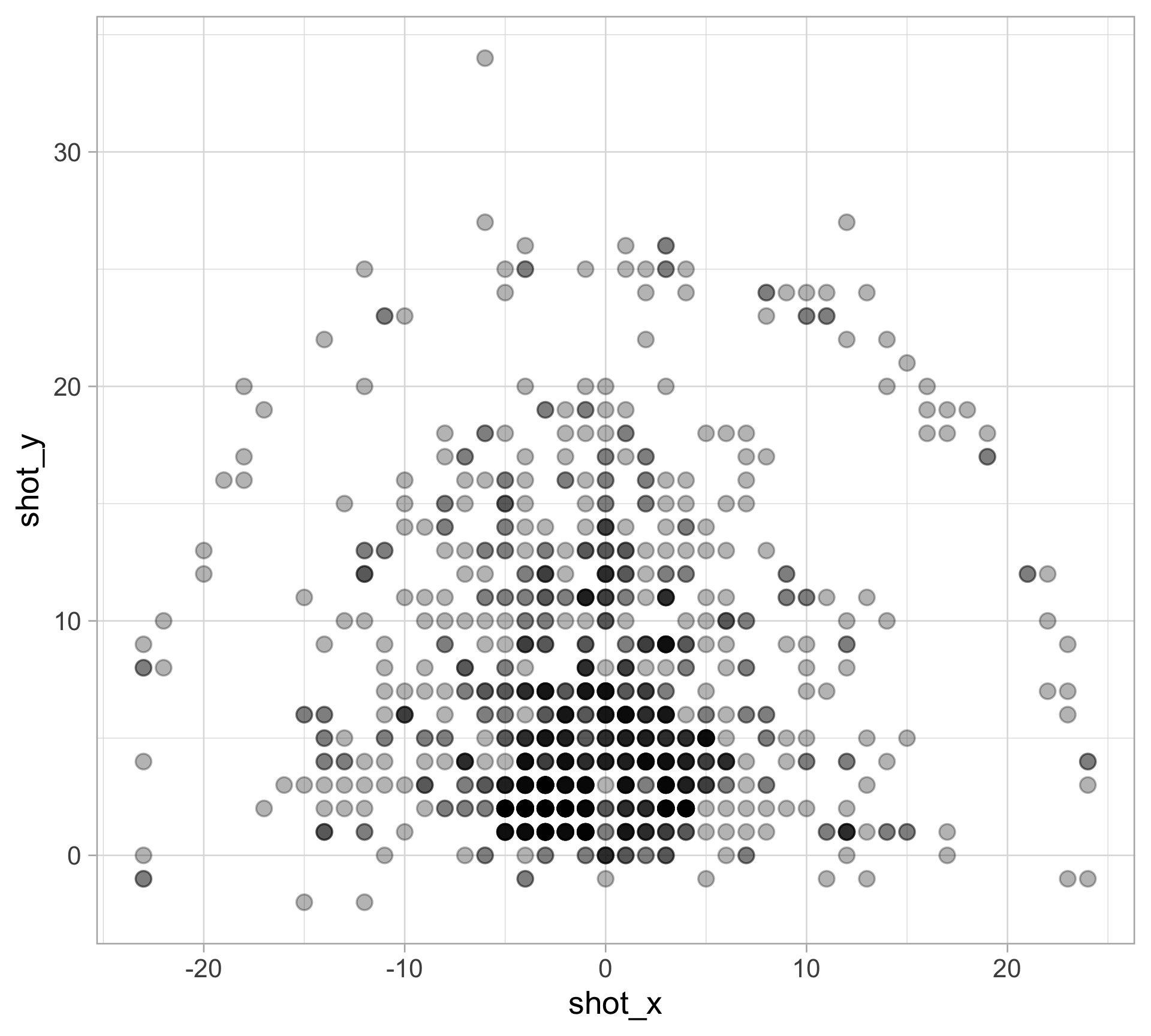
We can visualize all of the shot locations: (shot_x, shot_y)

wilson_shots |>
  ggplot(aes(x = shot_x, y = shot_y)) +
  geom_point(size = 4, alpha = 0.3)

Adjust transparency with alpha for overlapping points

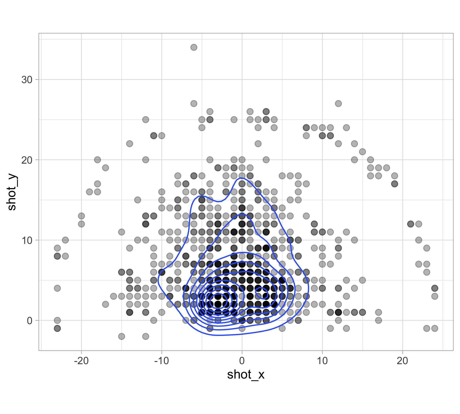
Create contours of 2D kernel density estimate

wilson_shots |>
  ggplot(aes(x = shot_x, y = shot_y)) + 
  geom_point(size = 4, alpha = 0.3) + 
  geom_density2d() +
  coord_fixed() +
  theme(legend.position = "bottom")
  • Inner lines denote “peaks”

  • coord_fixed() forced a fixed ratio

Create contours of 2D kernel density estimate

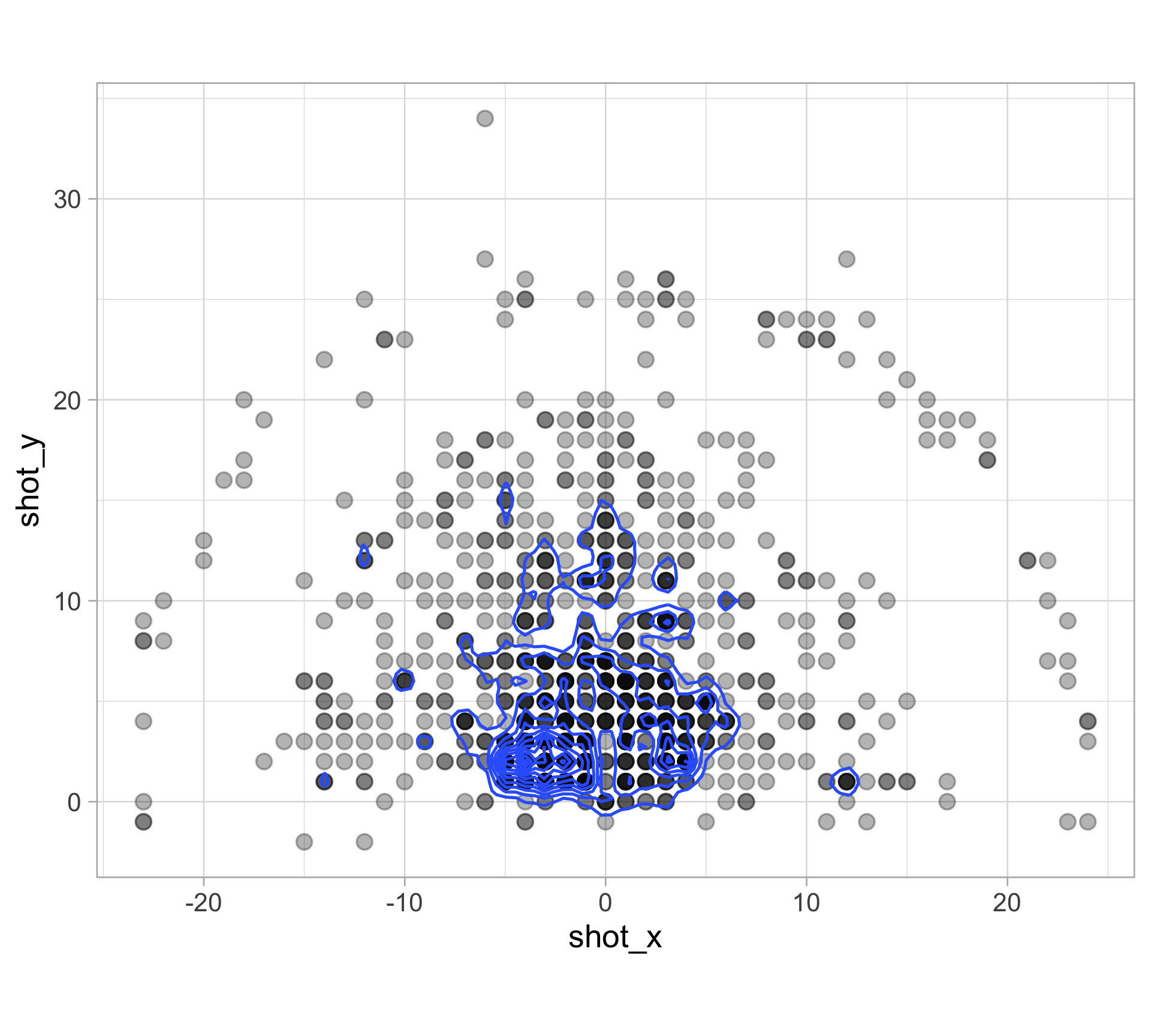
Similar with 1D KDE, we can use adjust to modify the multivariate bandwidth

wilson_shots |>
  ggplot(aes(x = shot_x, y = shot_y)) + 
  geom_point(size = 4, alpha = 0.3) + 
  geom_density2d(adjust = 0.3) +
  coord_fixed() +
  theme(legend.position = "bottom")

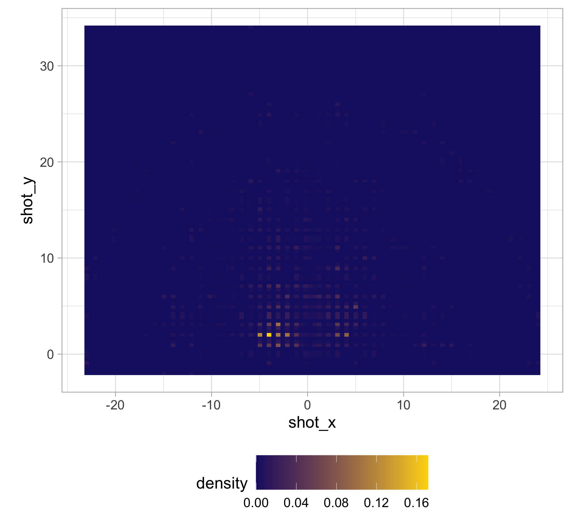
Contours are difficult… what about heatmaps?

Divide the space into a grid and color the grid according to high/low values

wilson_shots |>
  ggplot(aes(x = shot_x, y = shot_y)) + 
  stat_density2d(aes(fill = after_stat(density)),
                 h = c(0.6, 0.6), bins = 100, contour = FALSE,
                 geom = "raster") +
  scale_fill_gradient(low = "midnightblue", 
                      high = "gold") +
  theme(legend.position = "bottom", 
        legend.key.size = unit(1.5, "cm")) +
  coord_fixed()

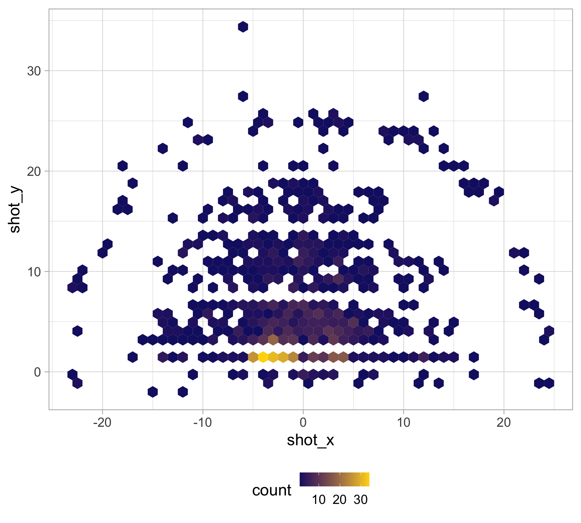
Hexagonal binning is a nice alternative

  • Use geom_hex() to make hexagonal heatmaps

  • Need to have the hexbin package installed

  • 2D version of histogram

  • Can specify binwidth in both directions

  • Avoids limitations from smoothing

wilson_shots |>
  ggplot(aes(x = shot_x, y = shot_y)) + 
  geom_hex(binwidth = c(1, 1)) +
  scale_fill_gradient(low = "midnightblue", 
                      high = "gold") + 
  theme(legend.position = "bottom") +
  coord_fixed()

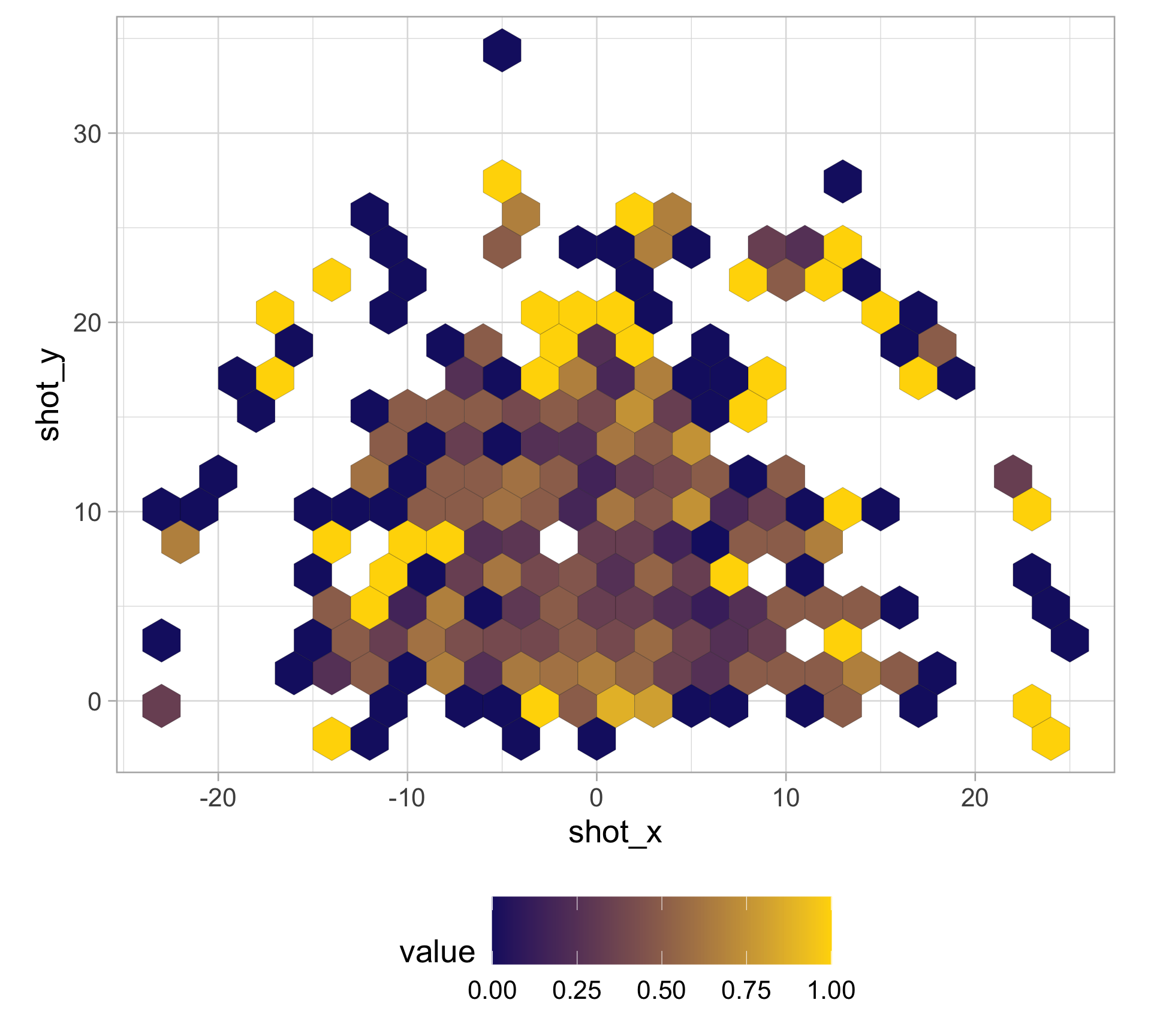
What about shooting efficiency?

Can compute a function of another variable inside hexagons with stat_summary_hex()

wilson_shots |>
  ggplot(aes(x = shot_x, y = shot_y, 
             z = scoring_play, group = 1)) +
  stat_summary_hex(binwidth = c(2, 2), fun = mean, 
                   color = "black", linewidth = 0.05) +
  scale_fill_gradient(low = "midnightblue", 
                      high = "gold") + 
  theme(legend.position = "bottom", 
        legend.key.size = unit(1.5, "cm")) +
  coord_fixed()

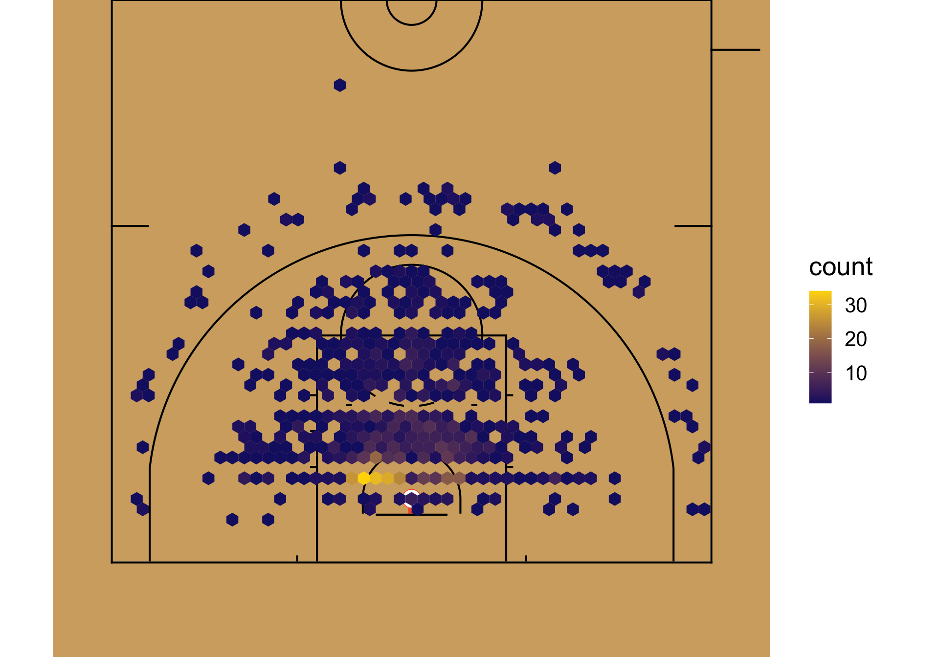
Appendix: Making shot charts and drawing courts with sportyR

library(sportyR)
wnba_court <- geom_basketball("wnba", display_range = "offense", rotation = 270, x_trans = -41.5)
wnba_court +
  geom_hex(data = wilson_shots, aes(x = shot_x, y = shot_y), binwidth = c(1, 1)) + 
  scale_fill_gradient(low = "midnightblue", high = "gold")

Appendix: Density estimation in Erin’s CMSACamp project

Presentation

Appendix: Code to build dataset

#install.packages("wehoop")
library(wehoop)
wnba_pbp <- load_wnba_pbp(2025)
wilson_shots <- wnba_pbp |> 
  filter(shooting_play == T) |> 
  filter(str_detect(text, "A'ja Wilson")) |> 
  filter(!str_detect(text, "A'ja Wilson assists")) |> 
  filter(!str_detect(text, "free throw")) |> 
  mutate(
    shot_x = coordinate_x_raw - 25,
    shot_y = coordinate_y_raw,
    shot_distance = sqrt((abs(shot_x) ^ 2) + shot_y ^ 2), 
    shot_type = type_text,
    scoring_play,
    score_value,
    .keep = "none"
  )