Dimension reduction: principal component analysis


CMSACamp 2026

Department of Statistics & Data Science
Carnegie Mellon University

What is the goal of dimension reduction?

We have \(p\) variables (columns) for \(n\) observations (rows) BUT which variables are interesting?


Specifically: can we find a smaller number of dimensions that captures the interesting structure in the data?

  • Could examine all pairwise scatterplots of each variable – tedious, manual process

  • Clustering variables based on correlation – this still doesn’t reduce the number of dimensions

  • Can we find a combination of the original \(p\) variables?


Dimension reduction:

  • Focus on reducing the dimensionality of the feature space (i.e., number of columns)

  • While retaining most of the information / variability in a lower dimensional space (i.e., reducing the number of columns)

Principal components analysis (PCA)

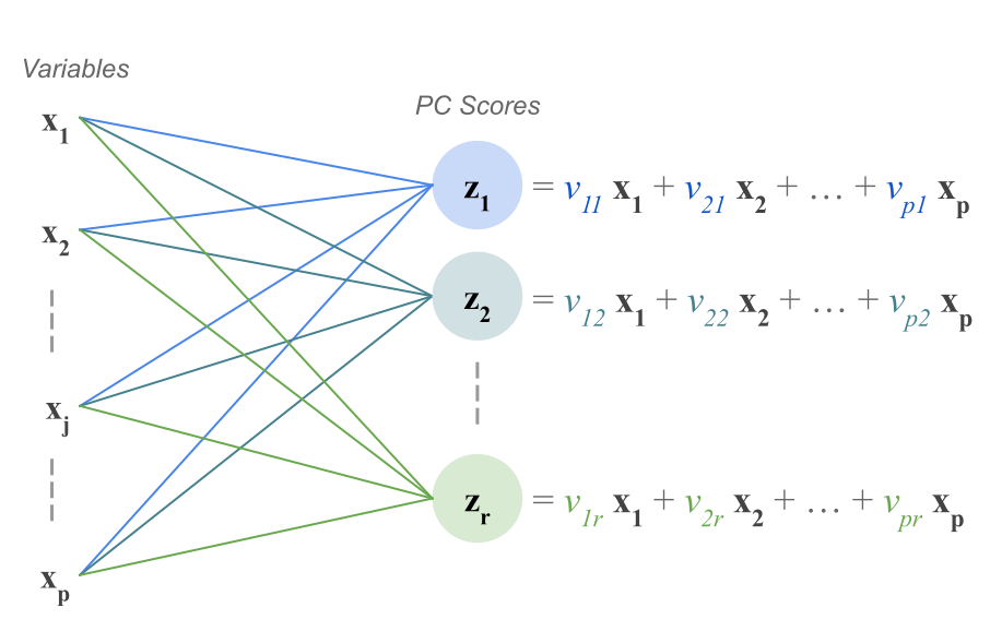
  • PCA explores the covariance between variables, and combines variables into a smaller set of uncorrelated variables called principal components (PCs)
  • PCs are weighted, (normalized) linear combinations of the original variables

    • Weights reveal how different variables are loaded into the PCs
  • We want a small number of PCs to explain most of the information/variance in the data


So that no set of variables dominate the total variance in the data, we standardize all relevant variables (i.e., center and scale)!

Principal components (a little more formal)

Assume \(\boldsymbol{X}\) is a \(n \times p\) feature matrix that has been standardized


PCA will give us \(p\) principal components that are \(n\)-length columns, denoted by \(Z_1, \dots, Z_p\)

  • The matrix of these principal components is called the PC matrix (aka the scores matrix): \(Z = (Z_1, \cdots, Z_p)^T\)
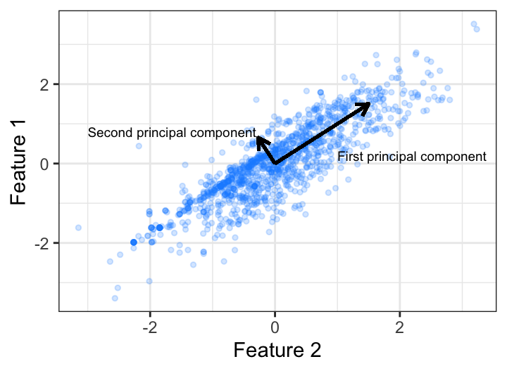
  • The first PC is the linear combination of the \(p\) variables that has the largest possible variance.
  • Each succeeding component has the largest possible variance under the constraint that it is uncorrelated with the preceding components


Often, a small number of principal components (\(p^* < p\)) can explain a high proportion of the variability in the data

Principal components analysis (PCA)

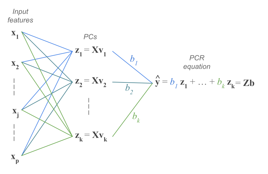
Figure 15.1: PCs as linear combinations of input variables from All Models are Wrong: Concepts of Statistical Learning

First two principal components

First principal component (PC1)

\[Z_1 = \phi_{11} X_1 + \phi_{21} X_2 + \dots + \phi_{p1} X_p\] where:

  • \(\phi_{j1}\) is the weight (loading) indicating the contribution of each variable \(j = 1, \dots, p\) to PC1
  • Weights are normalized: \(\sum_{j=1}^p \phi_{j1}^2 = 1\)
  • \(\phi_{1} = (\phi_{11}, \phi_{21}, \dots, \phi_{p1})\) is the loading vector for PC1


\(Z_1\) is the linear combination of the \(p\) variables that has the largest variance (among all PCs)

Second principal component (PC2)

\[Z_2 = \phi_{12} X_1 + \phi_{22} X_2 + \dots + \phi_{p2} X_p\]

where:

  • \(\phi_{j2}\) is the weight (loading) indicating the contribution of each variable \(j = 1, \dots, p\) to PC2
  • Weights are normalized: \(\sum_{j=1}^p \phi_{j2}^2 = 1\)
  • \(\phi_{2} = (\phi_{12}, \phi_{22}, \dots, \phi_{p2})\) is the loading vector for PC2


\(Z_2\) is a linear combination of the \(p\) variables that has the largest variance BUT subject to constraint it is uncorrelated with \(Z_1\)

The rest of the principal components

We repeat this same process to create \(p\) principal components, such that:

  • Uncorrelated: Each PC pair (\(Z_j, Z_{k}\)) for all \(j \neq k\) is uncorrelated with each other
  • Ordered Variance: \(\text{Var}(Z_1) > \text{Var}(Z_2) > \dots > \text{Var}(Z_p)\)
  • Total Variance: \(\sum_{j=1}^p \text{Var}(Z_j) = p\) (ideas for why the total variance is \(p\)?)


So how do we estimate the principal components from the observed data?

Eigenvalue decomposition (aka spectral decomposition)

With singular value decomposition (SVD), we can factorize that matrix \(X\) as follows:

\[ X = U D V^T \]

where:

  • \(V\) are eigenvectors of \(X^TX\) (covariance matrix, \(^T\) means transpose)
  • \(U\) are the eigenvectors of \(XX^T\)
  • The singular values (diagonal of \(D\)) are square roots of the eigenvalues of \(X^TX\) or \(XX^T\).

Here, \(Z = UD\) is the PC matrix, which can also be written as: \(Z = XV\) since \(V\) is an orthonormal matrix (\(V^T V = I\))!

  • Thus, \(V\) is called the loading matrix for \(X\) with \(\phi_{j}\) as columns

Eigenvalues guide dimension reduction

We want to choose \(p^* < p\) such that we are explaining variation in the data

Eigenvalues \(\lambda_j\) for \(j \in 1, \dots, p\) indicate the variance explained by each component. In particular:

  • \(\displaystyle \sum_j^p \lambda_j = p\), meaning \(\lambda_j \geq 1\) indicates \(\text{PC}j\) contains at least one variable’s worth in variability
  • \(\lambda_j/{p}\): proportion of variance explained by \(\text{PC}j\)
  • Arranged in descending order so that \(\lambda_1\) is largest eigenvalue and corresponds to PC1
  • Compute the cumulative proportion of variance explained (CVE) with \(p^*\) components:

\[\text{CVE}_{p^*} = \sum_j^{p*} \frac{\lambda_j}{p}\]

Use a scree plot to plot eigenvalues and guide choice for \(p^* <p\) by looking for “elbow” (rapid to slow change) – more on this later

Example in R

Data: National Women’s Soccer League (NWSL) Team Statistics

Data contains statistics on the regular season performance of each NWSL team between 2016–2022 (excluding 2020 which was cancelled due to COVID)

library(tidyverse)
theme_set(theme_light())
nwsl_team_stats <- read_csv("https://raw.githubusercontent.com/36-SURE/2026/main/data/nwsl-team-stats.csv")
glimpse(nwsl_team_stats)
Rows: 59
Columns: 13
$ team_name                <chr> "Boston Breakers", "Boston Breakers", "Chicag…
$ season                   <dbl> 2016, 2017, 2016, 2017, 2018, 2019, 2021, 202…
$ games_played             <dbl> 20, 24, 21, 25, 25, 26, 27, 23, 20, 24, 20, 2…
$ goal_differential        <dbl> -33, -11, 3, 2, 8, 10, 2, 5, -2, -2, 0, -16, …
$ goals                    <dbl> 14, 24, 25, 33, 38, 42, 32, 35, 18, 29, 29, 2…
$ goals_conceded           <dbl> 47, 35, 22, 31, 30, 32, 30, 30, 20, 31, 29, 3…
$ cross_accuracy           <dbl> 25.57, 23.70, 21.19, 21.08, 25.96, 23.53, 22.…
$ goal_conversion_pct      <dbl> 8.97, 12.37, 11.79, 13.10, 13.67, 14.53, 12.2…
$ pass_pct                 <dbl> 67.38, 72.53, 67.35, 69.23, 71.63, 71.97, 68.…
$ pass_pct_opposition_half <dbl> 57.86, 61.42, 57.74, 61.52, 64.55, 64.69, 60.…
$ possession_pct           <dbl> 47, 48, 46, 47, 51, 50, 44, 52, 48, 49, 50, 5…
$ shot_accuracy            <dbl> 42.95, 42.78, 48.58, 49.60, 45.68, 47.06, 45.…
$ tackle_success_pct       <dbl> 77.42, 73.49, 84.32, 71.29, 67.97, 67.51, 59.…
Implementing PCA

Use the prcomp() function (based on SVD) for PCA on centered and scaled data

nwsl_team_feat <- nwsl_team_stats |> 
  select(cross_accuracy:tackle_success_pct) # extracting relevant metrics

nwsl_team_pca <- prcomp(nwsl_team_feat, center = TRUE, scale. = TRUE) 
summary(nwsl_team_pca)
Importance of components:
                          PC1    PC2    PC3    PC4     PC5     PC6     PC7
Standard deviation     1.6408 1.3404 1.0032 0.8574 0.59210 0.55758 0.32881
Proportion of Variance 0.3846 0.2567 0.1438 0.1050 0.05008 0.04441 0.01544
Cumulative Proportion  0.3846 0.6413 0.7851 0.8901 0.94014 0.98456 1.00000

Computing the principal components

Extract the matrix of principal components

nwsl_team_pc_matrix <- nwsl_team_pca$x
head(as.data.frame(nwsl_team_pc_matrix))
          PC1        PC2         PC3        PC4         PC5         PC6
1 -3.00147977 -0.4250525  0.79002647  0.5520010  0.01634957 -0.17513575
2 -1.12252102 -0.4131886  0.09316881  0.3164745 -0.39011945  0.65001506
3 -2.83101406  0.9120641 -1.06897216  1.2503000  0.54491120  0.22863772
4 -1.29219637  0.5513347 -1.35610163  0.2118349  0.60452475 -0.02763602
5 -0.09410075  0.3256380  0.72066980 -0.3226947 -0.36431466  0.01118236
6  0.04897560  0.4083336 -0.27791329 -0.2146144 -0.16088042  0.19636910
          PC7
1 -0.13076178
2  0.28949409
3 -0.07723044
4 -0.39760994
5 -0.47694959
6 -0.43825486


Note: columns are mutually uncorrelated, and \(\text{Var}(Z_1) > \text{Var}(Z_2) > \dots > \text{Var}(Z_p)\)

# cov(nwsl_team_pc_matrix) # see for yourself!

Extracting the loading matrix

as.data.frame(nwsl_team_pca$rotation) |> rownames_to_column("statistic")
                 statistic        PC1        PC2         PC3          PC4
1           cross_accuracy -0.1032240  0.2215805  0.85491688 -0.445199216
2      goal_conversion_pct  0.1710103  0.5697152 -0.29340123 -0.397905599
3                 pass_pct  0.5684956 -0.1510319  0.06389823  0.062690819
4 pass_pct_opposition_half  0.5515707 -0.1062310  0.15815462 -0.006432924
5           possession_pct  0.4694496  0.1781412  0.24486018  0.412750768
6            shot_accuracy  0.1722262  0.6202085 -0.21280049 -0.042041966
7       tackle_success_pct -0.2874684  0.4193307  0.22067265  0.683642120
          PC5         PC6         PC7
1  0.03871280 -0.03405427  0.09221333
2 -0.50951283  0.37617338 -0.02563629
3  0.06912201  0.23229617  0.76632217
4  0.32960367  0.43200017 -0.60346310
5 -0.47614878 -0.51208520 -0.16915732
6  0.62936600 -0.37073924  0.07126625
7  0.05159785  0.46590707  0.07569029

Visualizing first two principal components

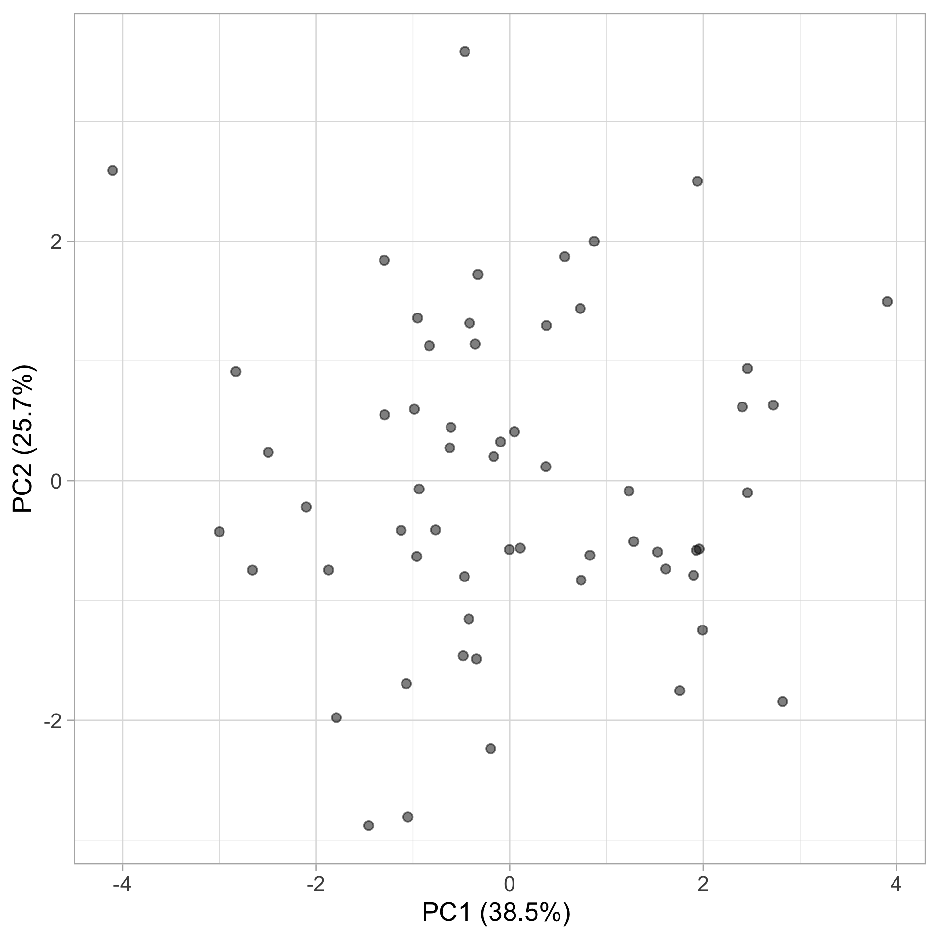
Principal components are not interpretable on their own

nwsl_team_stats_pca <- nwsl_team_stats |> 
  mutate(pc1 = nwsl_team_pc_matrix[,1], 
         pc2 = nwsl_team_pc_matrix[,2])

nwsl_team_stats_pca |> 
  ggplot(aes(x = pc1, y = pc2)) +
  geom_point(alpha = 0.5) +
  labs(x = "PC1 (38.5%) ", y = "PC2 (25.7%)")


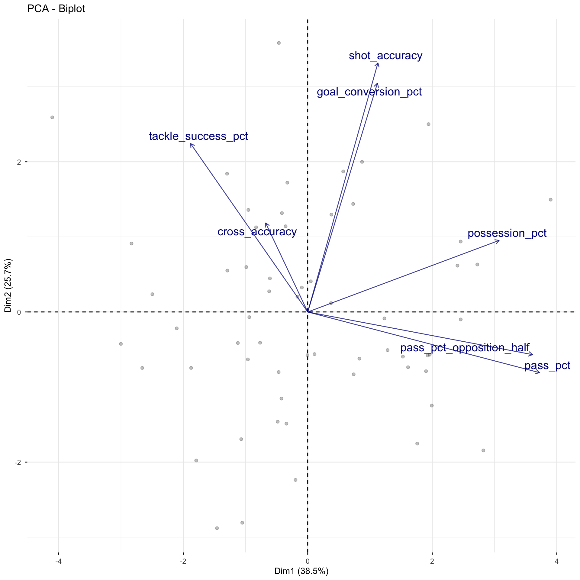
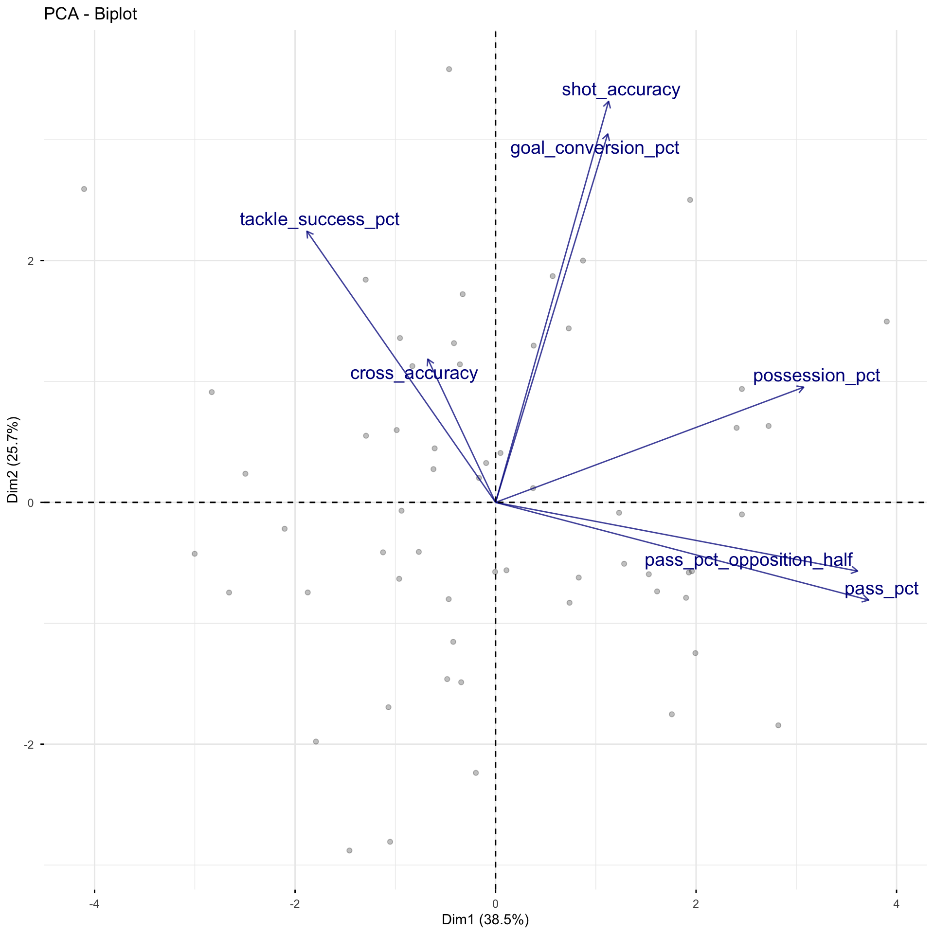
Make a biplot with arrows showing the linear relationship between one variable and other variables

Making PCs interpretable with biplots

Biplot displays both the space of observations and the space of variables

library(factoextra) # install.packages("factoextra")
# fviz_pca_var(): projection of variables
# fviz_pca_ind(): display observations with first two PCs
nwsl_team_pca |> 
  fviz_pca_biplot(label = "var",
                  alpha.ind = 0.25,
                  alpha.var = 0.75,
                  labelsize = 5,
                  col.var = "darkblue",
                  repel = TRUE)


We can look at three attributes of the arrows:

  1. Direction

  2. Angle

  3. Length

Interpreting a biplot: arrow direction

Arrow direction indicates the sign of the variable’s loadings

  • The arrow direction for tackle_success_pct suggests that as the percent of successful tackles for a team increases, \(Z_1\) tends to decrease, but \(Z_2\) tends to increase

\(\Rightarrow\) Coefficient for tackle_success_pct is negative for \(Z_1\) but positive for \(Z_2\)

  • The arrow direction for shot_accuracy suggests that as percent of shots on target increases, both \(Z_1\) and \(Z_2\) also increase

\(\Rightarrow\) Coefficient for shot_accuracy is positive for both \(Z_1\) and \(Z_2\)

Interpreting a biplot: arrow angle

The angle between two vectors displays of the correlation between the variables. In particular:

  • Right angle (\(90^{\circ}\)): variables are uncorrelated (e.g. cross_accuracy and possession_pct)

  • Acute (\(< 90^{\circ}\)): variables are positively correlated (e.g. shot_accuracy and goal_conversion_pct)

  • Obtuse (\(> 90^{\circ}\)):variables are negatively correlated (e.g. tackle_success_pct and pass_pct)

Interpreting a biplot: arrow length

Arrow length indicates how strongly related the principal components are with the variables

  • The arrow length for shot_accuracy suggests it has coefficients that are relatively large in the loading (rotation) matrix
  • The arrow length for cross_accuracy suggests it has coefficients that are relatively small in the loading (rotation) matrix

Intuition on how many PCs to use

summary(nwsl_team_pca)
Importance of components:
                          PC1    PC2    PC3    PC4     PC5     PC6     PC7
Standard deviation     1.6408 1.3404 1.0032 0.8574 0.59210 0.55758 0.32881
Proportion of Variance 0.3846 0.2567 0.1438 0.1050 0.05008 0.04441 0.01544
Cumulative Proportion  0.3846 0.6413 0.7851 0.8901 0.94014 0.98456 1.00000

As expected:

  • PC1 accounts for the most variation in our data, PC2 accounts for the next most, and so on…
  • Each time we add a new PC dimension, we capture a higher proportion of the variability/information in the data
  • BUT that increase in proportion of variance explained decreases for each new dimension we add (i.e., additional PCs will add smaller and smaller variance)

It is recommended to keep adding PCs until the marginal gain levels off (i.e. decreases to the point that it isn’t too beneficial to add another dimension to the data)

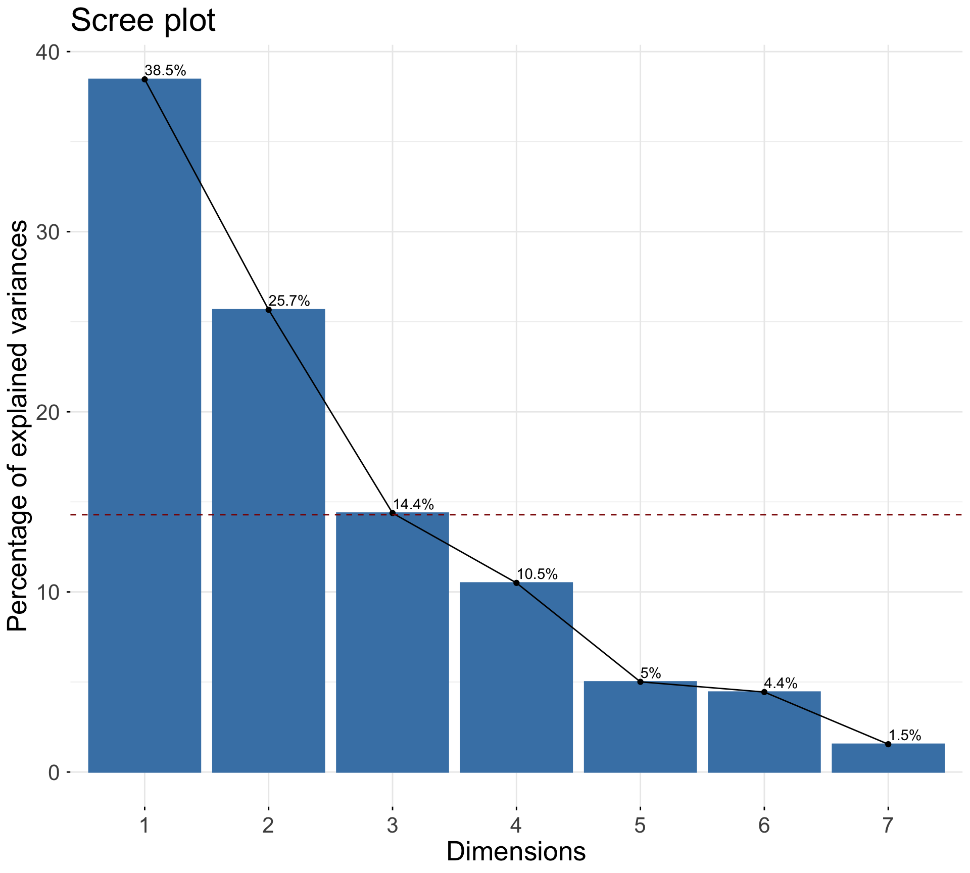
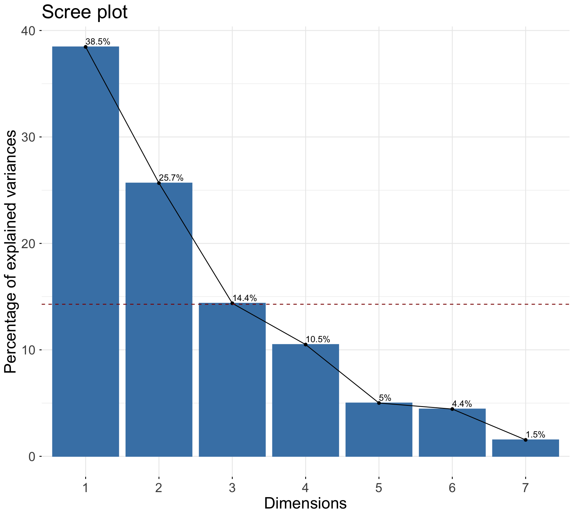
Create a scree plot (or elbow plot)

Scree plot shows the proportion of variation explained by each PC


Two common rules-of-thumb:

  • Visual: look for the “elbow” (where the proportion of variation starts to become flat)

  • Heuristic: horizontal line at \(1/p\)


For us: we can make a strong argument to use first 3 PCs (but maybe go up to first 5 PCs for another substantial drop in the elbow)

nwsl_team_pca |> 
  fviz_eig(addlabels = TRUE) +
  geom_hline(
    yintercept = 100 * (1 / ncol(nwsl_team_pca$x)), 
    linetype = "dashed", 
    color = "darkred",
  )

Remember the spelling…

Principal component regression (PCR)

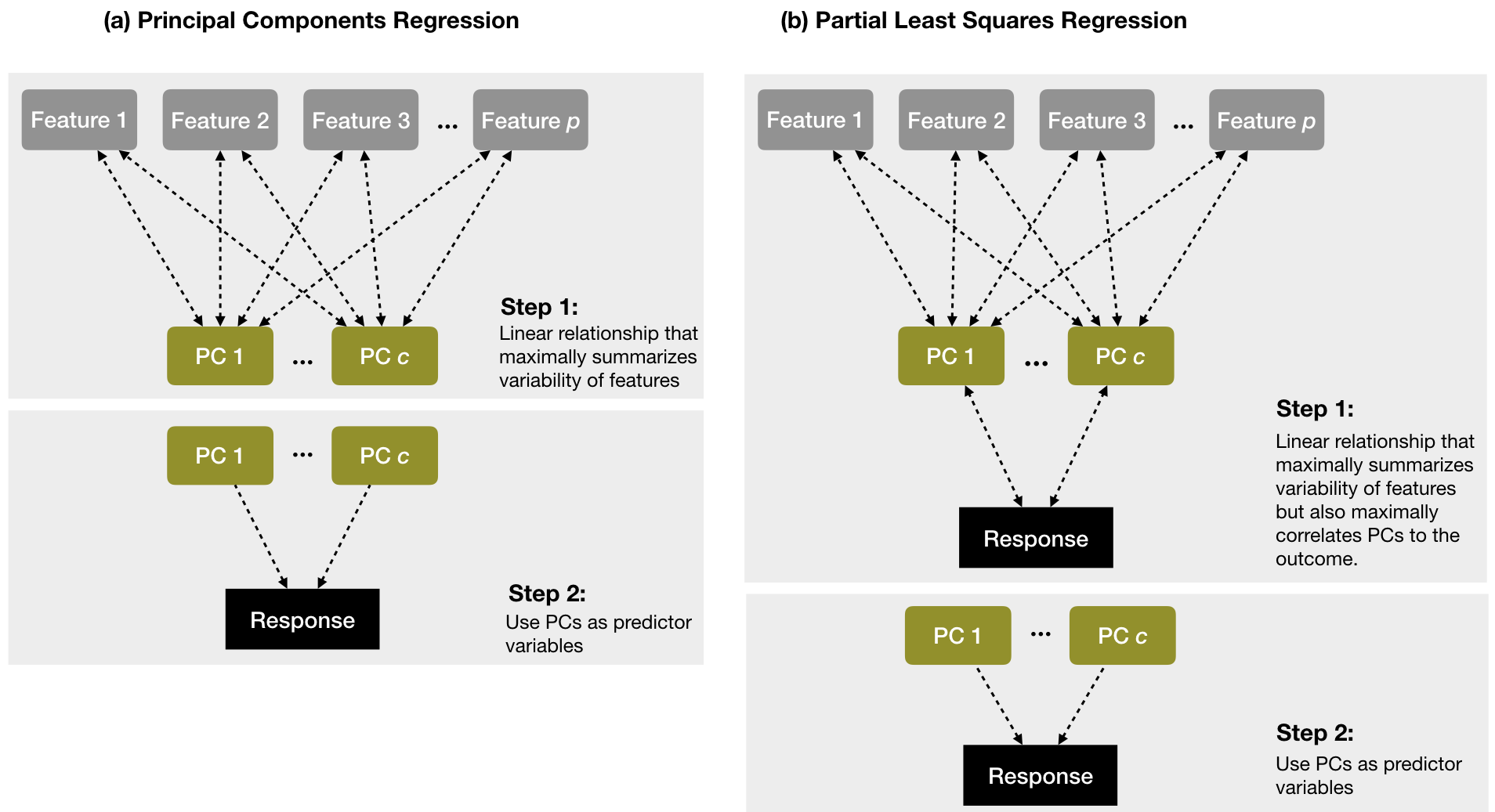
Principal component regression (PCR)

Figure 15.4: Path diagram of PCR from All Models are Wrong: Concepts of Statistical Learning

Implement PCR with pls

nwsl_model_data <- nwsl_team_stats |>
  select(-team_name, -season, -games_played, -goals, -goals_conceded)

# goal_differential will be our outcome (we will talk soon about how to model count data)


Similar syntax to lm formula but specify the number of PCs (ncomp)

library(pls) #install.packages("pls")
nwsl_pcr_fit <- pcr(goal_differential ~ ., ncomp = 2,
                    center = TRUE, scale = TRUE, data = nwsl_model_data)
summary(nwsl_pcr_fit)
Data:   X dimension: 59 7 
    Y dimension: 59 1
Fit method: svdpc
Number of components considered: 2
TRAINING: % variance explained
                   1 comps  2 comps
X                    38.46    64.13
goal_differential     9.72    31.54

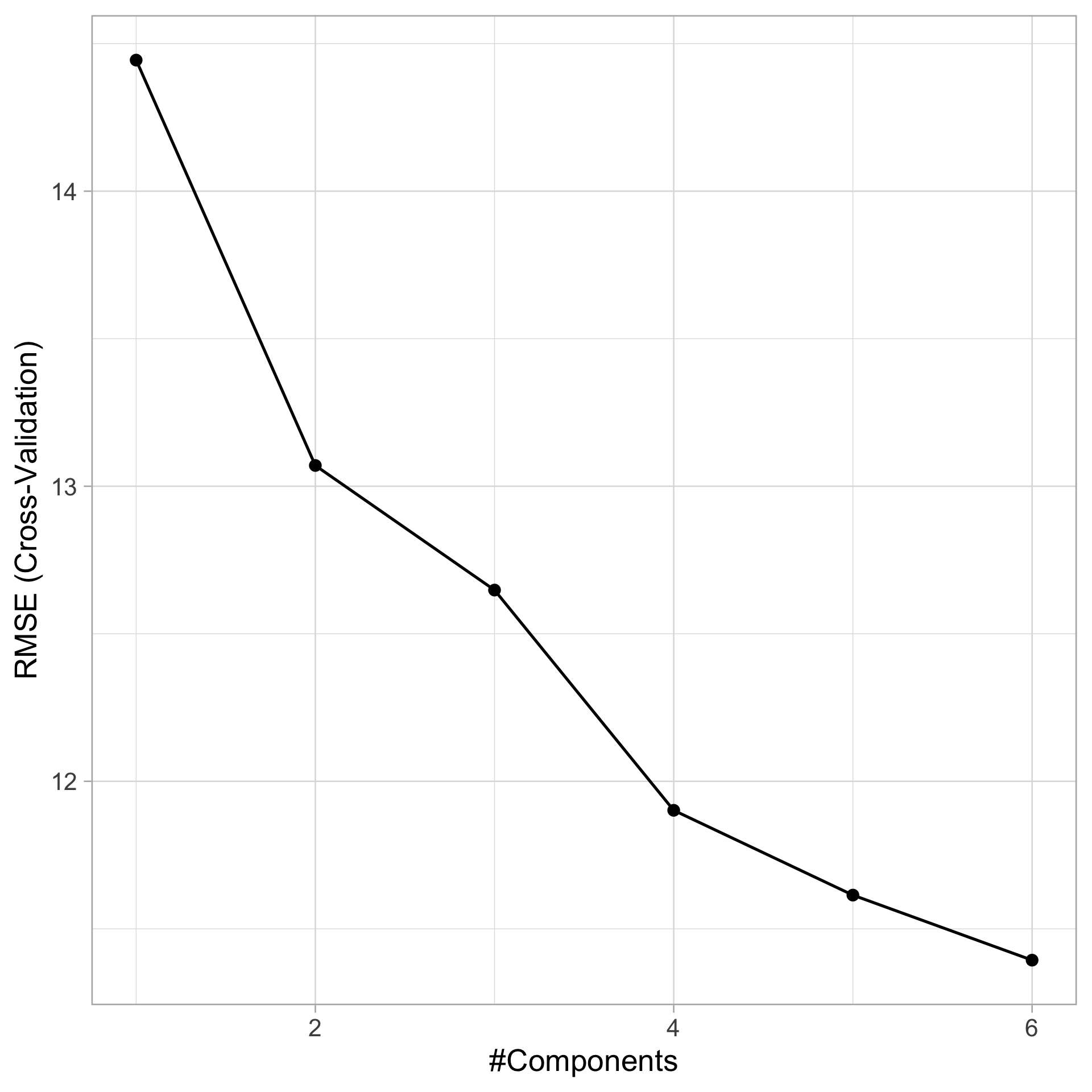
Tuning PCR with caret

set.seed(0622)
library(caret)

cv_model_pcr <- train(
  goal_differential ~ ., 
  data = nwsl_model_data, 
  method = "pcr",
  trControl = trainControl(method = "cv", number = 10),
  preProcess = c("center", "scale"),
  tuneLength = ncol(nwsl_model_data) - 1)

ggplot(cv_model_pcr)

Tuning PCR with caret

summary(cv_model_pcr$finalModel)
Data:   X dimension: 59 7 
    Y dimension: 59 1
Fit method: svdpc
Number of components considered: 6
TRAINING: % variance explained
          1 comps  2 comps  3 comps  4 comps  5 comps  6 comps
X           38.46    64.13    78.51    89.01    94.01    98.46
.outcome     9.72    31.54    36.31    44.43    53.56    53.77

Tuning PCR with caret

set.seed(0622)

cv_model_pcr_onese <- train(
  goal_differential ~ ., 
  data = nwsl_model_data, 
  method = "pcr",
  trControl = 
    trainControl(method = "cv", number = 10,
                 selectionFunction = "oneSE"),
  preProcess = c("center", "scale"),
  tuneLength = ncol(nwsl_model_data) - 1)

summary(cv_model_pcr_onese$finalModel)
Data:   X dimension: 59 7 
    Y dimension: 59 1
Fit method: svdpc
Number of components considered: 4
TRAINING: % variance explained
          1 comps  2 comps  3 comps  4 comps
X           38.46    64.13    78.51    89.01
.outcome     9.72    31.54    36.31    44.43

Appendix

Partial least squares (PLS)

PCR is agnostic of response variable

PLS as supervised dimension reduction

First principal component in PCA:

\[ Z_1 = \phi_{11} X_1 + \phi_{21} X_1 + \cdots + \phi_{p1} X_p \]

In PLS, we set \(\phi_{j1}\) to the coefficient from the simple linear regression of \(Y\) on \(X_j\) for each \(j = 1, 2, \dots, p\)

  • Remember this slope is proportional to the correlation! \(\hat{\beta} = r_{X,Y} \cdot \frac{s_Y}{s_X}\)
  • Thus \(Z_1\) in PLS places most weight on variables strongly related to response \(Y\)

To compute \(Z_2\) for PLS:

  • Regress each \(X_j\) on \(Z_1\): the residuals capture signal not explained by \(Z_1\)

  • Set \(\phi_{j2}\) to the coefficient from simple linear regression of \(Y\) on these residuals for each variable

Repeat process until all \(Z_1, Z_2, \dots, Z_p\) are computed (PLS components)

Then, regress \(Y\) on \(Z_1, Z_2, \dots, Z_{p^*}\) where \(p^* < p\) is a tuning parameter

Tuning PLS with caret

set.seed(0622)

cv_model_pls <- train(
  goal_differential ~ ., 
  data = nwsl_model_data, 
  method = "pls",
  trControl = 
    trainControl(method = "cv", number = 10,
                 selectionFunction = "oneSE"), 
  preProcess = c("center", "scale"),
  tuneLength = 6)

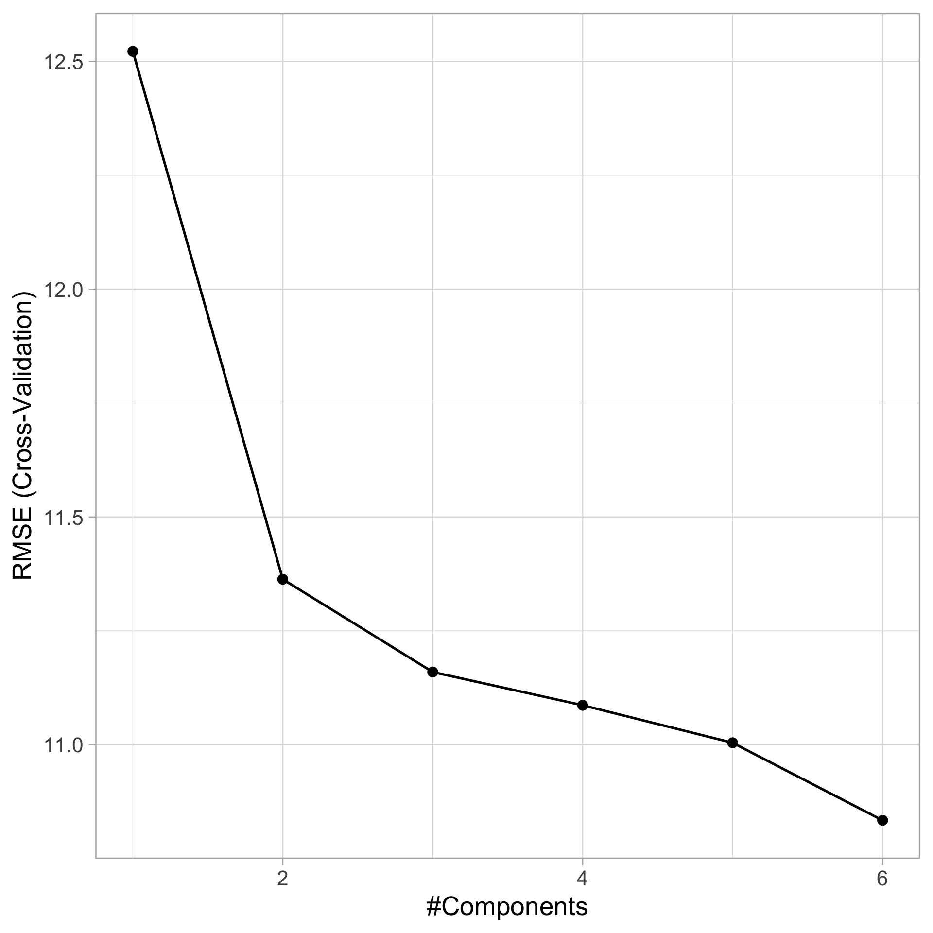
ggplot(cv_model_pls)
  • Contrasts with PCR results – lower RMSE and “optimal” number of components

  • Fewer PLS components because they are guided by the response variable

But how do we summarize variable relationships without a single coefficient?

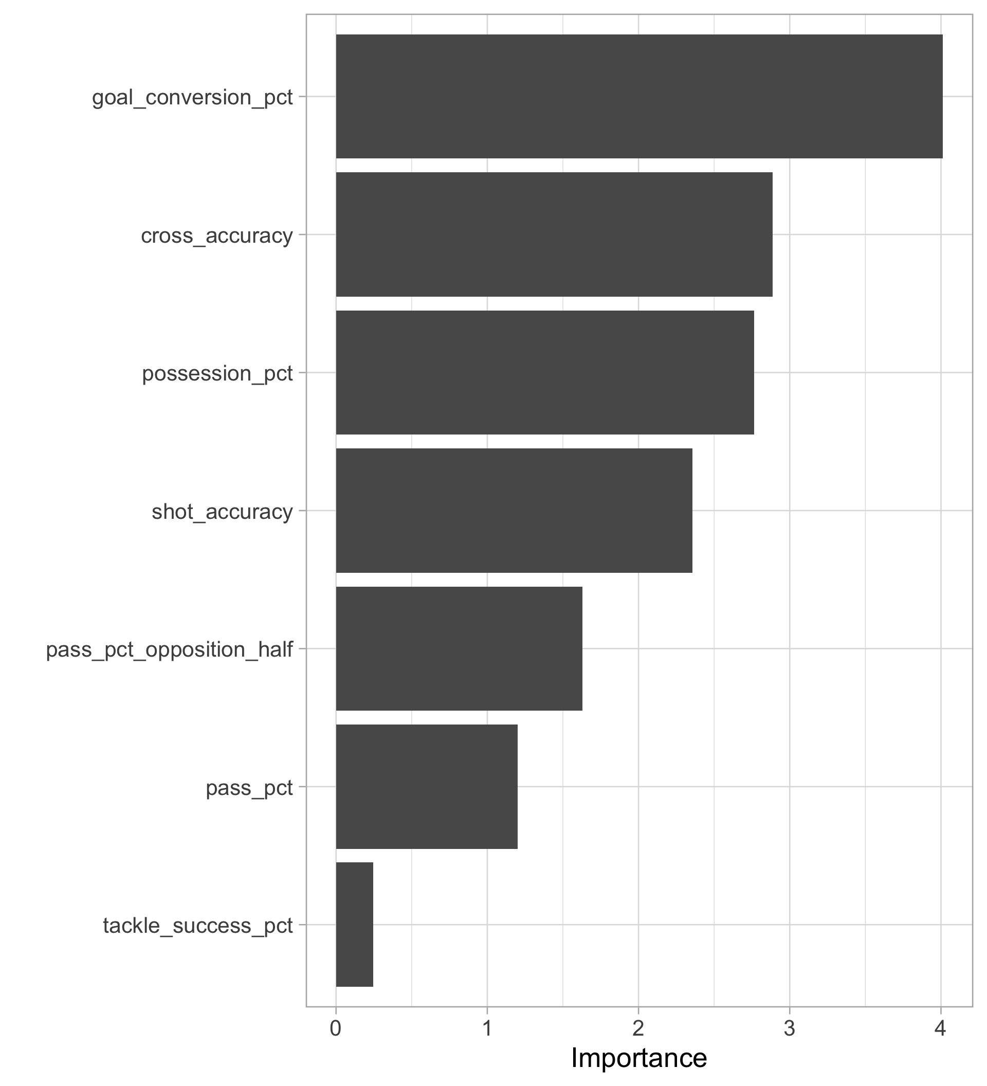
Variable importance

Variable importance attempts to quantify how influential variables are in the model

  • E.g., absolute value of \(t\)-statistic in regression

For PLS: weighted sums of the absolute regression coefficients across components

  • Weights are function of reduction of RSS across the number of PLS components
library(vip) #install.packages("vip")
vip::vip(cv_model_pls$finalModel) 

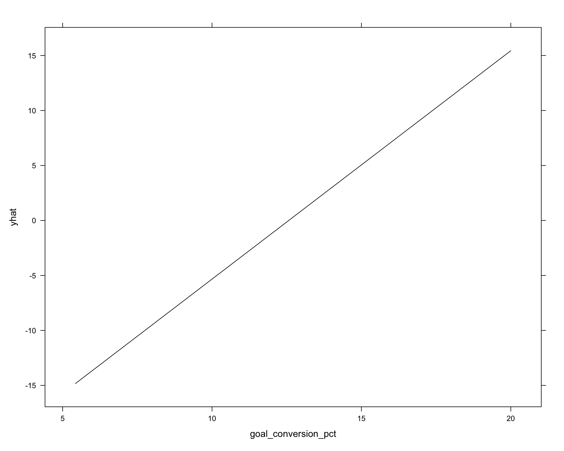
Partial dependence plots (PDP) with pdp package

PDPs display the change in the average predicted response as the predictor varies over their marginal distribution

library(pdp) #install.packages("pdp")
partial(cv_model_pls, "goal_conversion_pct", plot = TRUE)

More useful for non-linear models later on!

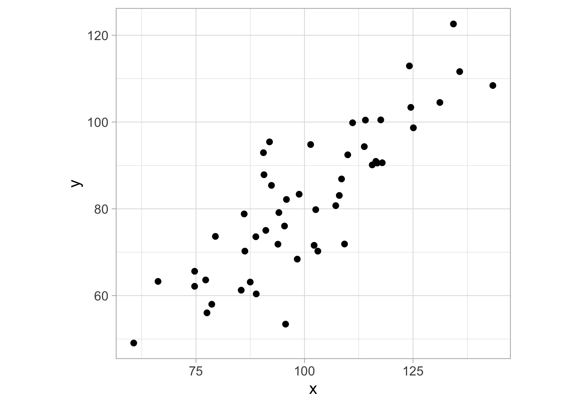
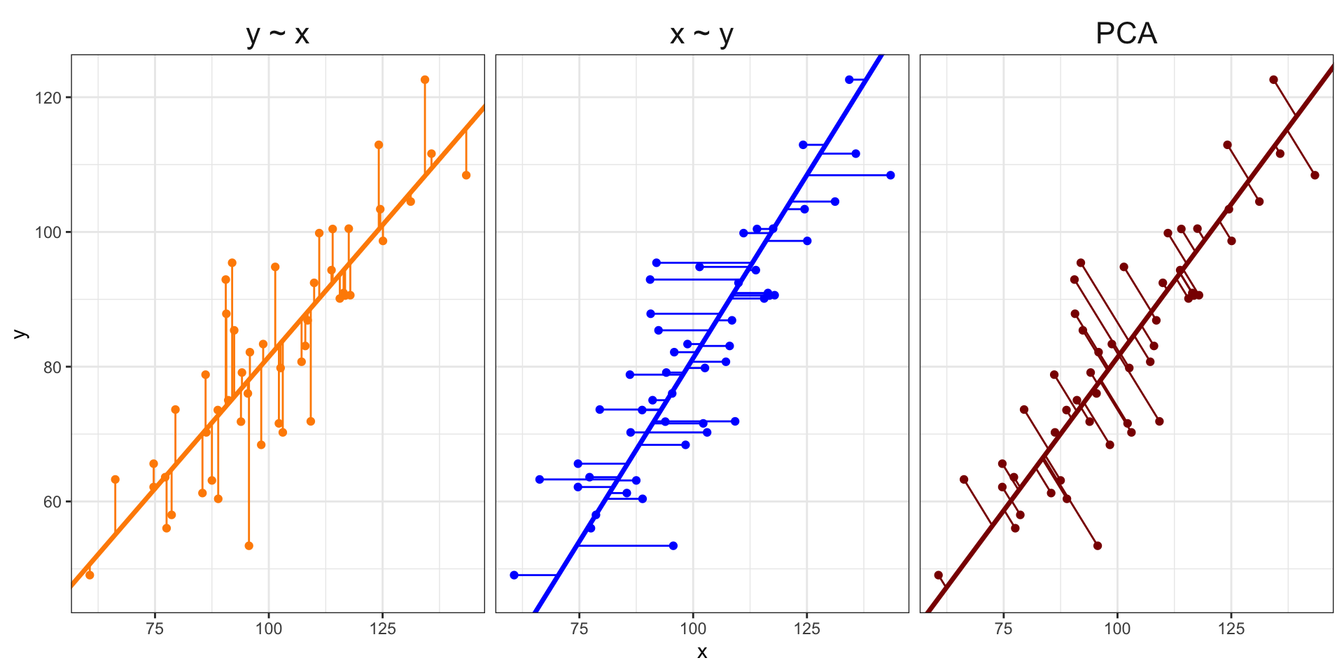
Visualizing PCA in two dimensions

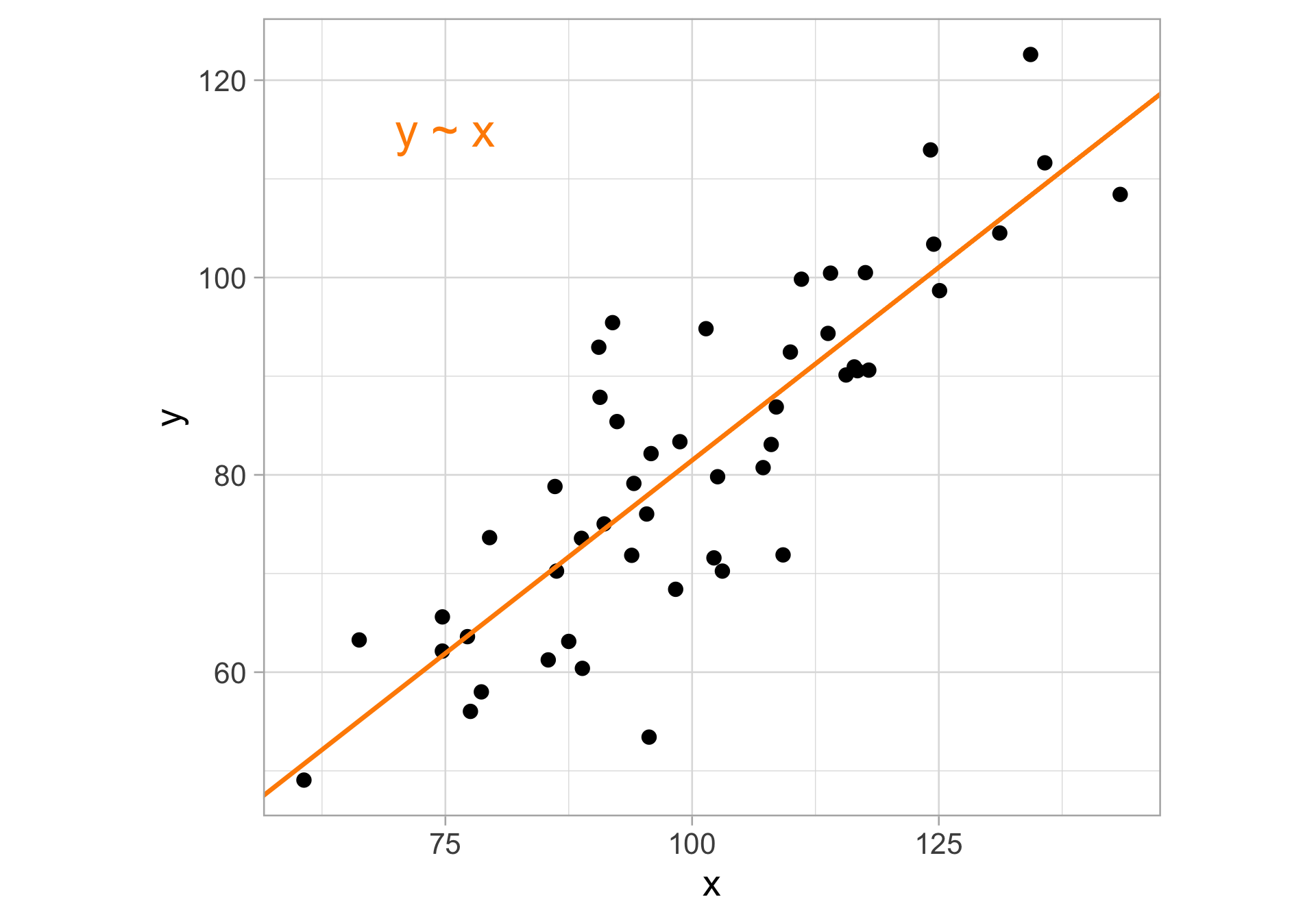
Visualizing PCA in two dimensions

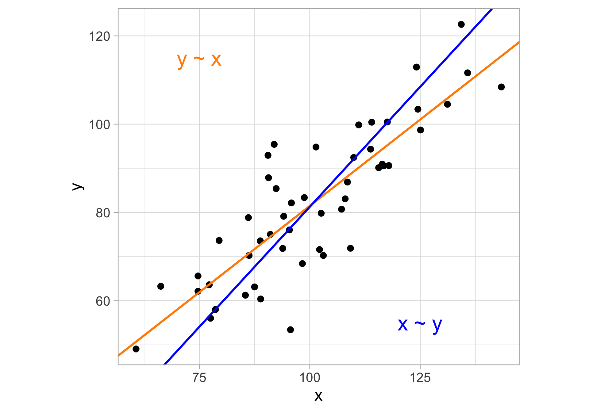
Visualizing PCA in two dimensions

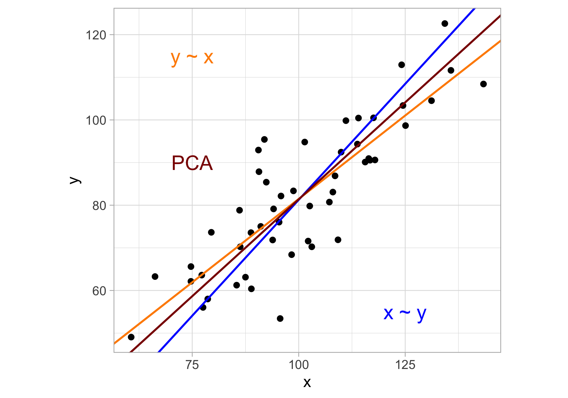
Visualizing PCA in two dimensions

Visualizing PCA in two dimensions

Key idea: provide low-dimensional linear surfaces that are closest to the observations

  • The above is the minimizing projection residuals viewpoint of PCA

  • There’s another viewpoint—maximizing variance. That is, if we project all points onto the solid red line, we maximize the variance of the resulting projected points across all such red lines

PCA output

# str(nwsl_team_pca)

Examine the output after running prcomp()

  • nwsl_team_pca$sdev: singular values (\(\sqrt{\lambda_j}\))

  • nwsl_team_pca$rotation: loading matrix (\(V\))

  • nwsl_team_pca$x: principal component scores matrix (\(Z=XV\))

Can use the broom package for tidying prcomp()

library(broom)
tidy(nwsl_team_pca, matrix = "eigenvalues") # equivalent to nwsl_team_pca$sdev
tidy(nwsl_team_pca, matrix = "rotation") # equivalent to nwsl_team_pca$rotation
tidy(nwsl_team_pca, matrix = "scores") # equivalent to nwsl_team_pca$x

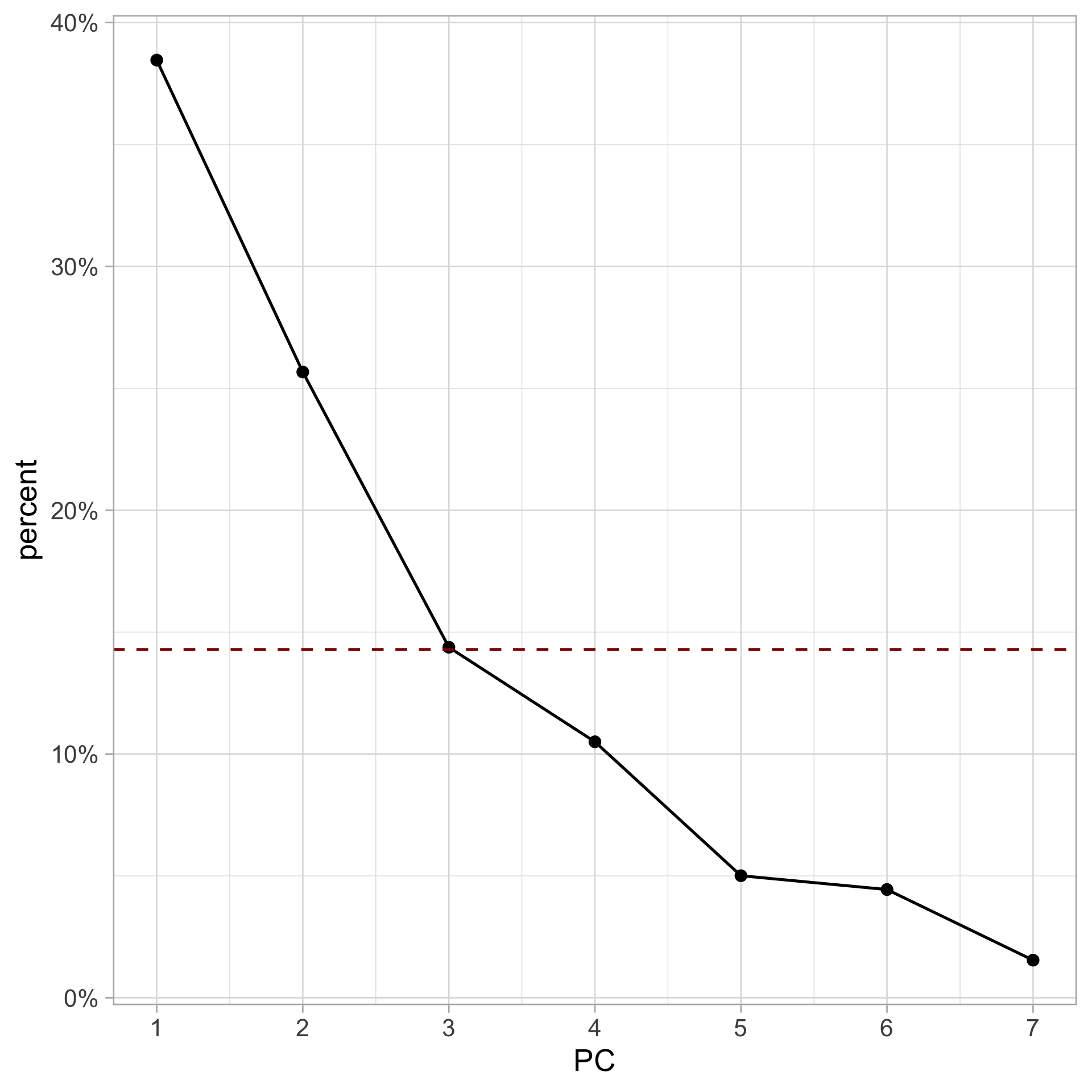
Proportion of variance explained

nwsl_team_pca |>
  tidy(matrix = "eigenvalues") |>
  ggplot(aes(x = PC, y = percent)) +
  geom_line() + 
  geom_point() +
  geom_hline(yintercept = 1 / ncol(nwsl_team_feat),
             color = "darkred", linetype = "dashed") +
  scale_x_continuous(breaks = 1:ncol(nwsl_team_pca$x)) +
  scale_y_continuous(labels = scales:: label_percent())

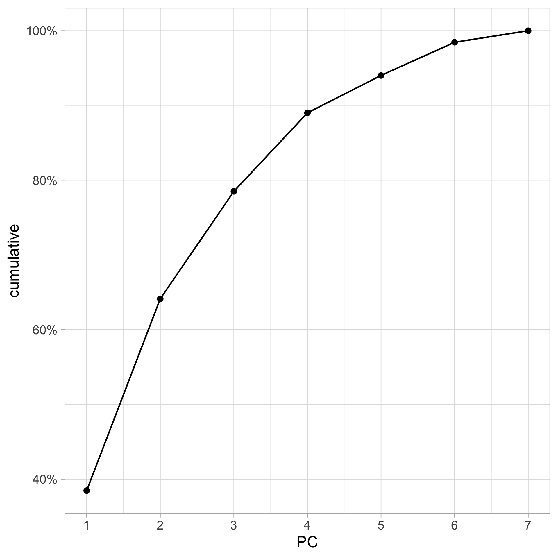
Cumulative proportion of variance explained

nwsl_team_pca |>
  tidy(matrix = "eigenvalues") |>
  ggplot(aes(x = PC, y = cumulative)) +
  geom_line() + 
  geom_point() +
  scale_x_continuous(breaks = 1:ncol(nwsl_team_pca$x)) +
  scale_y_continuous(labels = scales:: label_percent())

Biplot discussion

nwsl_team_pca |> 
  fviz_eig(addlabels = TRUE) +
  geom_hline(
    yintercept = 100 * (1 / ncol(nwsl_team_pca$x)), 
    linetype = "dashed", 
    color = "darkred",
  )

  • A biplot only plots the first 2 PCs, and so we are hiding some data information (~36% of information) that we are better off plotting in some way if possible

    • ~40% of this remaining information is captured by PC3
  • Theoretically, we should plot three quantitative variables (e.g., point size, transparency, or even a 3D scatterplot)

  • Alternatively, we could make three scatterplots (one for each pair of PCs)